Project Goals
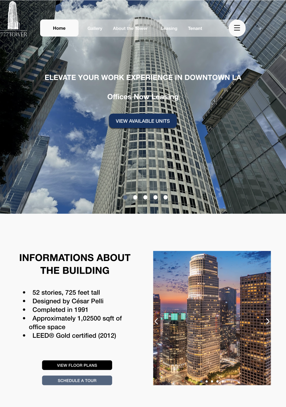
The 777 Tower project aims to create a modern, user-centered website that bridges business objectives with user needs. It focuses on increasing leasing conversions, elevating brand perception, and improving tenant engagement through an efficient, visually appealing digital experience. By offering clear leasing information, interactive navigation, and real-time updates, the project enhances accessibility for tenants and visitors while promoting 777 Tower’s identity as a creative, community-driven workplace.
Check in figmaFeatures Roadmap
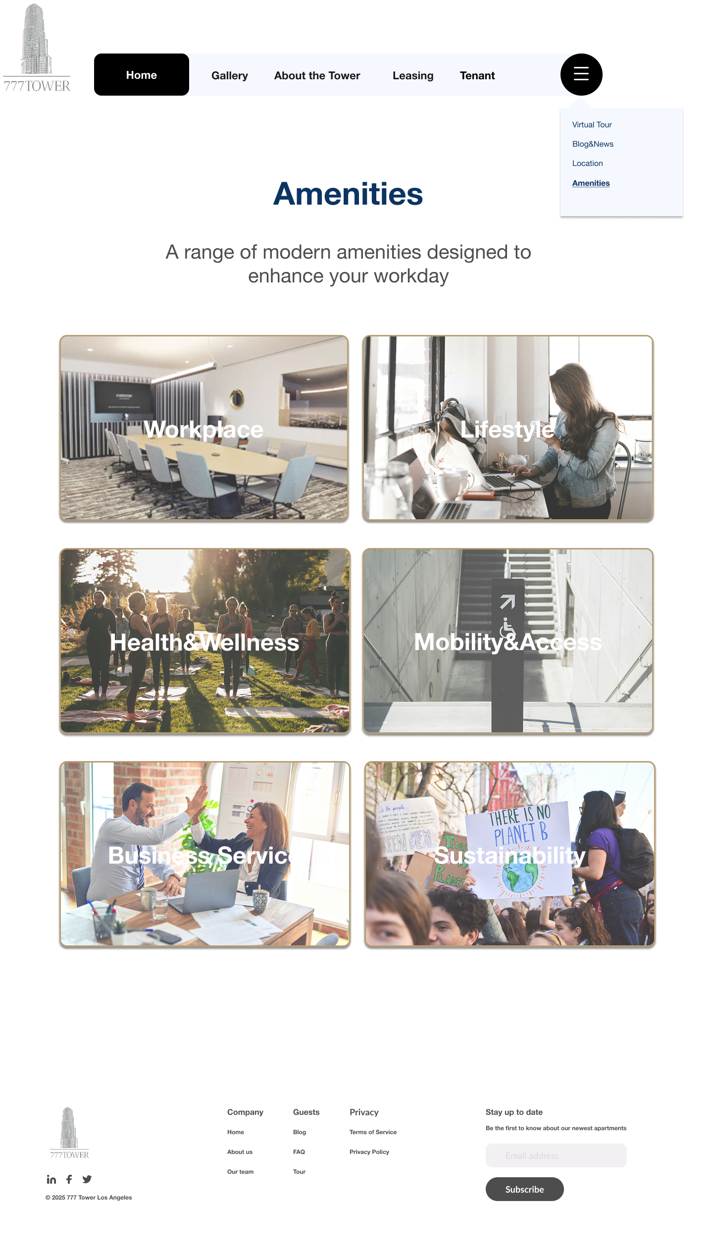
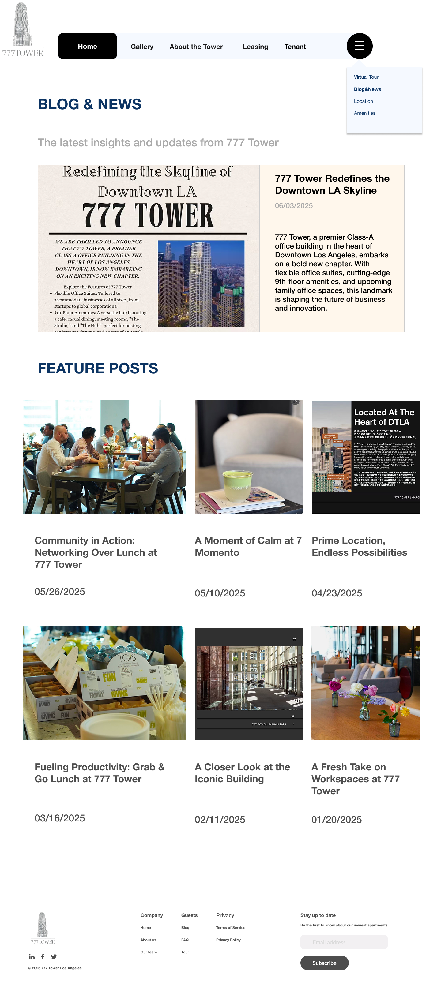
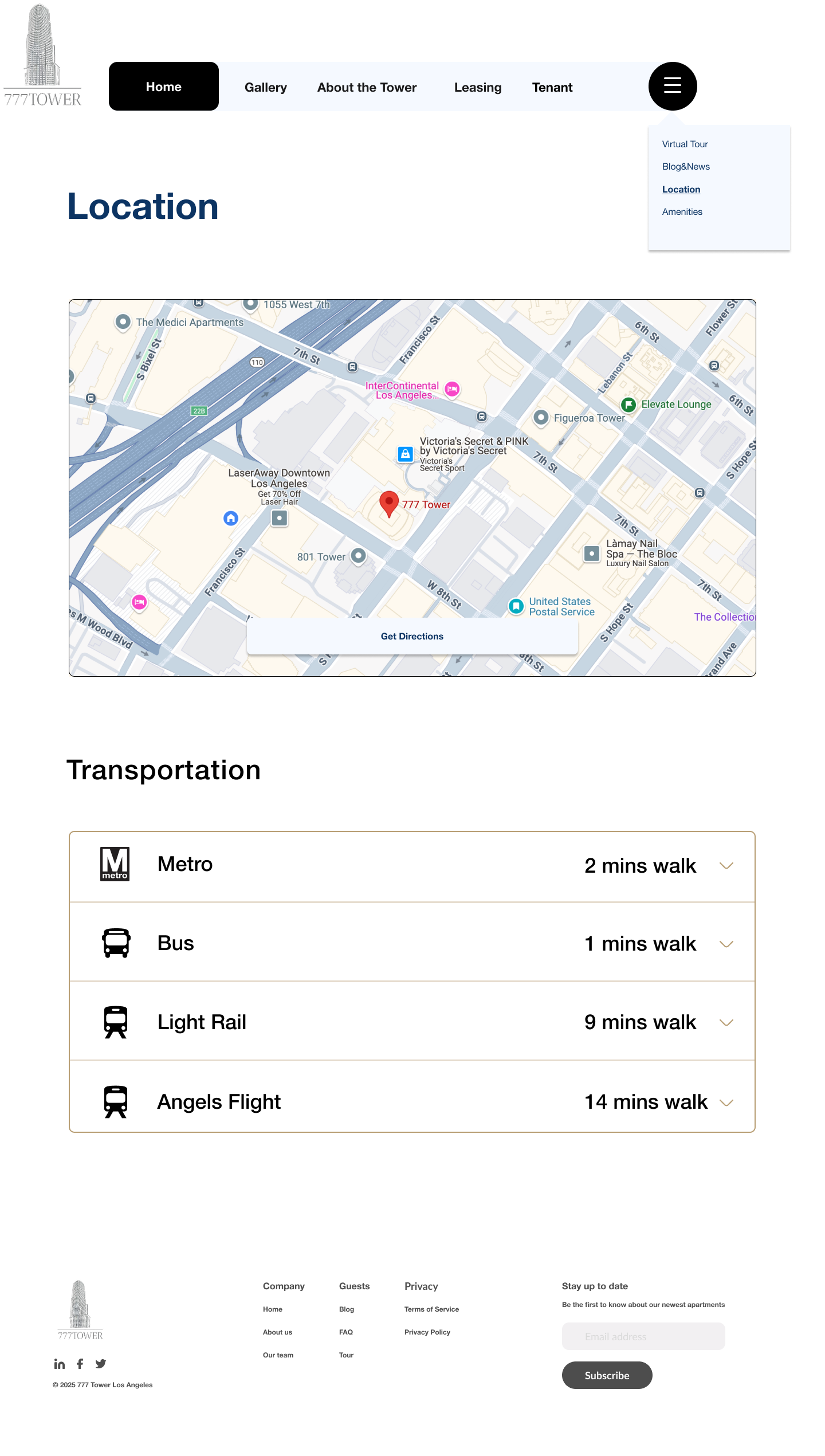
The 777 Tower feature map outlines a user-focused website that combines leasing efficiency with engaging digital tools. Core features include an interactive building overview, leasing inquiry form, and location map, complemented by advanced options like virtual tours, downloadable floor plans, and a tenant directory. Users can explore nearby amenities, check availability, and read tenant testimonials, while tenants gain access to exclusive portals, multilingual support, and regular news or event updates, creating a connected, transparent, and modern online experience.
 Check in Figma
Information architecture
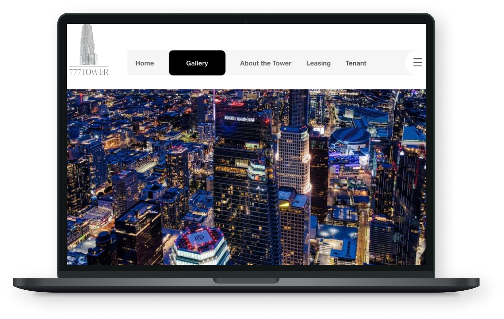
The 777 Tower sitemap organizes the website into four main sections—Homepage, About the Tower, Gallery/Virtual Tour, and Community/Tenants—to ensure clear navigation and accessibility. It highlights key features such as leasing inquiries, availability calendars, floor plans, and interactive maps, while offering sections for sustainability, amenities, and tenant engagement. The structure balances functionality and storytelling, helping users explore leasing options, building details, and community updates in a cohesive, user-friendly flow.
Sitemap
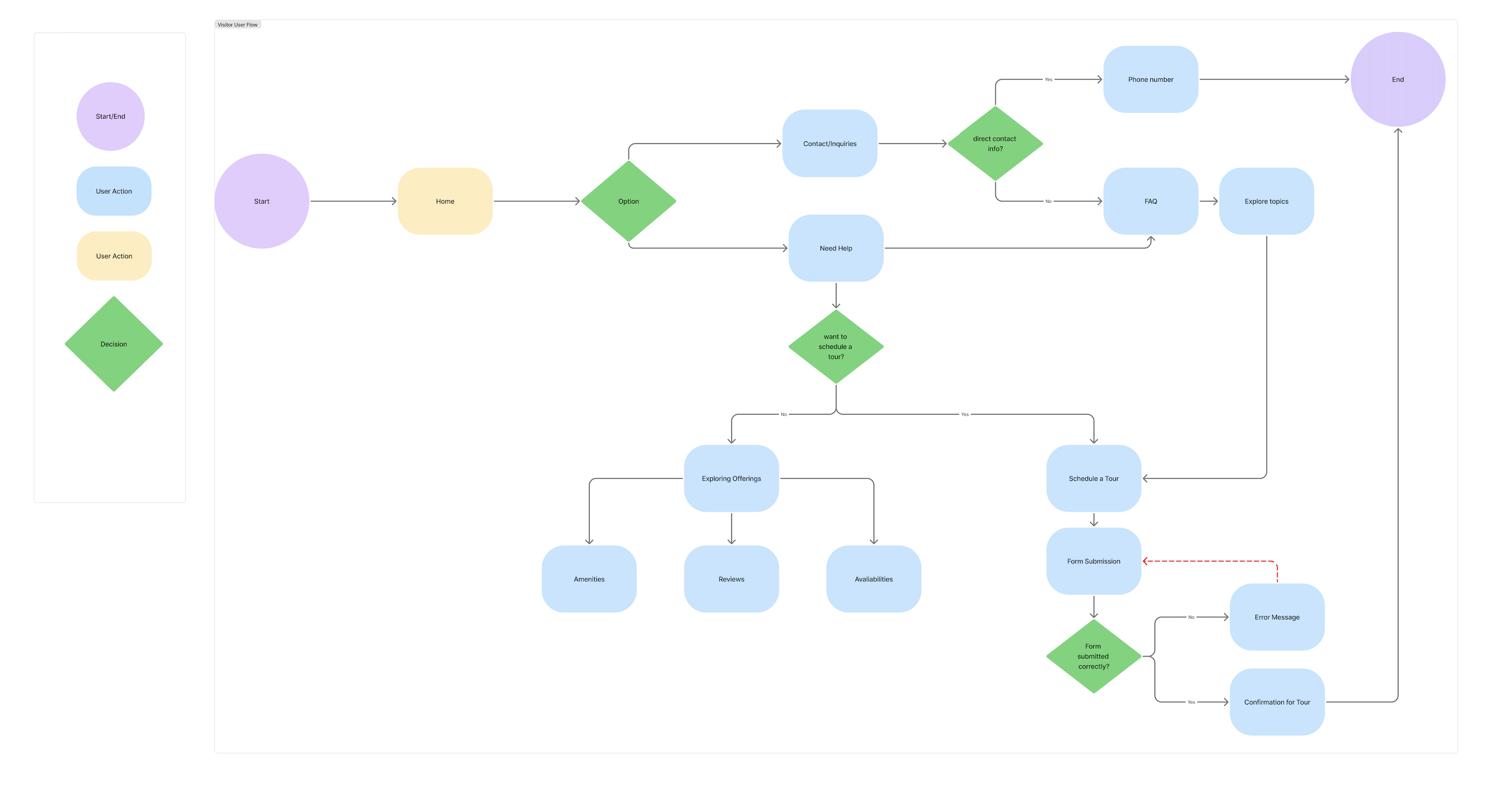
The 777 Tower visitor user flow outlines a seamless journey from homepage entry to tour confirmation. Users can explore building information, amenities, and reviews or directly contact management through inquiry options. If they choose to schedule a tour, they complete a simple submission process with clear feedback for success or errors. The flow prioritizes intuitive navigation, helpful prompts, and quick access to key actions—enhancing both user convenience and conversion efficiency.
User Flow
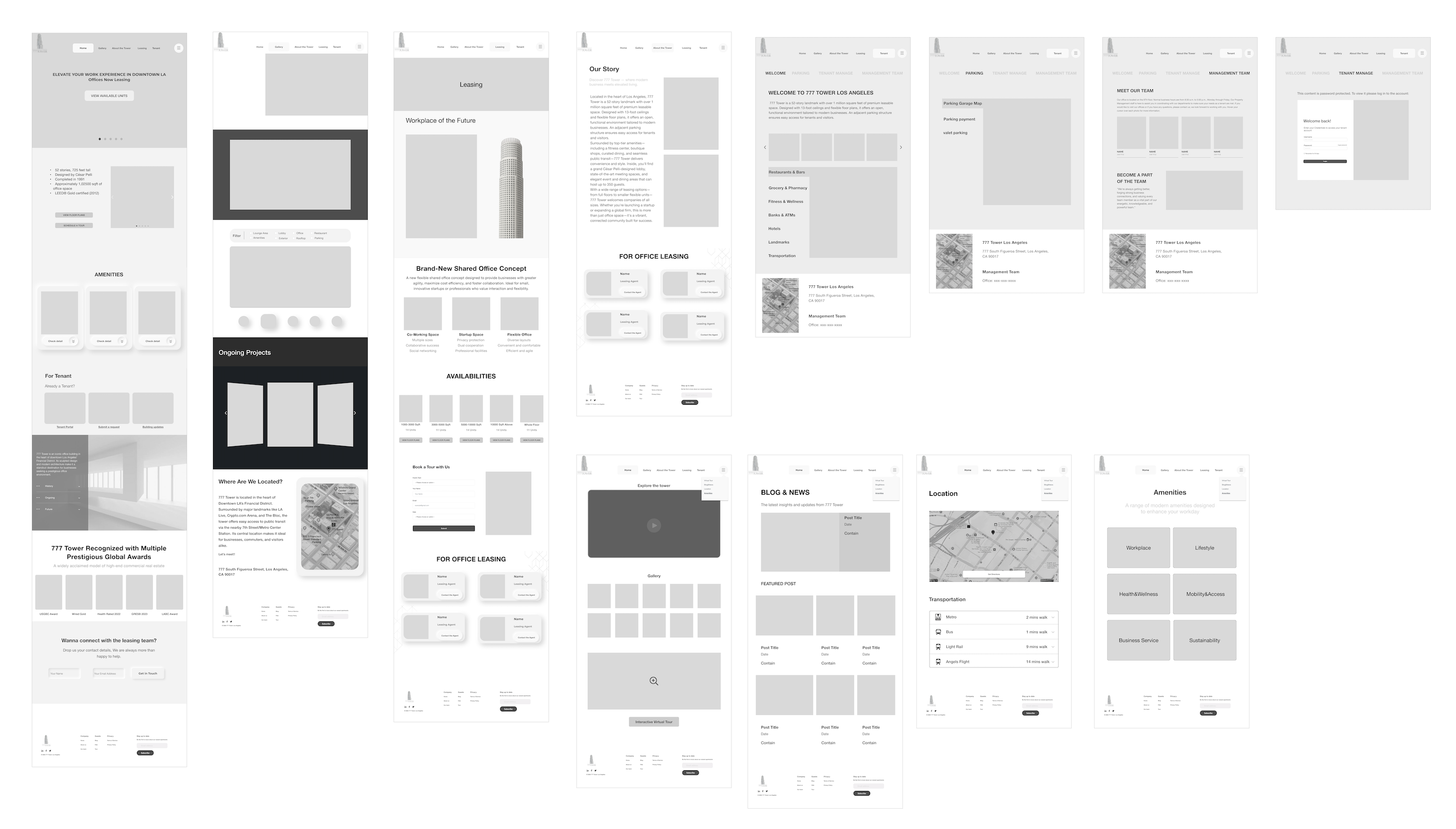
Wireframes
I created the low-fidelity wireframes to establish a clear and intuitive structure for the 777 Tower website. My goal was to design a seamless navigation system that helps users easily explore leasing options, amenities, and location details while maintaining a consistent visual hierarchy. I focused on creating a simple, functional layout that supports both tenants and visitors—making actions like booking tours or contacting management effortless. This early stage allowed me to prioritize usability and flow before moving into visual refinement and branding.
Brand Identity
Since the 777 Tower already had an established logo and core branding, my role focused on expanding and adapting the existing identity into a cohesive digital experience. I applied the building’s signature color palette (aluminum and white) and minimalist, professional tone consistently across the website to maintain brand integrity. The goal was to translate the physical elegance and prestige of the tower into a modern online presence, using clean typography, generous spacing, and refined visual hierarchy to reflect its premium character.
UI Components
The Movideo UI component library establishes a consistent visual system across the platform. Built with modular buttons, icons, cards, and navigation elements, it uses a vibrant orange accent to convey energy and motion while maintaining clarity, balance, and scalability.
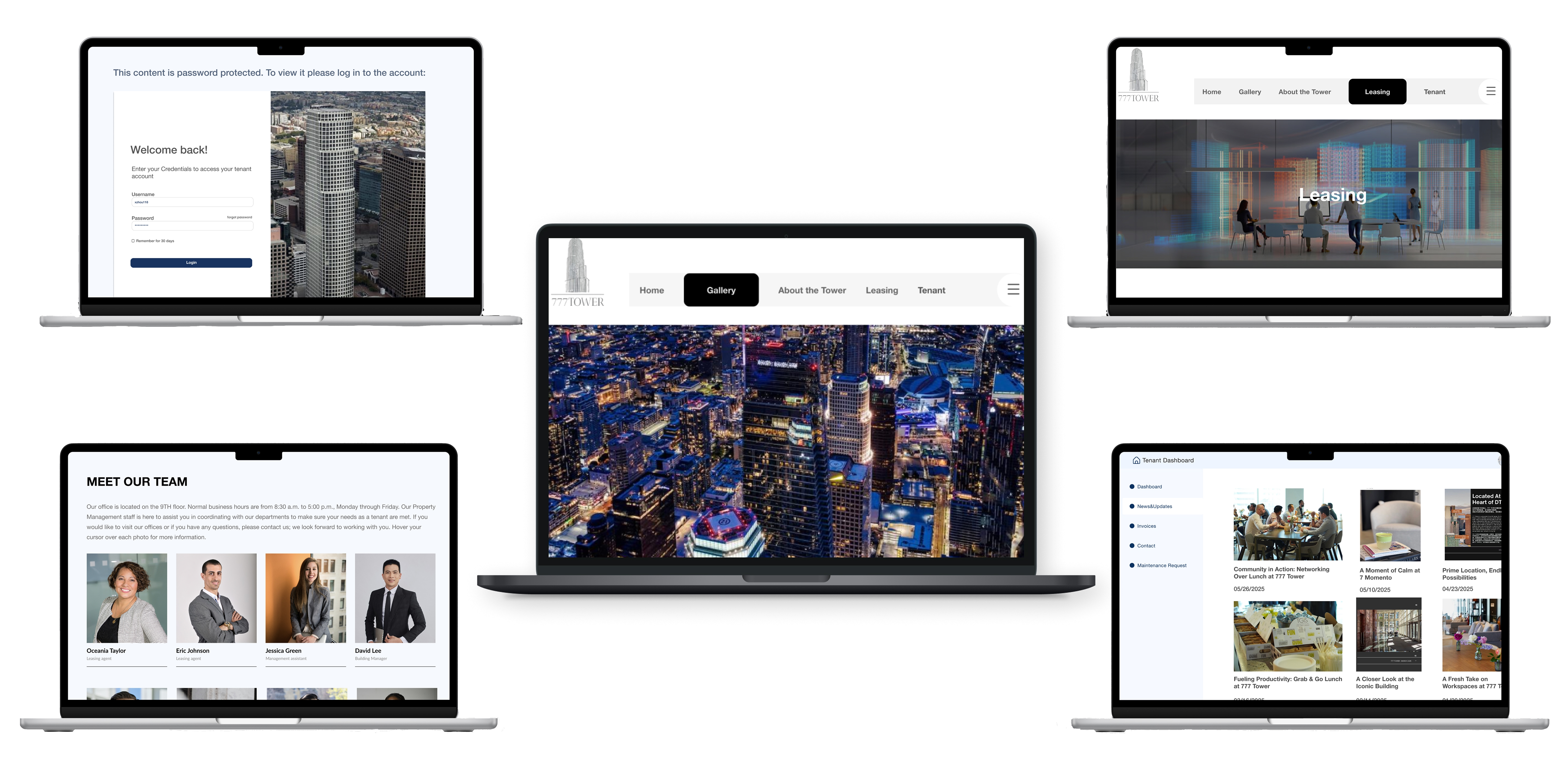
High-fidelity key-screens
These high-fidelity key screens bring Movideo’s concept to life through warm tones, clear hierarchy, and intuitive navigation. The design highlights the seamless flow between watching packing tutorials and booking professional services — reflecting the brand’s mission to connect learning with real-world action. Each screen emphasizes clarity, approachability, and consistency with the Movideo design system.
click to view in FigmaUsability Test
Outcome
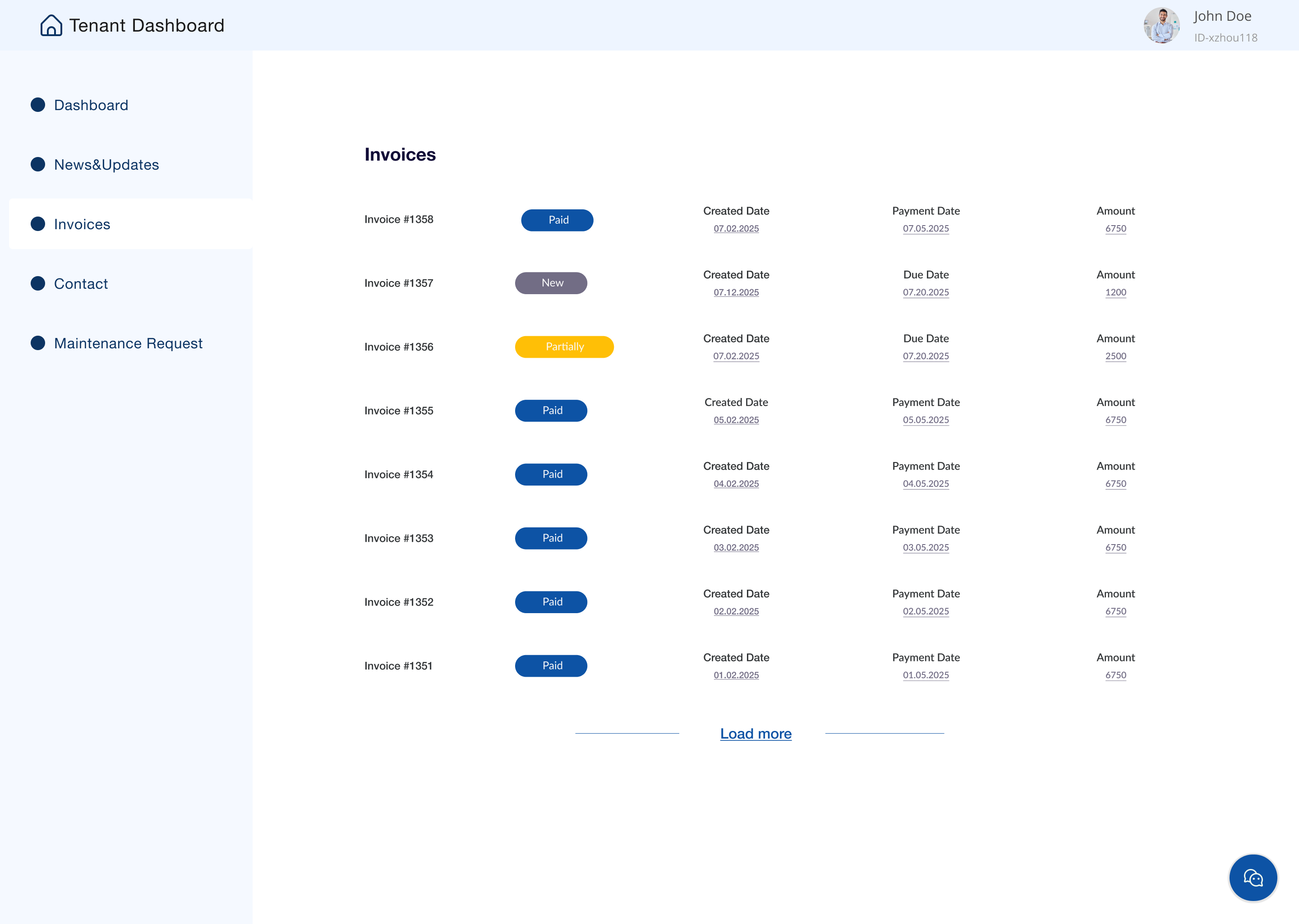
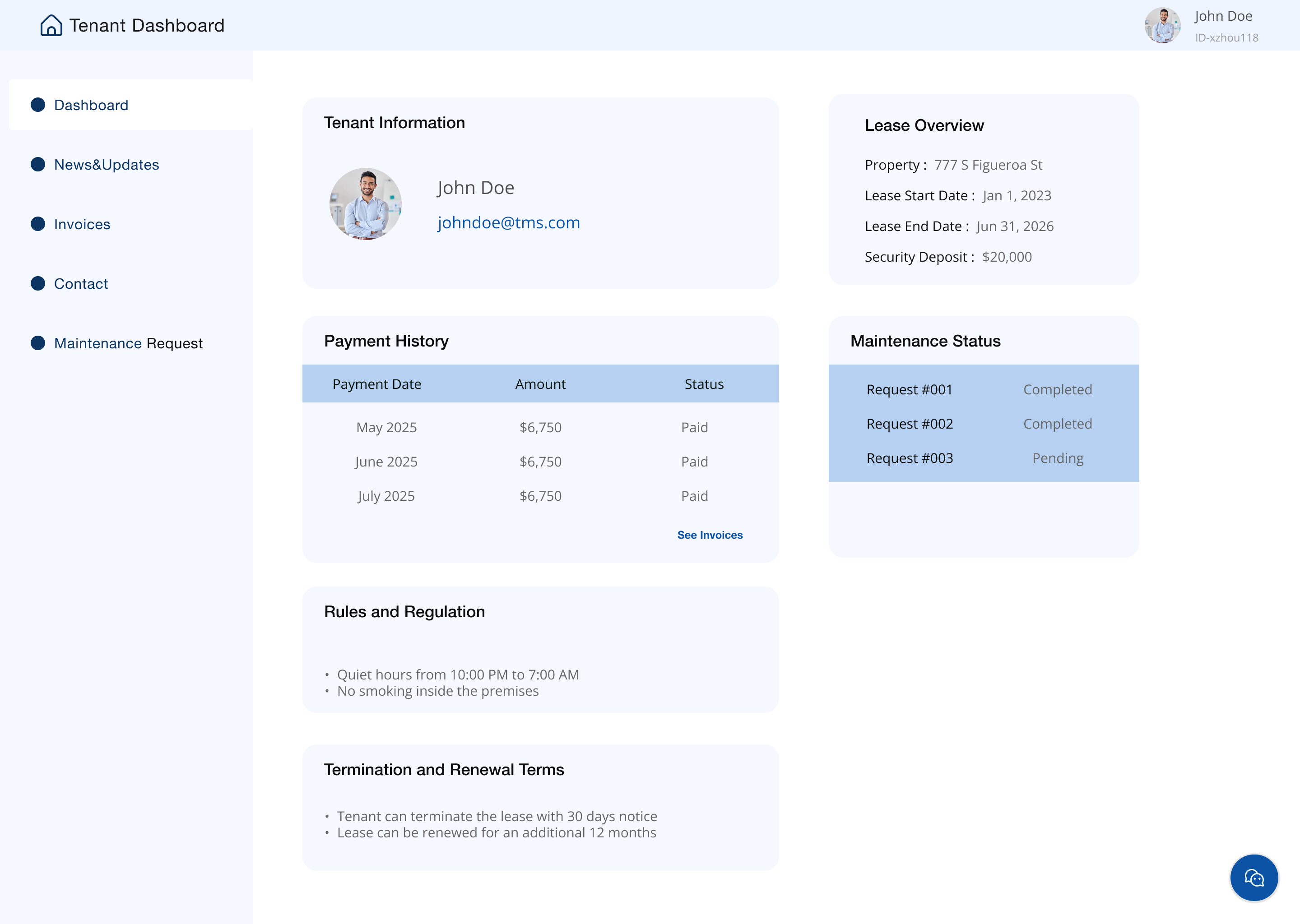
I conducted usability testing with five participants to evaluate the functionality and clarity of the 777 Tower website. All users successfully completed key tasks—exploring leasing options, finding nearby restaurants and parking, and accessing the tenant portal to submit maintenance request—within 15 to 20 minutes.
The feedback was overwhelmingly positive; participants described the design as clean, modern, and intuitive. However, several users mentioned that the tenant portal could be more visible and that mobile spacing needed refinement. Based on these insights, I plan to adjust the portal’s placement, improve hierarchy in the contact section, and optimize the mobile layout to ensure a smoother and more engaging user experience.
Iterations
Thanks to usability tests, I had done some iterations for the final high fidelity prototype
Change the Dropdown color theme to match the overall color theme
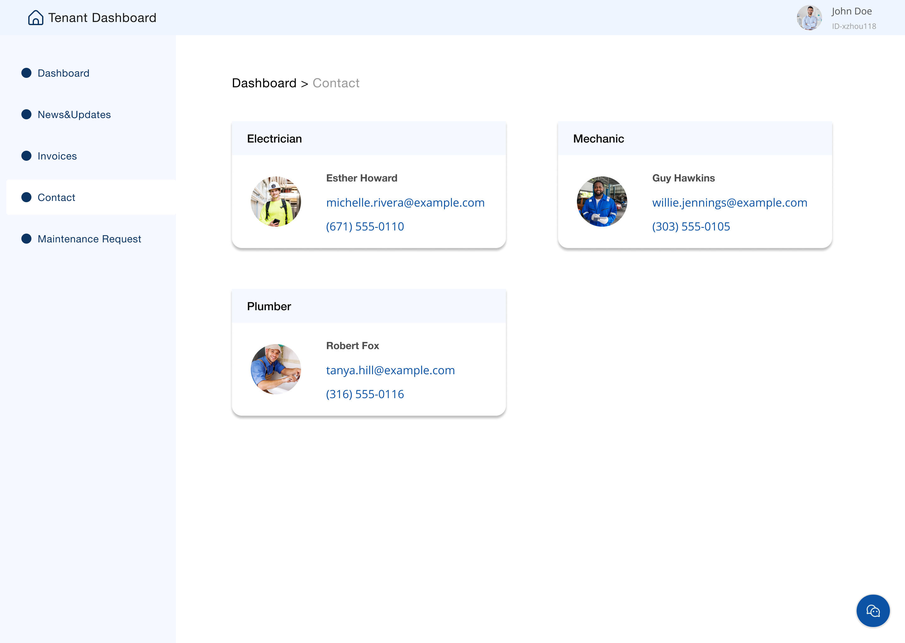
Add the tenant portal in order to provide easy access to services, resources and support that improve daily tenant experience.
Adjust the background to make the texts pop up
View full prototype.png)