ALTAPORT MARKETPLACE CONCEPT

From fragmented luxury platforms to a unified global marketplace.

Designing AltaPort’s cross-border fashion ecosystem for verified resale, transparent logistics, and emerging global sellers.

Client Concept Product / Independent UX Case Study
Timeline July 2025 — September 2025
UX Design UI Design UX Research Design Strategy Prototyping Marketplace Systems
01 Verified sellers
02 Cross-border checkout
03 Transparent duties
AltaPort mobile app prototype

Scroll to explore

01

Problem System

Trust was not missing at one point — it broke across the entire luxury buying journey.

The friction problem

Four blockers disrupted confidence before checkout.

Hover or click each system point.

Opportunity

Build a marketplace that makes trust visible before users have to question it.

Part 1

Exploring User Needs

Turning user research into a trust-first product system.

I translated interview signals into visual systems: clusters, emotional shifts, personas, and use-case flows that shaped AltaPort’s product direction.

01 / Interview Signals

Start with the moments where users hesitate.

I interviewed fashion shoppers and resale sellers to understand what information they need before trusting a high-value purchase.

Core Question What builds trust?

Resale buyer

Luxury shopper

Seller

Trend-driven user

02 / Affinity System

Cluster scattered interview notes into product themes.

I turned raw research notes into visual clusters that revealed repeated needs around trust, pricing, discovery, social behavior, and resale structure.

Trust & Authenticity

Need certificates, QC checks, and verified badges.
Fake listings make users hesitate.
Seller ratings build confidence.

Shopping UX

Simple navigation matters more than feature density.
Too many products create decision fatigue.
Checkout should feel short and clear.

Fashion Inspiration

Users want trend updates and outfit ideas.
Emerging designers create excitement.
Customization adds emotional value.

Pricing Transparency

Duties and shipping should appear early.
Fair resale comparison increases trust.
Hidden cost creates abandonment risk.

Seller Infrastructure

Sellers need payout clarity.
Listing tools should feel lightweight.
Buyer messages need to stay organized.
03 / Emotional Journey

Map where excitement turns into doubt.

The journey showed that confidence drops when users move from browsing inspiration to validating authenticity, price, and delivery.

04 / Personas

Translate patterns into two marketplace archetypes.

The personas helped define the two sides of AltaPort’s ecosystem: the confidence-seeking buyer and the credibility-seeking seller.

User Persona

Maggie Lindemann

Model / Stylist / Trend-driven shopper

Visual Social Trend-driven Fast-moving
Goal

Discover rare and curated fashion pieces without feeling uncertain about authenticity or price.

Needs

Personalized style feed, verified seller badges, transparent pricing, and easy comparison.

Pain Point

Gets bored by generic shopping apps but hesitates when trust signals are missing.

05 / Use Case Flows

Turn personas into product scenarios.

I mapped two journeys to make the product requirements more concrete: buying with confidence and selling with operational clarity.

01 Discover curated resale
02 Compare authenticity
03 Review total cost
04 Purchase confidently
06 / Design Direction

Research became four product requirements.

The final direction was not just “make shopping easier.” It was to make trust, cost, discovery, and seller infrastructure visible in the product.

01

Verified Trust Layer

Badges, certificates, reviews, and seller credibility indicators.

02

Transparent Pricing

Early duties, taxes, shipping, and resale pricing breakdowns.

03

Curated Discovery

Social inspiration, personalization, and clean shopping UX.

04

Seller Infrastructure

Listing management, messages, verification status, and payout tracking.

Part 2

Map the User Journey

Turning research insights into a connected product structure.

I translated the research into a sitemap, priority user flows, early ideation, and low-fidelity wireframes to define how AltaPort should connect shopping, resale, customization, and authentication.

01 / Sitemap System

Structure the marketplace around four connected product zones.

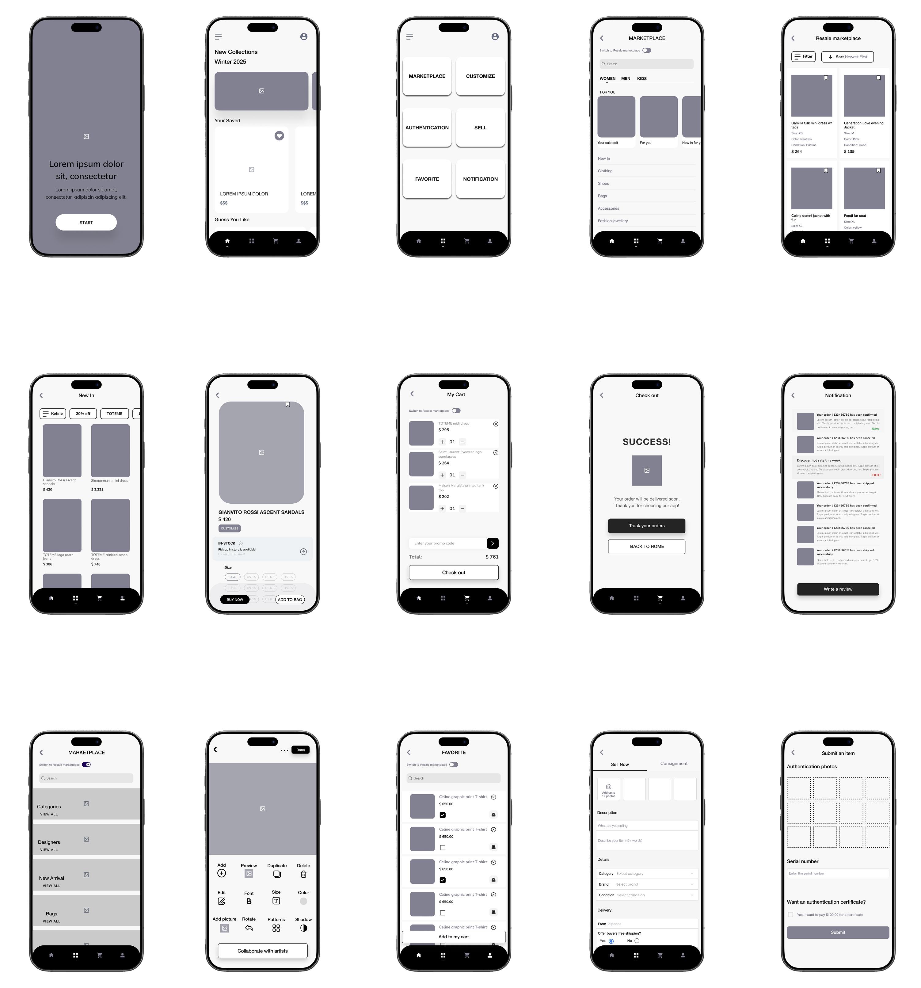
The sitemap separates buyer, seller, customization, and authentication flows, while keeping them connected under one marketplace system.

AltaPort Home
01

Shop

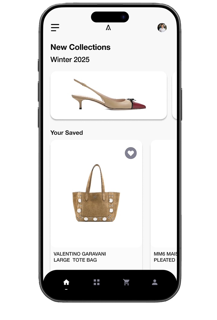
Users can browse resale and international marketplace inventory, compare products, view product details, and move into cart or checkout.

Resale Marketplace
International Marketplace
Browse / Search
Product Detail
Shopping Cart
Checkout
02 / User Flow System

Prioritize four flows that address the biggest decision points.

I mapped the most important journeys to clarify how users move from intent to action: listing, buying, authenticating, and customizing.

View User Flows in Figma
Start
01 Homepage
02 Sell
03 Add Item Info
04 Need authentication?
05 Preview Listing
06 Publish
End
03 / Crazy 8s System

Rapidly sketch concepts around the strongest flow opportunities.

I used Crazy 8s to explore multiple product directions quickly, then grouped the sketches by feature purpose.

01

Home + Discovery

02

Buy Flow

Browse
Product
Cart
03

Checkout + Edge Cases

Payment $8,500
Review Total cost
Error Try again
Success Order placed
Output

The strongest ideas became the foundation for the low-fidelity structure: marketplace browsing, product detail, seller listing, cart refinement, checkout, and post-purchase tracking.

04 / Low-Fidelity Wireframes

Translate flow logic into low-fidelity screens.

At this stage, I focused on layout hierarchy, key decision points, and flow clarity before moving into visual styling.

AltaPort Low-Fi System

User Flow → Home → Browse → Product → Cart → Checkout → Success

View Low-Fi Prototype
AltaPort low fidelity wireframe system
Validated Structure Browse → Product → Cart → Checkout
Design Focus Hierarchy, decision clarity, and reduced checkout friction
Next Step Convert wireframes into UI patterns and prototype interactions
Part 3

Building the Brand

Building a visual system for a high-trust luxury marketplace.

After defining the structure and core flows, I developed AltaPort’s brand identity, interface language, and high-fidelity direction to make the product feel premium, minimal, and globally connected.

02 / Visual Language

Create a muted system that lets products, trust, and decisions stand out.

AltaPort uses a restrained neutral palette and Helvetica Neue-inspired typography to create a calm, premium, and highly legible shopping experience.

Palette system

Muted neutral scale

White

Primary surface

Used to keep the shopping experience spacious, editorial, and product-focused.

Typography system

Helvetica Neue as the interface voice

AUTHENTICATED SELLER

Product clarity first.

A restrained interface keeps attention on item quality, verification, and total cost.

03 / UI Kit System

Translate the brand into reusable product components.

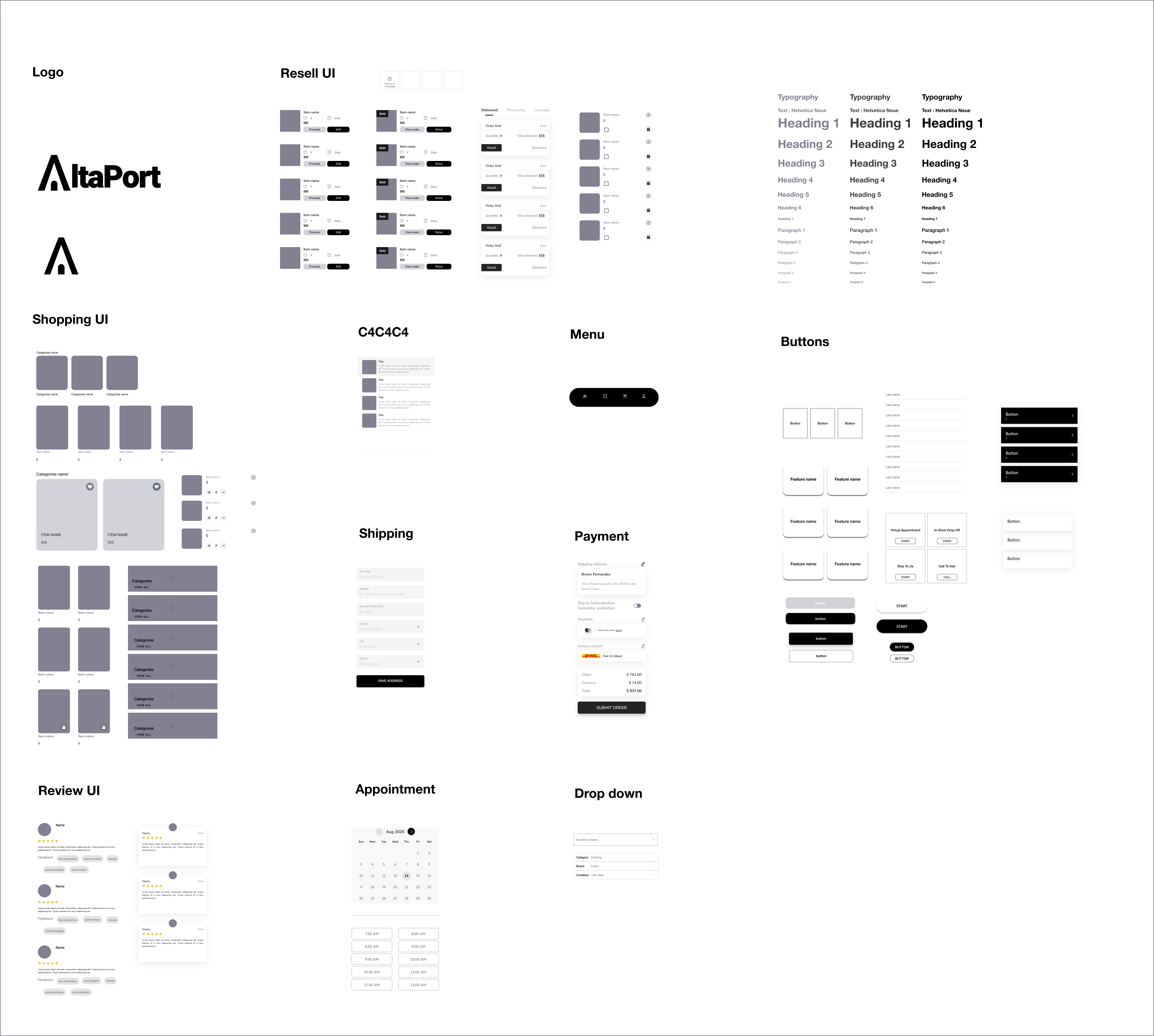
I built a UI kit to keep the interface consistent across marketplace browsing, resale tools, checkout, reviews, appointments, and authentication flows.

GIANVITO ROSSI Ascent Sandals

$420

CELINE Denim Jacket

$264

Full UI Kit Board

Logo, product cards, resale UI, typography, buttons, menu, forms, reviews, appointment, dropdown

View UI Kit in Figma
AltaPort UI kit
04 / High Fidelity

Bring the structure, brand, and UI system into high-fidelity screens.

The final visual direction combines editorial product presentation, verified resale tools, customization, authentication, and checkout into one cohesive luxury marketplace experience.

Marketplace discovery

Curated fashion browsing with clean product hierarchy.

View High-Fi Prototype
AltaPort high fidelity key screens
Part 4

Prototyping & Testing

Testing AltaPort through focused prototype flows.

I structured the prototype around four key flows that represent the core mental models of AltaPort: selling, buying, authenticating, and customizing. Each flow was isolated so users could focus on one task at a time without being distracted by unrelated prototype paths.

Prototype Strategy

Separate each key journey into a focused prototype test.

Instead of testing the whole app at once, I separated AltaPort into four focused task flows. This made it easier to observe where users felt confident, where they hesitated, and which moments needed clearer guidance.

01

Curation

Can users find the right product or action without feeling overwhelmed?

02

Trust

Can users understand authenticity, seller credibility, and item confidence?

03

Control

Can users review details, edit decisions, and move forward with clarity?

04

Completion

Can users finish the task without friction or confusion?

Flow 01

Seller infrastructure

Seller listing in a curated resale marketplace.

This flow helps sellers list high-value items in a clear and structured way. Instead of overwhelming users with one long form, the process is broken into focused steps: product details, pricing, condition, shipping, verification, and review.

Testing Focus Can sellers understand what information is required before publishing?
Design Goal Reduce listing uncertainty while reinforcing trust and accuracy.
Interactive Prototype

Seller listing flow only

Flow 02

Marketplace purchase

International marketplace “Buy Now” experience.

This is the core shopping journey. It guides users from browsing to product detail, then into cart, shipping, payment, and final confirmation. Because these are high-value purchases, the flow emphasizes visible totals, editable cart details, secure payment options, and a calm review step.

Testing Focus Can buyers complete checkout while understanding cost, shipping, and order details?
Design Goal Make checkout feel transparent and intentional instead of rushed.
Interactive Prototype

Buy now flow only

Flow 03

Trust verification

Authentication service user flow.

Trust is central to AltaPort, so this flow supports users who want authentication before selling or buying. Users can submit an item for verification, receive updates, and proceed based on the result. The system accounts for approval, additional review, or rejection scenarios.

Testing Focus Can users understand the verification process and what happens next?
Design Goal Make authentication feel transparent, reassuring, and protected.
Interactive Prototype

Authentication flow only

Flow 04

Product personalization

Product customization flow.

For select pieces, this flow allows users to customize details like material, color, or finish before purchasing. The experience centers around previewing changes clearly, confirming selections, and giving users a sense of ownership while keeping the interaction simple.

Testing Focus Can users customize a product without losing confidence in the purchase path?
Design Goal Balance creative control with clear confirmation before checkout.
Interactive Prototype

Customization flow only

Testing Outcome

Focused prototypes made the testing process clearer.

By isolating each flow, the prototype testing became easier to evaluate. Users could focus on one goal at a time, and the feedback became more actionable because each issue could be tied to a specific journey, decision point, or interface pattern.

01

Clearer task framing

Each prototype started from the correct flow entry point, reducing confusion during testing.

02

More focused feedback

Participants could react to one specific journey instead of navigating the entire product.

03

Better iteration priorities

The results helped identify which moments needed clearer labels, states, or confirmation screens.

Part 5

Usability Test & Iteration

Validating the product system through usability testing.

I tested AltaPort’s core flows to understand whether users could complete key tasks with clarity, confidence, and trust. The results confirmed the overall product direction while revealing specific moments that needed clearer marketplace distinction, seller guidance, and live pricing feedback.

01 / Usability Results

Testing confirmed the core flows, but surfaced three clarity gaps.

Participants completed all four core flows successfully and responded positively to the premium visual direction. The biggest opportunities were not about rebuilding the experience, but about making key decision moments more explicit.

Overall result Validated
Positive Signal Premium visual tone

Users described the interface as refined, minimal, and aligned with designer fashion.

Positive Signal Checkout clarity

The checkout flow felt consistent because users could review cost, payment, and confirmation clearly.

Improvement Area Marketplace distinction

Users needed clearer separation between resale and international marketplace shopping modes.

02 / Iterations

Turn testing feedback into targeted interface refinements.

The iteration work focused on the moments where users needed more confidence: understanding marketplace context, choosing seller methods, and seeing pricing changes during customization.

Marketplace distinction

Iteration evidence

AltaPort marketplace distinction iteration
03 / Final Prototype

Present the final product as one interactive experience.

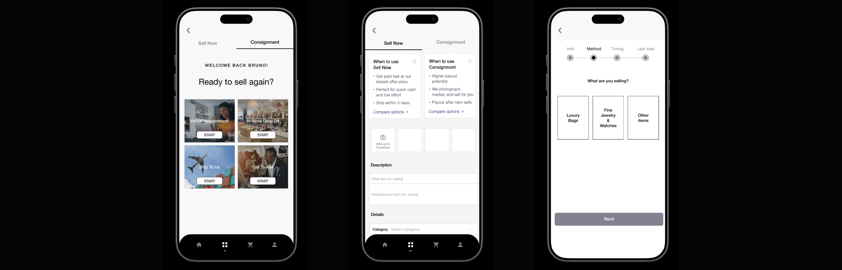
After iteration, the final prototype brings together the validated flows into one cohesive product experience: discovery, resale, authentication, customization, checkout, and post-purchase confidence.

Final product

AltaPort

Retail + resale + customization + authentication in one luxury marketplace system.

Verified resale journey

Transparent checkout

Authentication support

Customization flow

Interactive Final Prototype

Explore AltaPort’s final high-fidelity experience directly inside the case study.

Open in Figma
Outcome Trust-first marketplace

The final product makes authentication, pricing, and seller credibility visible before users have to question them.

Interaction Direction Calm, guided, premium

The prototype avoids overwhelming users and supports high-value decisions with clear steps.

Next Step Expand testing sample

Future testing would validate edge cases, return flows, seller payout clarity, and long-term retention behavior.

Part 6

Key Takeaways

What this project taught me about designing complex systems.

AltaPort was not just a shopping app concept. It became a system design exercise about balancing multiple user groups, building trust into high-value decisions, and turning a complex marketplace vision into clear, testable product flows.

01
02
03
04
05
06
Design principle Structure before features
01

Complexity needs hierarchy.

A large product concept becomes easier to understand when every section has a clear role, entry point, and user goal.

02

Trust is a design material.

For luxury resale, trust is not only a backend feature. It needs to appear through labels, states, proof, pricing, and confirmation moments.

03

Testing makes priorities visible.

Usability testing helped me see which details actually affected confidence, instead of only judging the interface visually.

Final thought

AltaPort helped me grow from designing screens to designing a connected product ecosystem.

The biggest takeaway from this project is that good product design is not about adding more features. It is about making the right decisions visible at the right time, so users can move through a complex experience with confidence.