Challenge and result
AltaPort set out to bridge a major gap in the fashion market—bringing retail, resale, customization, and authentication into one seamless platform. The challenge lay in merging these diverse services into an intuitive, mobile-first experience that could cater to both luxury shoppers and independent sellers worldwide.
From discovering emerging designers to authenticating secondhand treasures and personalizing items, AltaPort delivers a trusted, versatile ecosystem for the modern fashion consumer. What follows are the results of this design transformation.
Integrated fashion ecosystem
I transformed AltaPort from a simple marketplace concept into a multifaceted platform that unites retail, resale, customization, and authentication—streamlining the fashion commerce experience for buyers and sellers worldwide.
Trust and authenticity focus
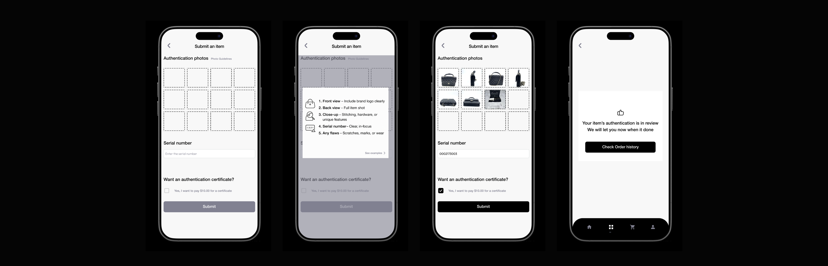
By embedding a robust authentication center, AltaPort reduces counterfeit risk and strengthens buyer confidence, ensuring that every product—whether new, vintage, or customized—is verified and trustworthy.
User-centered global reach
Through an intuitive, mobile-first UX design and inclusive features, AltaPort makes global fashion more accessible, connecting emerging designers, certified boutiques, and resale sellers to a diverse, worldwide audience.
Background
AltaPort is a mobile-first fashion marketplace that brings together retail, resale, customization, and authentication into one seamless platform. Users can:
- Discover and shop international designer brands and emerging boutiques
- Resell or consign pre-owned luxury items
- Customize products with personal designs or modifications
- Verify authenticity through trusted authentication services
Methodologies
- Competitor Analysis
- User Interviews
- Affinity Mapping
- Persona Development
Project Goal
Most competitors like Farfetch, SSENSE, and The RealReal offer luxury or resale shopping but lack a unified, user-centered experience. AltaPort combines both in one platform with verified listings, personalized curation, and transparent shipping. Its AI-driven tools and rewards system enhance trust, convenience, and engagement beyond what current platforms provide.
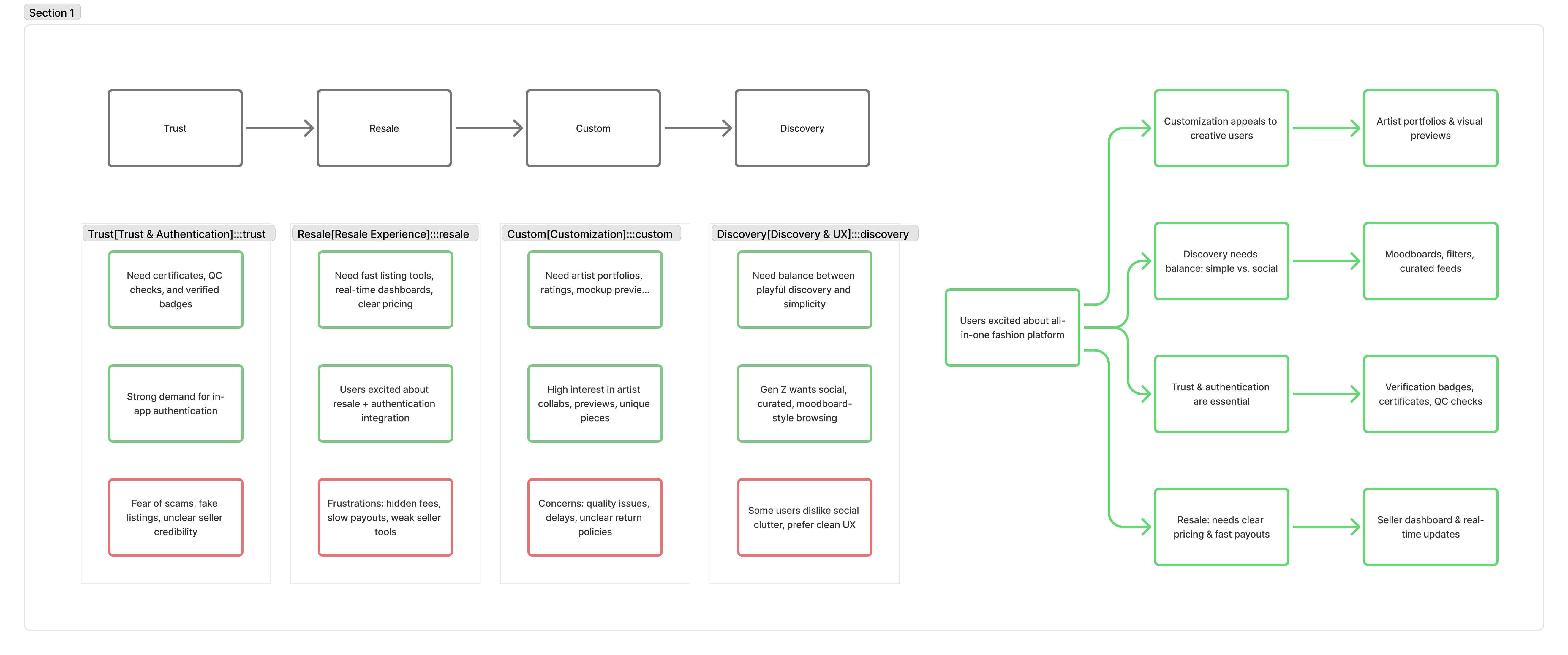
Click to check in FigmaTo synthesize insights from the interviews, I created an affinity map to uncover shared patterns in user needs, frustrations, and motivations. Six key themes emerged: trust and authenticity, usability, fashion inspiration, social features, pricing transparency, and sustainability. Across all groups, users wanted verified products, clear pricing, smoother navigation, and more personalized discovery. Many also valued eco-conscious shopping and community-driven style inspiration. Overall, the analysis showed that users want a seamless, trustworthy, and creatively inspiring shopping experience.
 Click to check in Figma
Interview Details
User interviews revealed strong interest in AltaPort’s all-in-one approach to luxury fashion by combining resale, new designer items, customization, and authentication. Participants loved the idea of trustworthy resale and creative personalization, but consistently highlighted concerns around authenticity, pricing transparency, seller credibility, and quality control for custom pieces. While Gen Z users wanted social discovery, moodboards, and curated feeds, others preferred clean, simple navigation without clutter. Overall, users saw clear value in AltaPort’s concept, but emphasized that trust, transparency, and a smooth, well-balanced experience are essential for adoption.
Click to check in FigmaPersona Development
Jessie is 26 and works as a stylist in LA. She’s been selling secondhand fashion online for a while, but she’s tired of scammy buyers, unclear fees, and platforms that put buyers first. What she really wants is a seller-friendly app she can trust
.- What she’s looking for: A clear way to track payouts, a simple dashboard that saves her time, and a platform that backs up sellers.
- Frustrations: Current apps feel clunky, don’t verify resale items, and often make her feel ignored as a seller.
- Vibe: Efficient, detail-oriented, independent.
- Fav brands: Amazon, Apple, Snapchat.
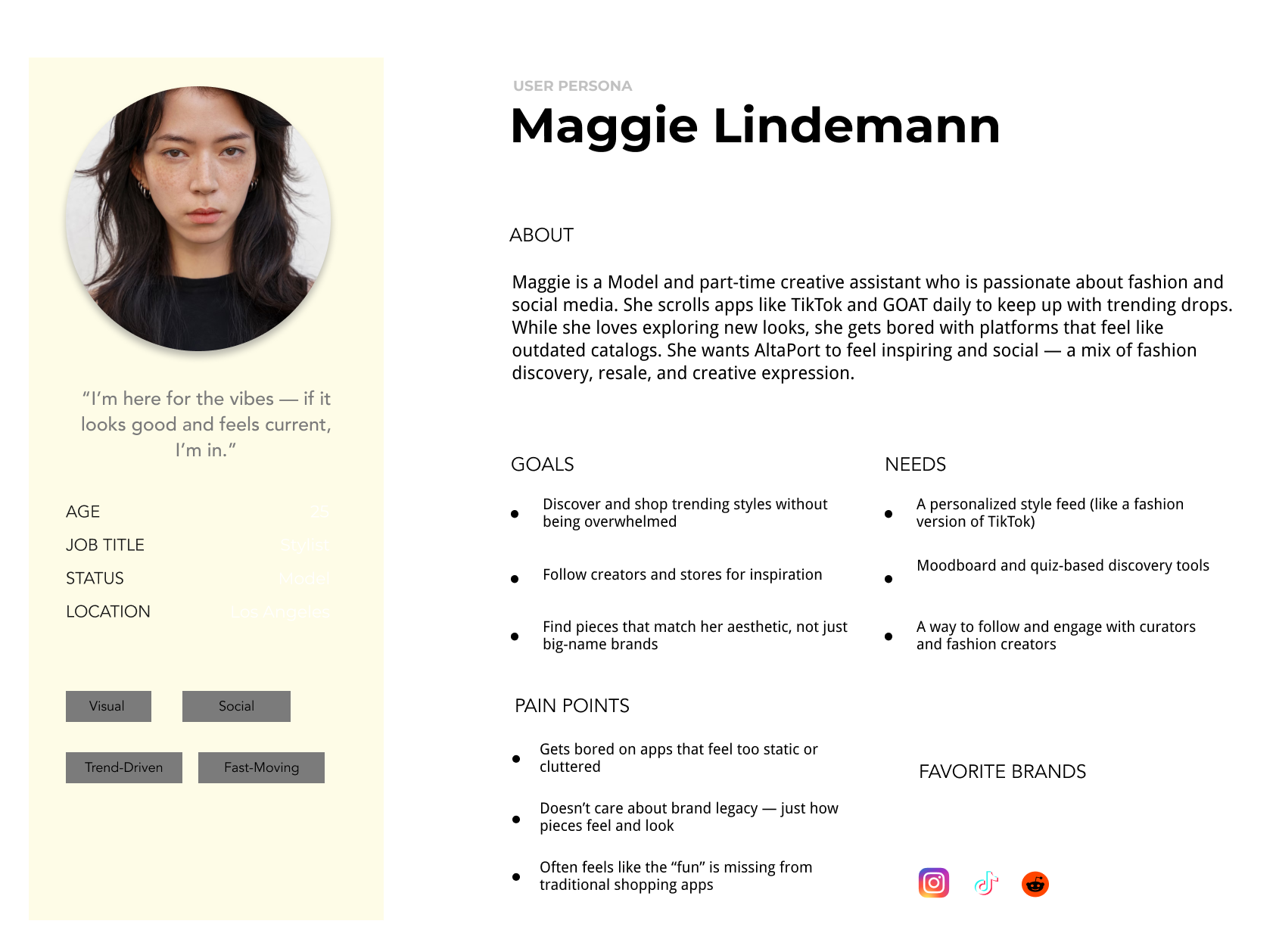
Maggie is 25, a model and creative assistant in LA. She’s into fashion and spends a lot of time on TikTok and GOAT. She loves discovering new styles and creators, but gets bored with apps that feel outdated or cluttered. For her, shopping should be fun and inspiring.
- What she’s looking for: A personalized feed that feels like a fashion version of TikTok, tools like moodboards and quizzes to explore her style, and ways to follow and engage with creators.
-Frustrations: She doesn’t care about big brand names or history — just how clothes look and feel. Traditional shopping apps feel static and miss the “fun.”
- Vibe: Social, trend-driven, fast-moving
.- Fav brands: Instagram, TikTok, Reddit.
Prioritisation
• Project Goals
After completing the research phase, I narrowed down the key needs for AltaPort based on both user and business insights. The shared goals were summarized into three main points:
- Build trust through verified authentication, transparent pricing, and reputable sellers.
- Create a seamless experience that connects luxury retail and resale with personalized curation.
- Increase engagement by encouraging repeat users, loyalty rewards, and community interaction.
Click to check in FigmaFeatures Roadmap
Sitemap
The sitemap organizes AltaPort into five core flows—Shop, Customize, Sell, Authentication, and Account—ensuring both buyers and sellers can easily navigate between retail, resale, customization, and trust-building features.
User Flows
The user flows map out key journeys across resale, international shopping, authentication, and customization, ensuring a seamless experience for both buyers and sellers.
I’ve immediately identified my Four user flows:•
- Seller List items in Resale marketplace•
- International Marketplace “buy now”
- User Flow• Authentication Service User Flow•
- Customize Product User Flow
Click to check in FigmaWireframes
I started by designing the key screens for AltaPort: the Homepage, Product Listing, Product Detail, Sell/Consign page, User Profile, and Shopping Cart & Checkout flow. Each screen was mapped to reflect the essential steps users take when browsing, buying, or reselling luxury items.
Low-fidelity wireframes helped me explore layout hierarchy, navigation patterns, and the overall user flow between retail and resale experiences. This stage also allowed me to focus on structure and usability—testing how users might discover products, verify authenticity, and complete purchases seamlessly before moving into visual design.
Brand Identity
For AltaPort’s brand identity, I explored different directions before defining a system that reflects trust, creativity, and global connection—aligning with the platform’s mission to merge retail, resale, customization, and authentication into one cohesive experience.
First of all, I’ve explored potential naming solutions and marks for my logo. Eventually, I’ve decided to go for the "AltaPort", blends two meaningful ideas that reflect the brand’s vision. “Alta” comes from the Latin root for “high” or “elevated,” symbolizing premium quality, elevated taste, and a more curated shopping experience. “Port”evokes a global hub — a place where people and goods from around the world connect, arrive, and exchange. Together, AltaPort suggests a high-end, globally connected platform where fashion flows in — from rare vintage finds and international designer drops to one-of-a-kind custom pieces.
UI Library Components
I’ve created a colour palette . The choice for typography has fallen on Helvetica NeueWith those elements added to my low fidelity wireframes, I made my way into high-fidelity wireframes.
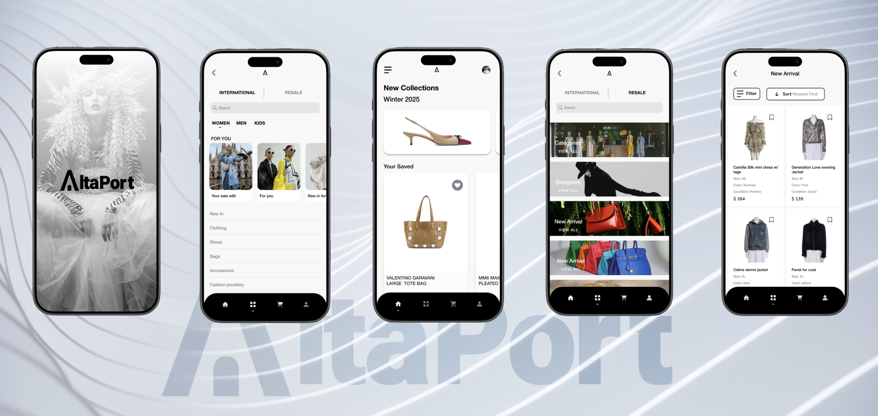
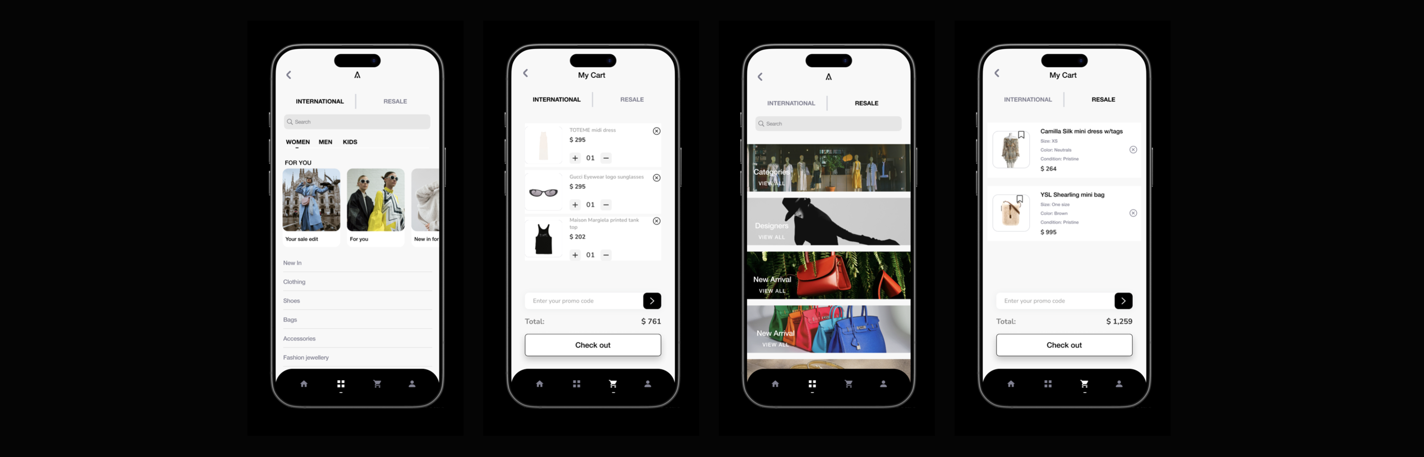
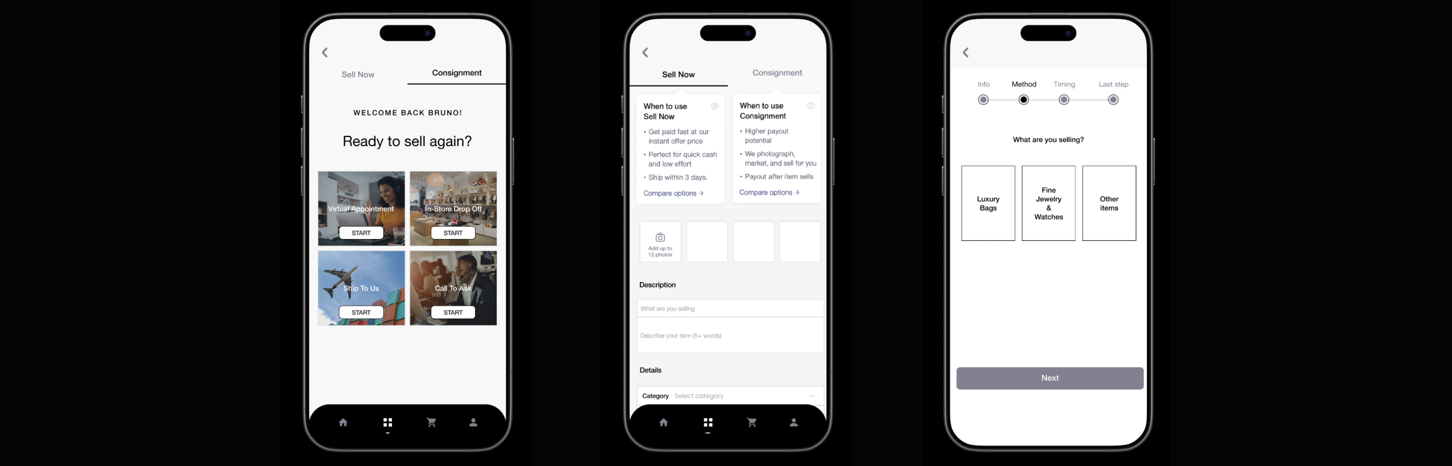
High-fidelity key-screens
Click to check in FigmaPrototype
I built most of the prototype using components and variants, which made the process pretty straightforward.
To keep things clean and consistent, I stuck with a simple transition effect across most screens. The only exceptions were the Intro and Get Started screens, where I added a bouncier transition to signal that something new was kicking off. I also included a loading animation to make the overall experience feel more realistic.
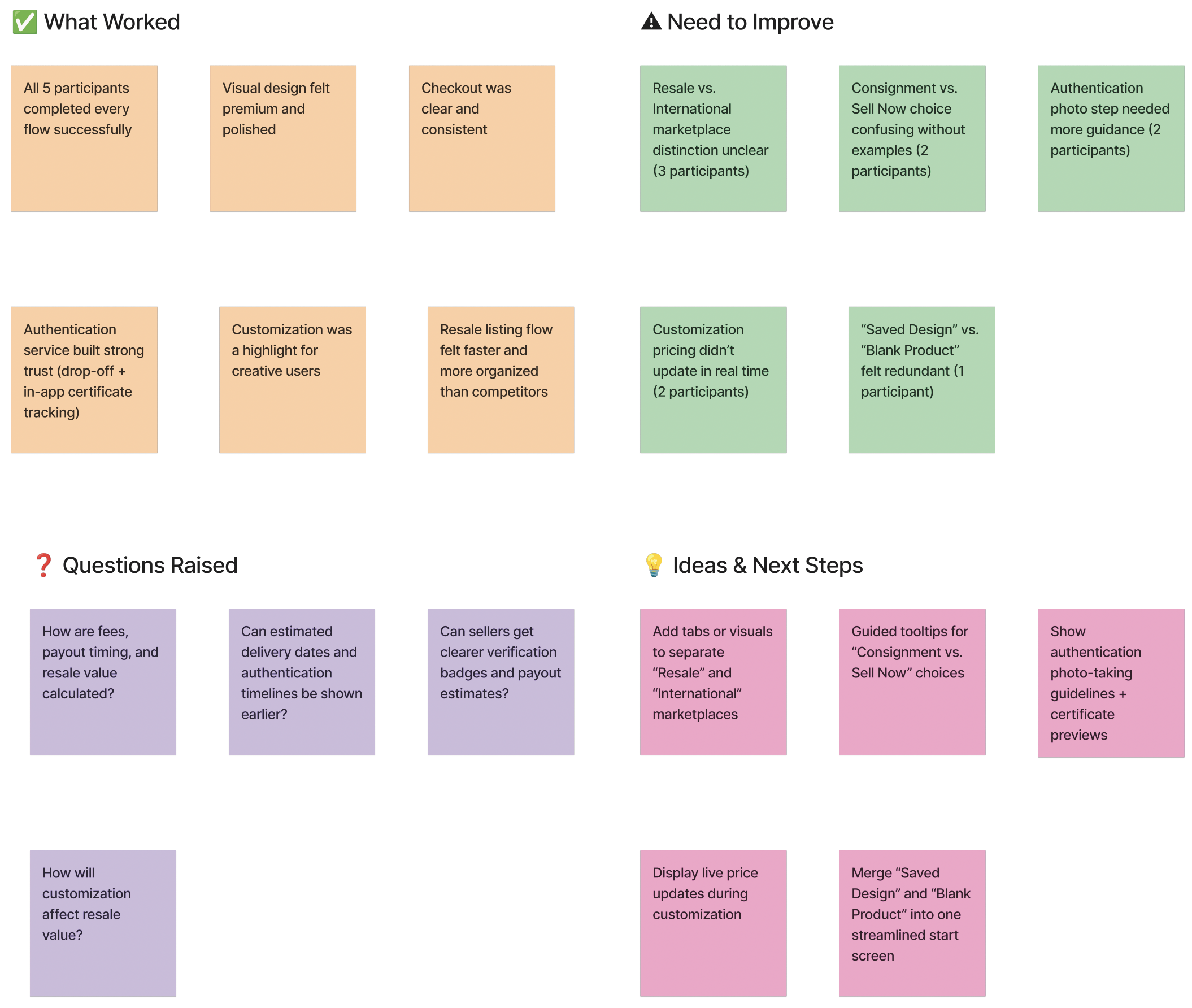
Outcome
Overall, usability test was quite satisfying. The general flow proved to be viable. I made a few fixes that aimed at facilitating the flow even more.
Iterations
- Add visual/tab distinction between “Resale” and “International” marketplaces.
- Include guided tooltips for “Consignment vs Sell Now” during listing.
- Show live pricing changes in customization based on options.
• Challenge
- Balancing different marketplace functions (retail, resale, customization, and authentication) within one seamless platform
- Building user trust, especially around authenticity and international sellers
- Prioritizing features for MVP without losing the value of the full ecosystem vision
- Designing flows that work for both buyers and sellers while keeping navigation intuitive
• Lesson learned
- Balancing different marketplace functions (retail, resale, customization, and authentication) within one seamless platform
- Building user trust, especially around authenticity and international sellers
- Prioritizing features for MVP without losing the value of the full ecosystem vision
- Designing flows that work for both buyers and sellers while keeping navigation intuitive
- A clear and consistent design system speeds up prototyping and keeps the user experience coherent across diverse features
- Small design decisions (e.g., clear distinctions between resale vs. international markets) can strongly impact usability and trust
- Guided interactions (like tooltips or onboarding) help users understand complex processes such as consignment or authentication
- Simplifying complex flows into approachable steps improves both usability and adoption
.png)