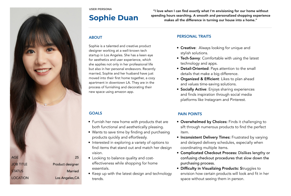
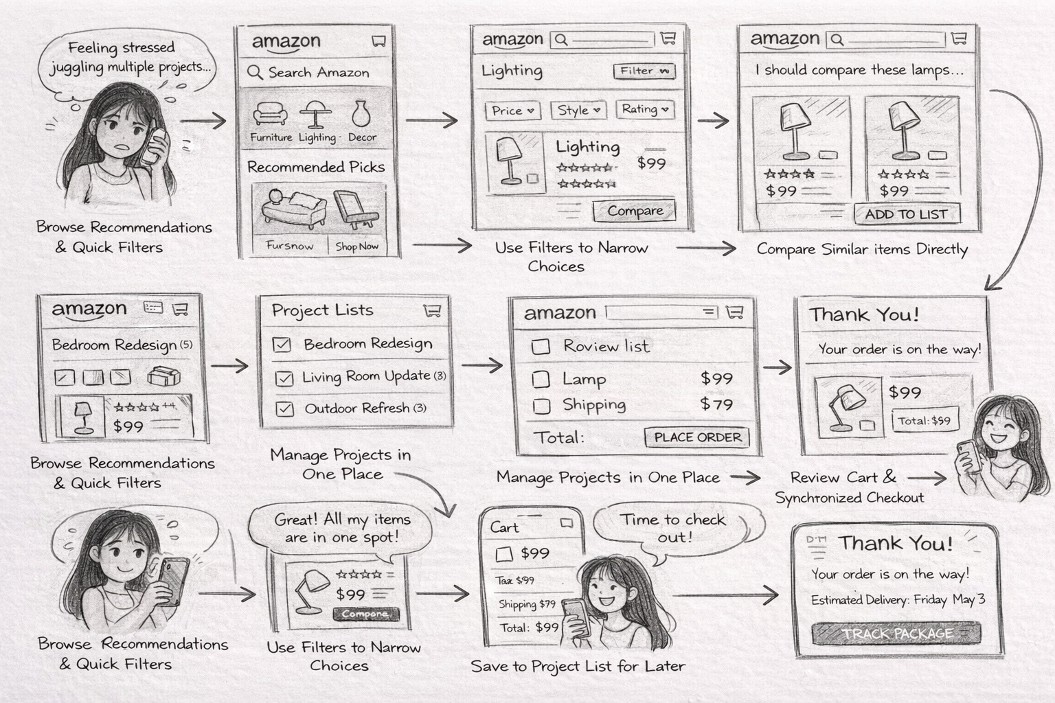
Persona 01
Sophie Duan
“I love when I can find exactly what I’m envisioning for our home without spending hours searching.”
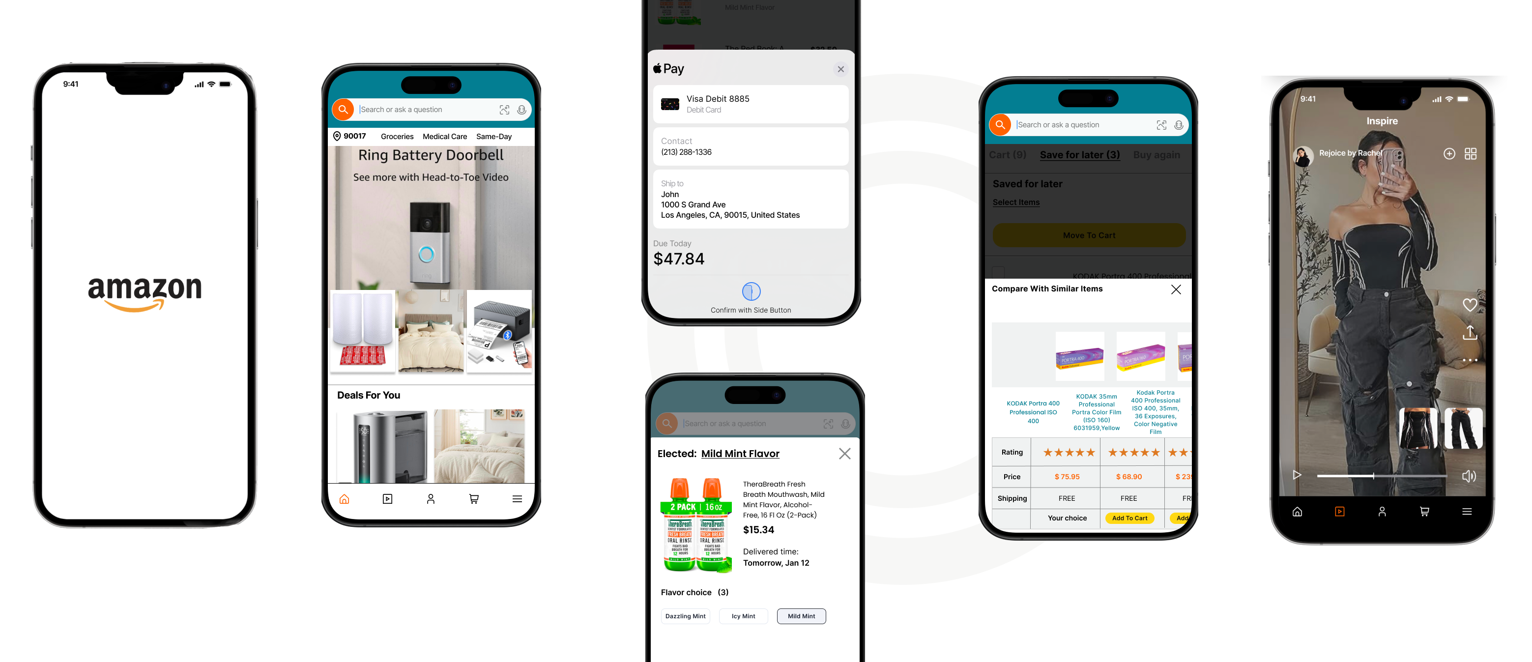
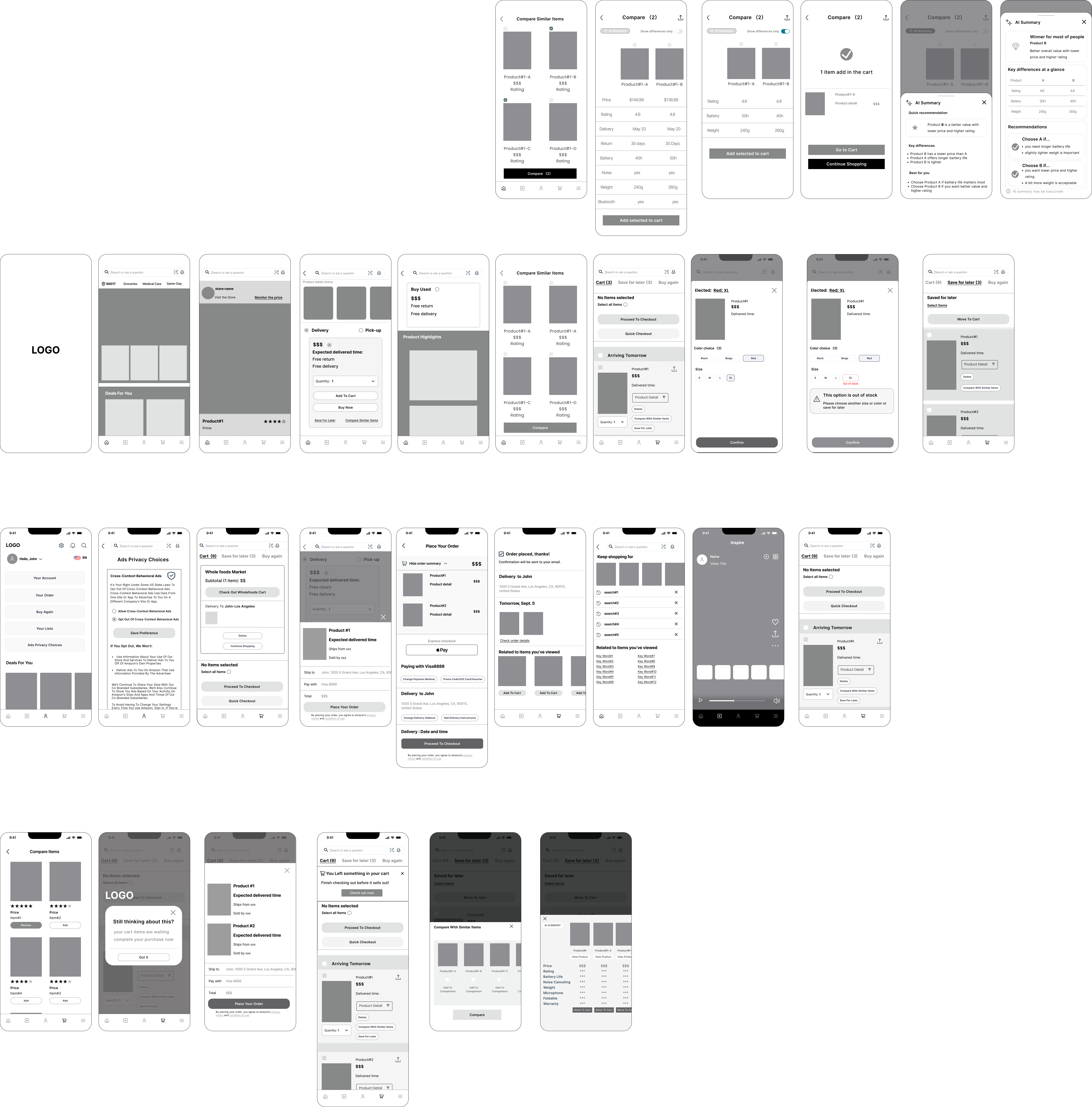
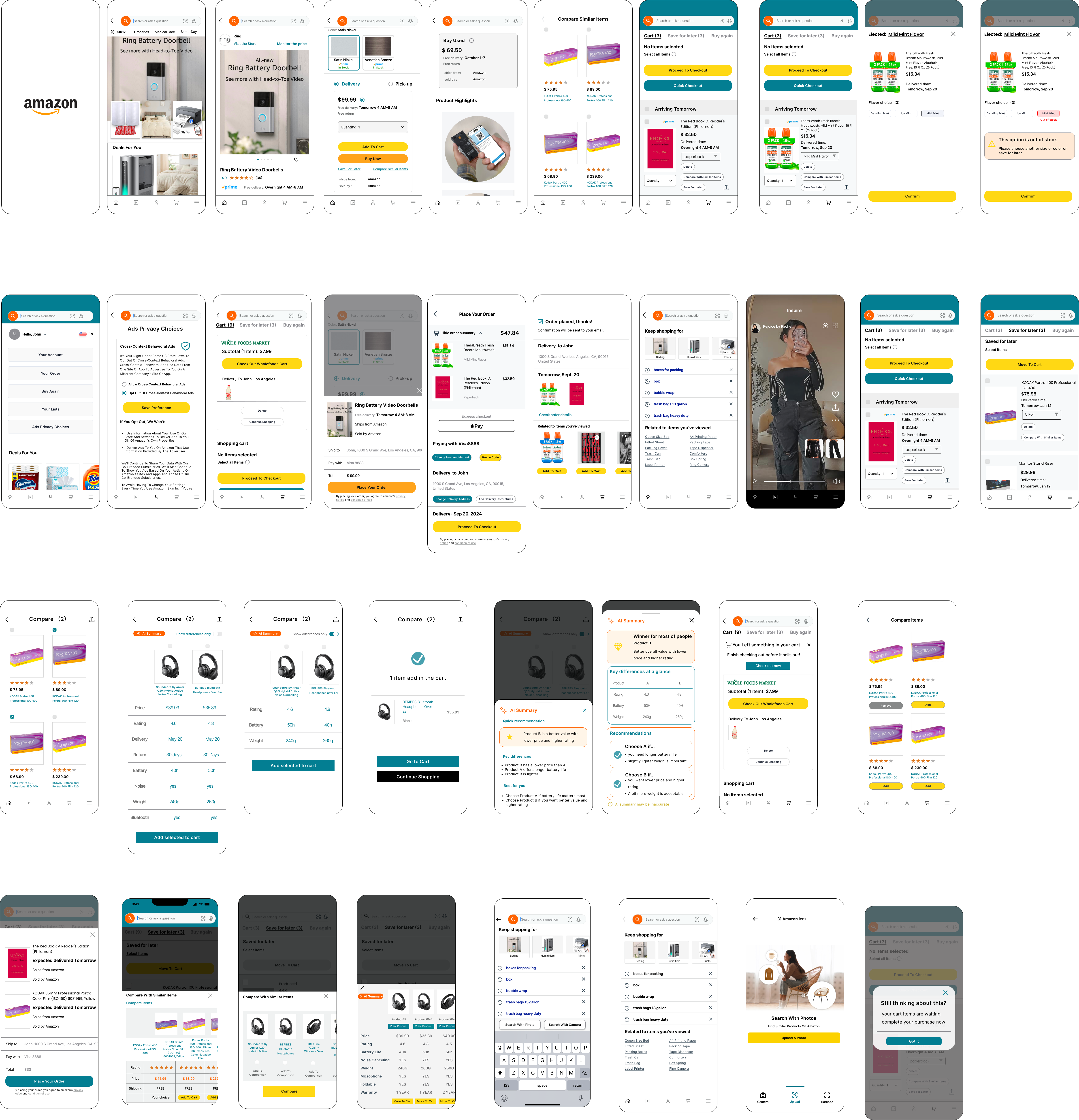
Goals
- Find products that match her style quickly.
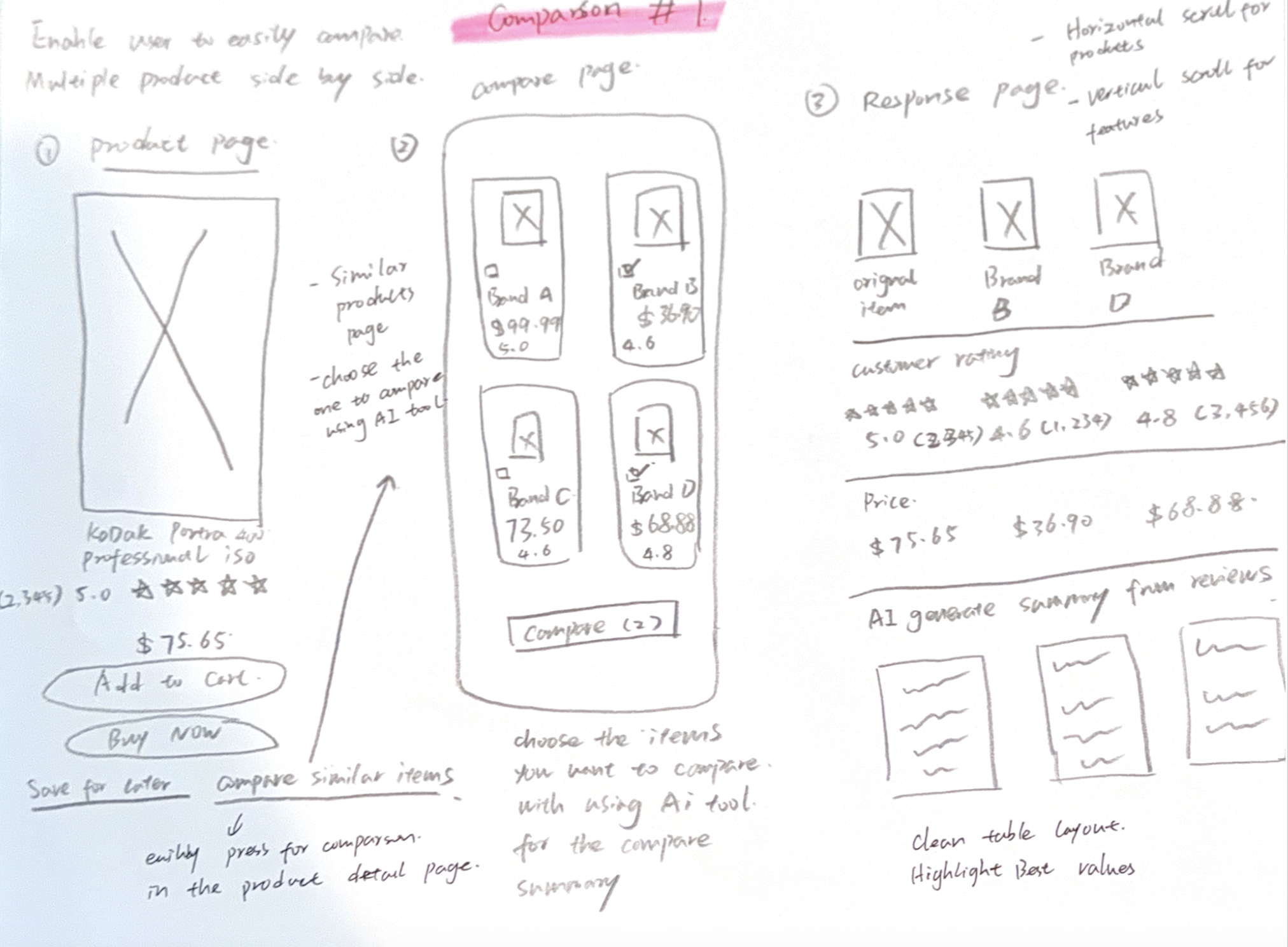
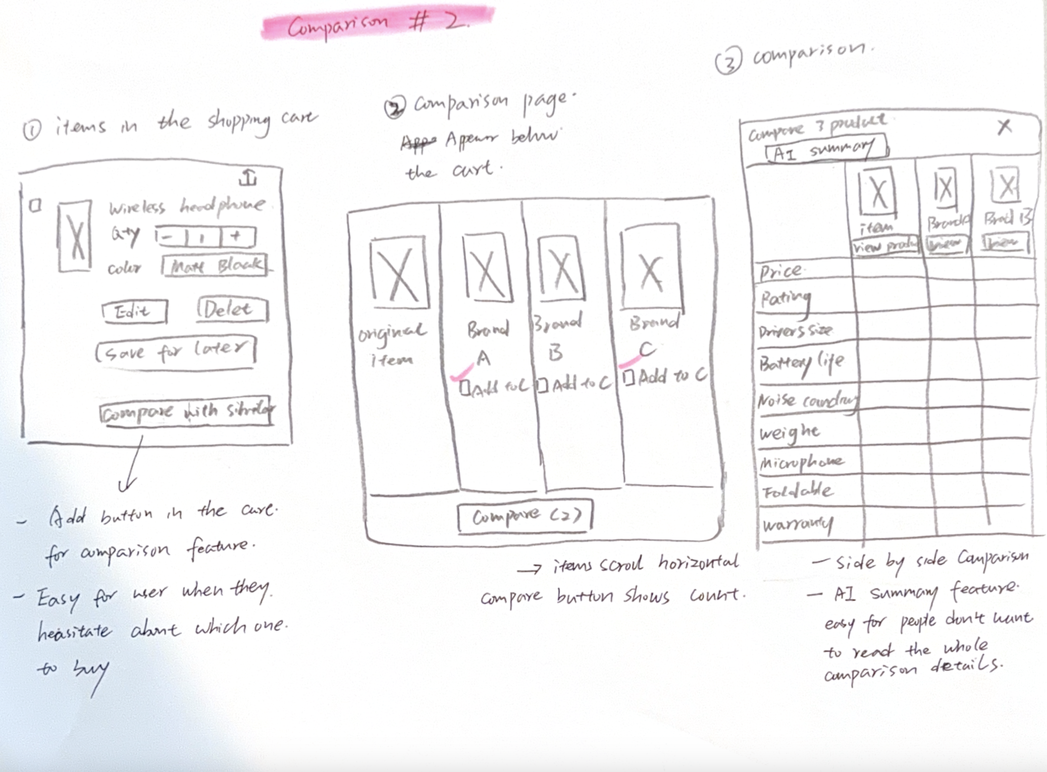
- Compare similar items with less effort.
- Feel confident before purchasing.
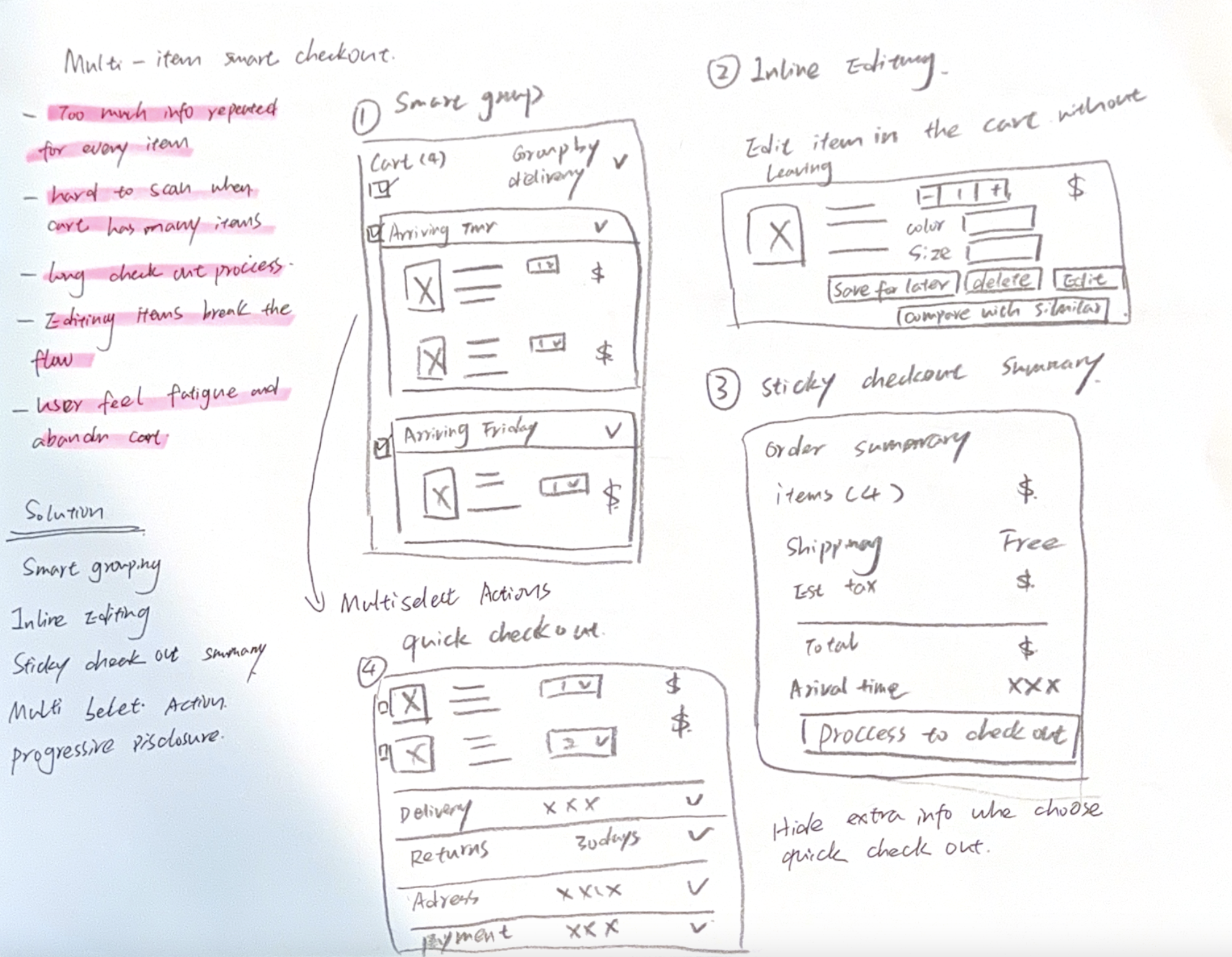
Pain Points
- Overwhelmed by too many product options.
- Hard to compare details across pages.
- Unclear delivery or product information.

.png)