Challenge and results
The main challenge was simplifying Amazon’s complex interface without removing its rich functionality. With countless categories, promotions, and features, users often felt overwhelmed and struggled to navigate or complete purchases smoothly. The goal was to balance clarity and depth—making the experience intuitive while maintaining the app’s powerful capabilities.Through refined navigation, improved search relevance, and a streamlined checkout flow, the redesign made shopping faster and more effortless. Usability testing showed users completing tasks more easily, feeling less frustrated, and expressing greater satisfaction with the overall experience.
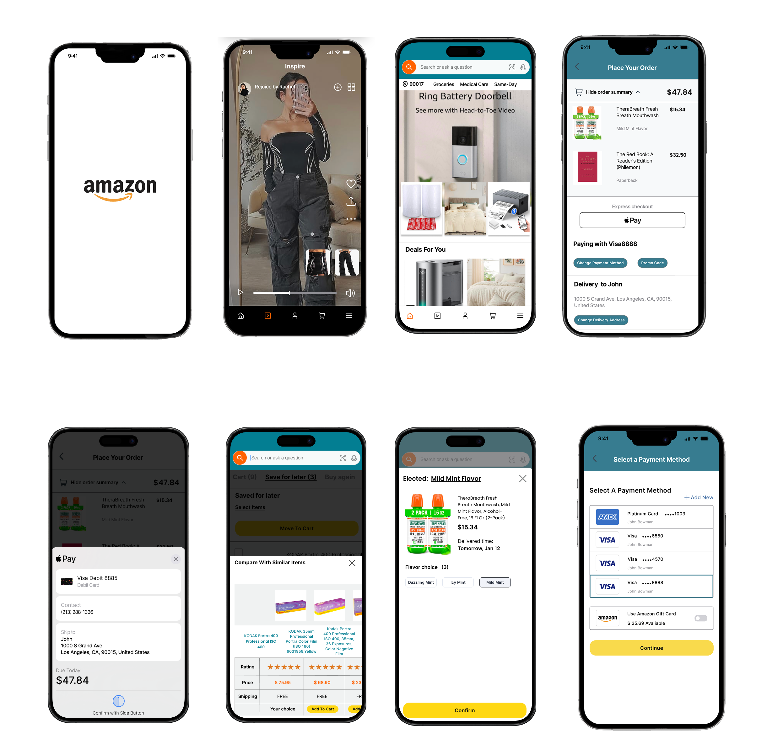
Simplified Shopping Experience
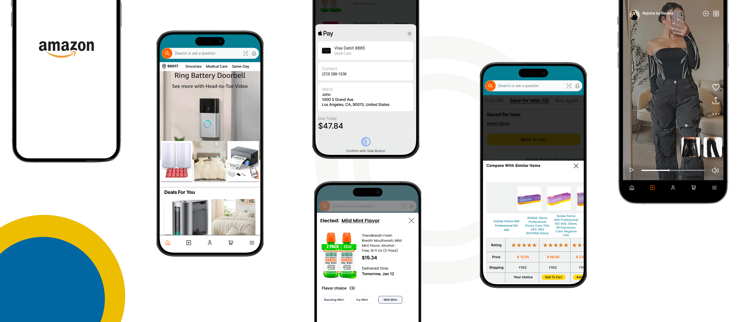
I redesigned the Amazon app’s shopping flow to make product discovery and checkout faster and more intuitive. By simplifying navigation and reducing cognitive load, users can now browse, compare, and purchase items with fewer steps and less friction.
Smarter Search & Discovery
Through improved search accuracy and personalized recommendations, users can quickly find relevant products that match their needs. Highlighting key factors like price, reviews, and delivery time enhances decision-making and confidence during the shopping process.
Seamless & Trustworthy Checkout
I streamlined the checkout experience with clearer information, real-time updates, and simplified payment steps. This not only reduces confusion—especially when handling multiple items—but also increases user trust and overall satisfaction with every purchase.
Background
As one of the largest e-commerce platforms in the world, Amazon’s app plays a crucial role in shaping how millions of users shop online. While its extensive features and product range offer convenience, they also create challenges in usability and clarity. Many users report feeling overwhelmed by dense information, complex category structures, and occasional friction during checkout.This project was developed to address these issues by rethinking the app’s user experience—focusing on simplification, intuitive navigation, and a smoother shopping flow to enhance both efficiency and satisfaction.
Methodologies
- Competitor Analysis
- User Interviews & Surveys
- Usability Testing
- Heuristic Evaluation
Project Goal
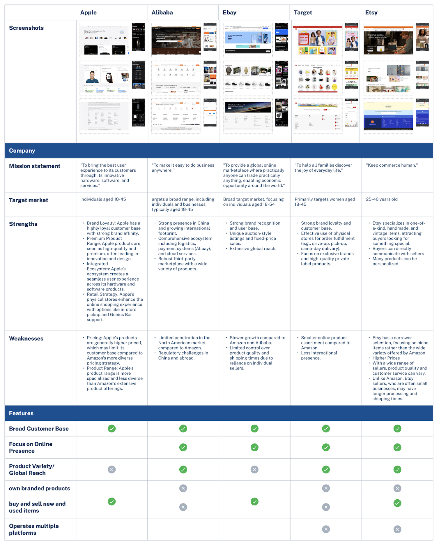
The analysis compared Amazon with Apple, Alibaba, eBay, Target, and Etsy to identify UX opportunities. While Apple excels in design, Alibaba in global reach, eBay in resale, Target in omnichannel retail, and Etsy in personalization, common weaknesses include quality control and slower delivery. Insights highlight Amazon’s strengths in scale and efficiency, with room to grow in personalization, brand identity, and emotional connection.
Click to check in FigmaAffinity Mapping
From the affinity mapping, I grouped user insights into six main areas: navigation, decision-making, cart management, checkout experience, transparency, and pain points. I noticed that most users love Amazon’s convenience but still get frustrated when switching between product pages, managing their cart, or checking out multiple items. They also want clearer information, more control over delivery options, and a smoother, more personalized shopping flow. These findings helped me focus my redesign on simplifying navigation, improving the cart experience, and making checkout feel faster and more intuitive.
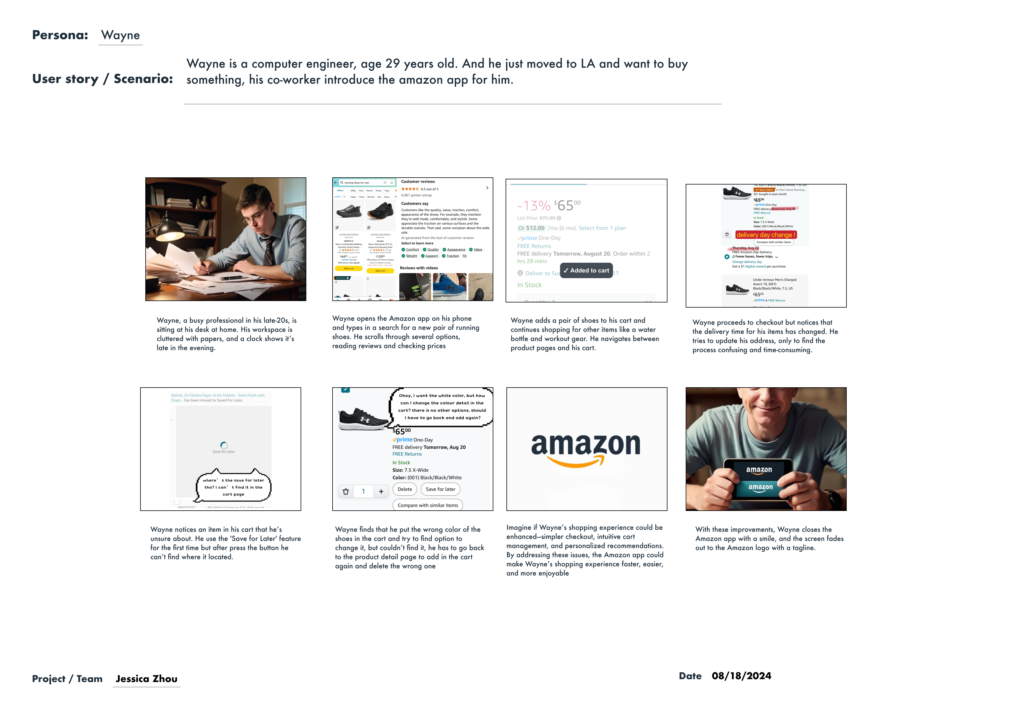
Storyboard
Persona Development
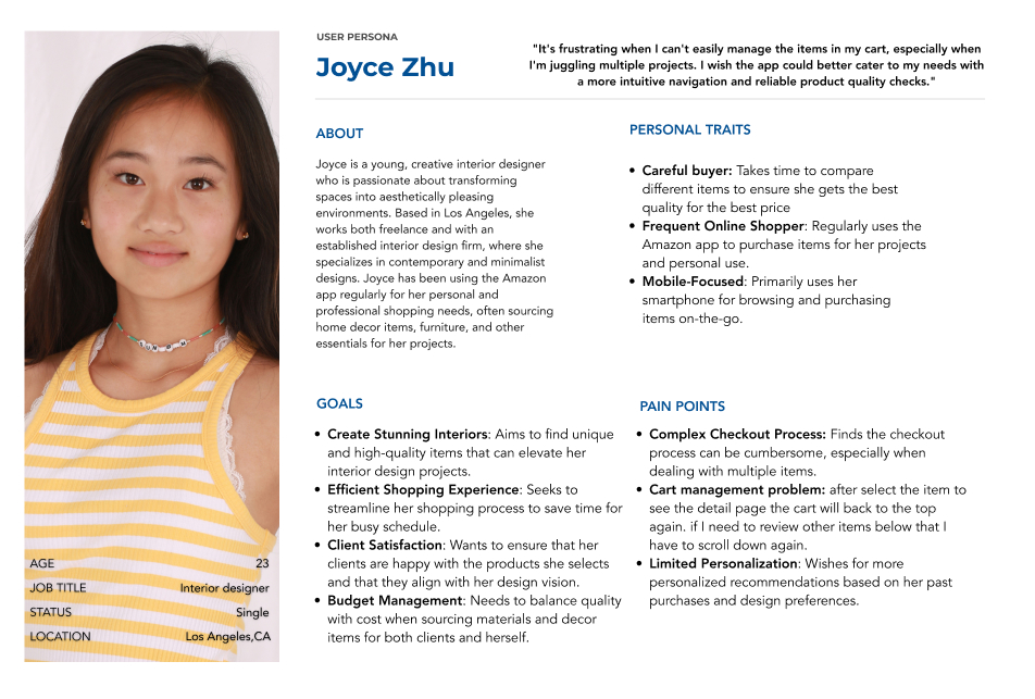
Joyce Zhu, a 23-year-old interior designer, values efficiency and high-quality products for her design projects. She often shops on her phone and looks for ways to streamline her shopping process. Her main pain points include a complex checkout process, cart management issues, and limited personalization.
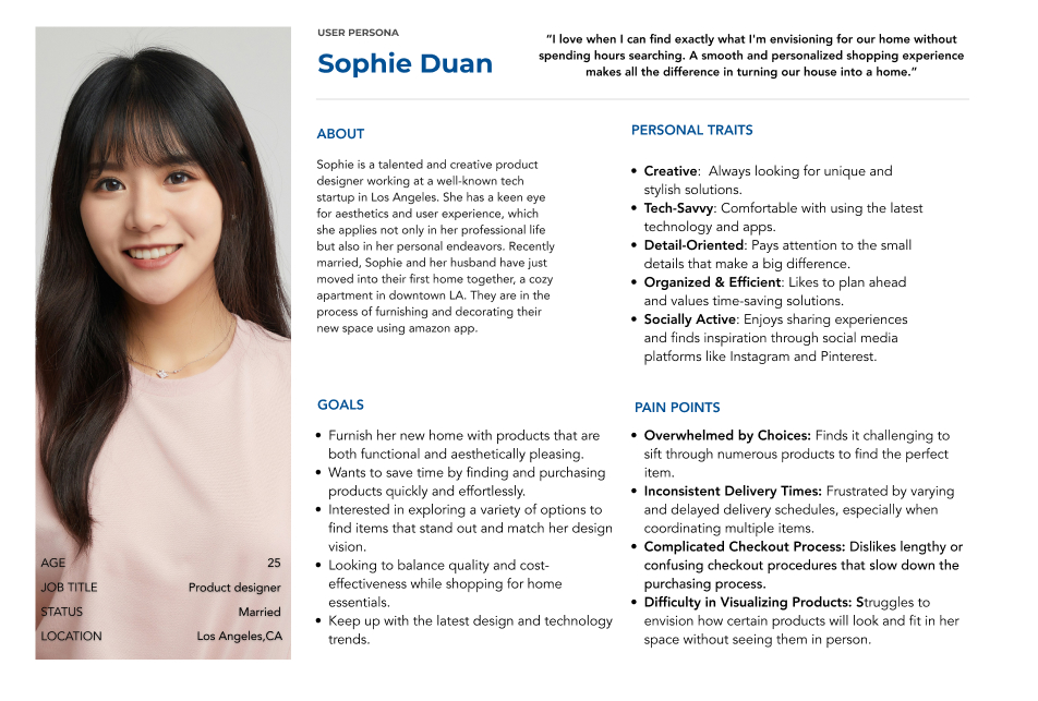
Sophie Duan, a 25-year-old product designer, prioritizes aesthetics, organization, and time efficiency. She enjoys browsing for stylish and functional home products but feels overwhelmed by too many choices, experiences inconsistent delivery times, and dislikes complicated checkout flows.
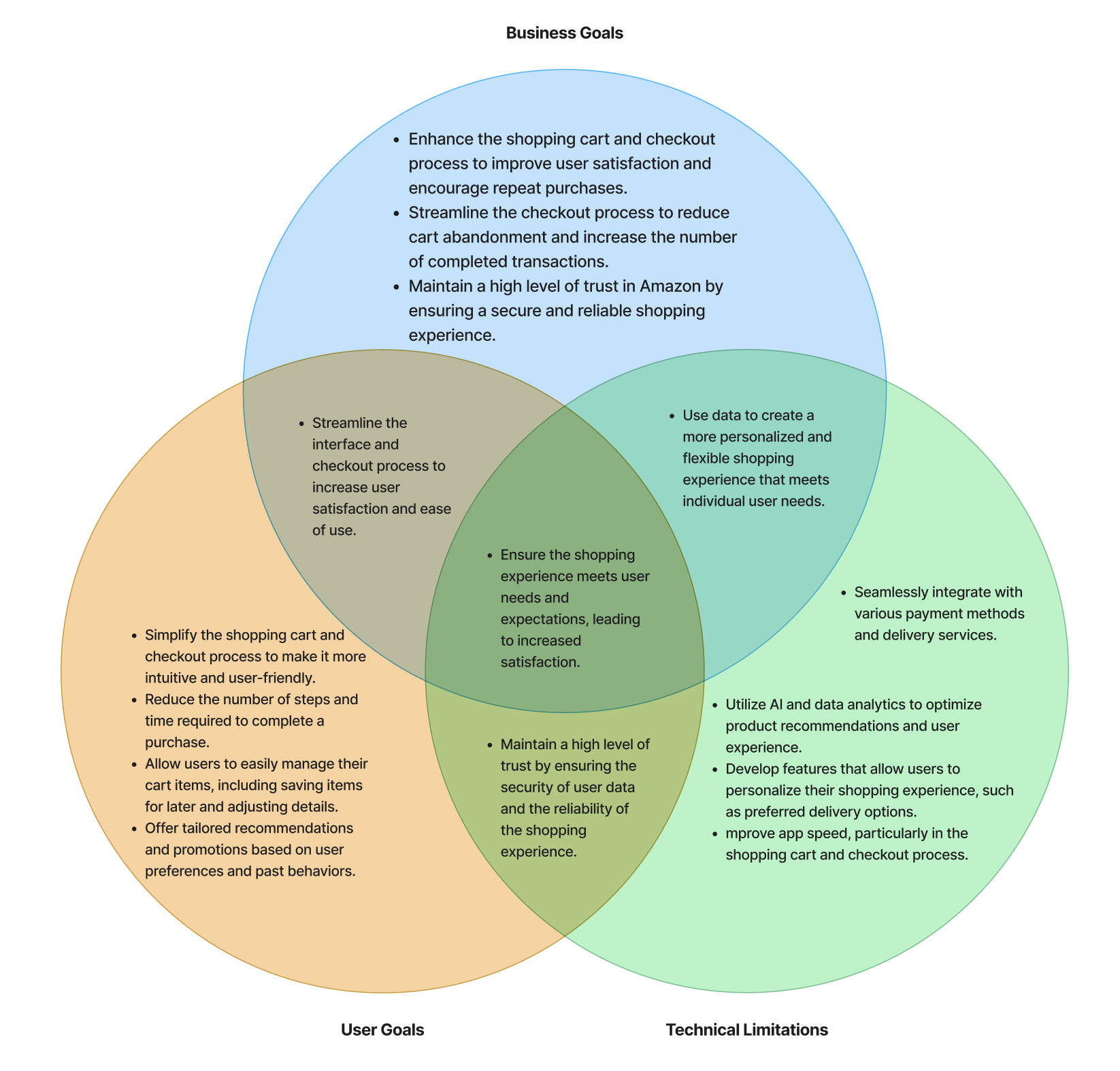
Prioritisation
The diagram illustrates how business, user, and technical goals align to enhance Amazon’s shopping and checkout experience. By focusing on a streamlined, personalized, and trustworthy journey, the project aims to boost satisfaction, reduce cart abandonment, and strengthen trust. Through AI, data analytics, and secure payment integration, the design ensures a fast, reliable, and user-centered experience that balances functionality and efficiency.
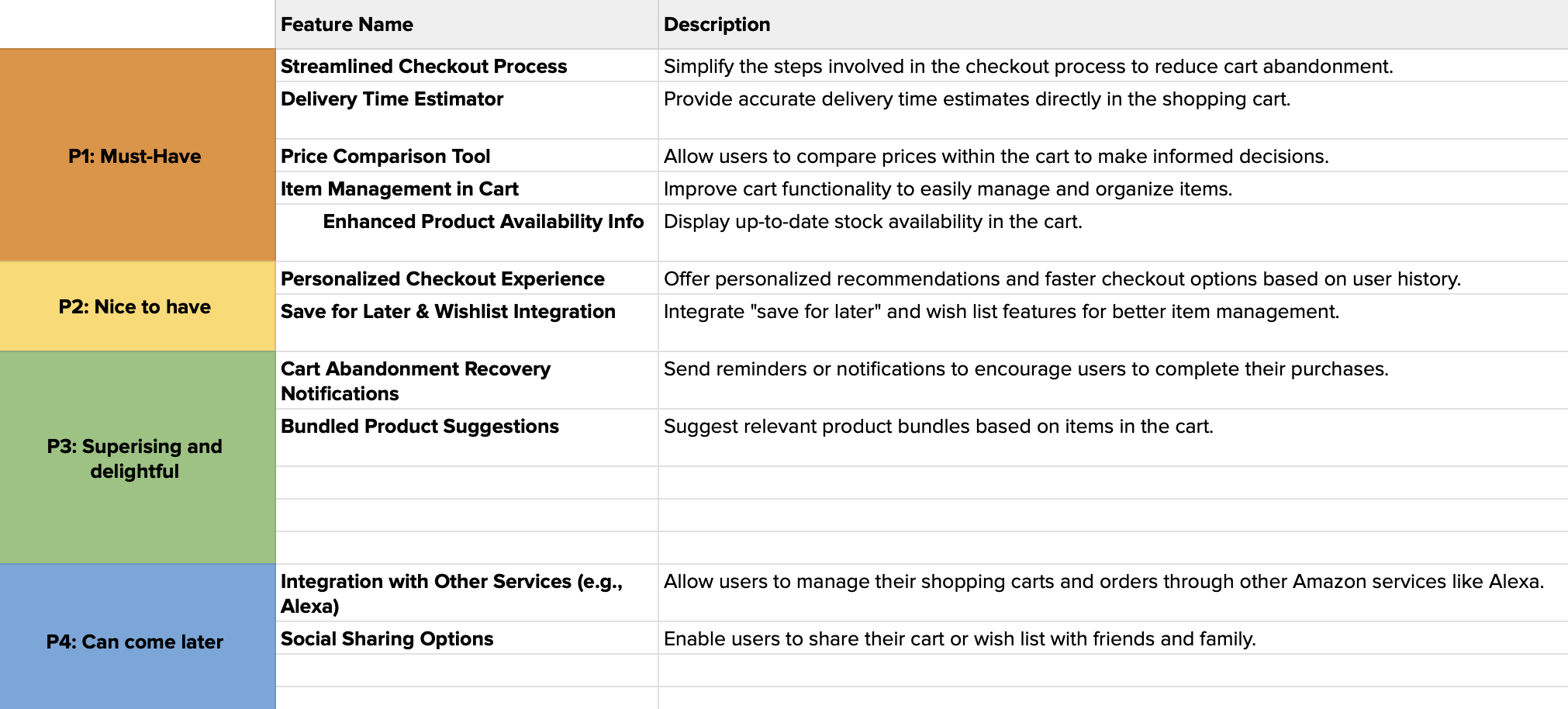
Click to check in FigmaFeatures Roadmap
To refine the Amazon app’s shopping and checkout experience, features were prioritized based on user needs and business impact.
Sitemap
The sitemap outlines the Amazon app’s core structure, showing how users navigate seamlessly from homepage to product pages, shopping cart, and checkout—highlighting improved organization, clearer hierarchy, and a more intuitive flow for efficient shopping.
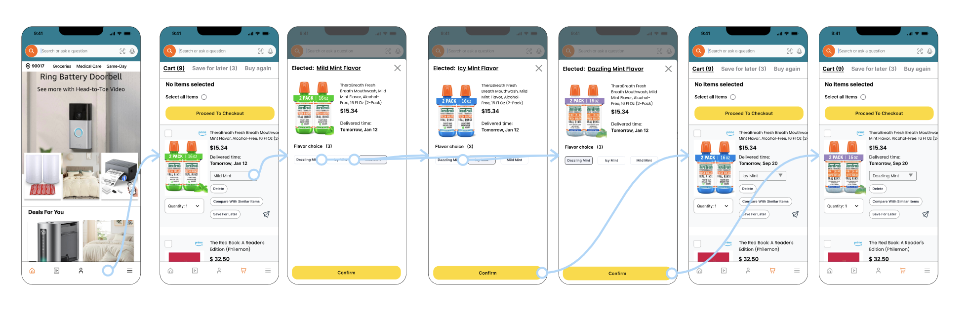
User Flows
The user flows visualize how shoppers navigate through key actions within the Amazon app—comparing items, editing products in the cart, and receiving checkout notifications. Each flow focuses on reducing friction and guiding users toward faster, more confident purchase decisions.
- The comparison flow streamlines how users review similar items before checkout, minimizing back-and-forth navigation.
- The cart modification flow allows users to easily adjust item details, such as size or quantity, directly within the cart.
- The notification flow re-engages users who abandon their carts by sending reminders and simplifying their return to checkout.
Click to check in FigmaWireframes
The low-fidelity wireframes focus on visualizing the core user flow from product discovery to checkout, emphasizing clarity, simplicity, and ease of navigation. These early sketches helped map out key features such as product comparison, cart management, delivery selection, and order confirmation, allowing quick testing of layout and interaction patterns before moving into high-fidelity design. The goal was to ensure that every step—from browsing items to completing a purchase—feels intuitive, efficient, and consistent with Amazon’s user-centered experience.
Click to check in FigmaPrototype
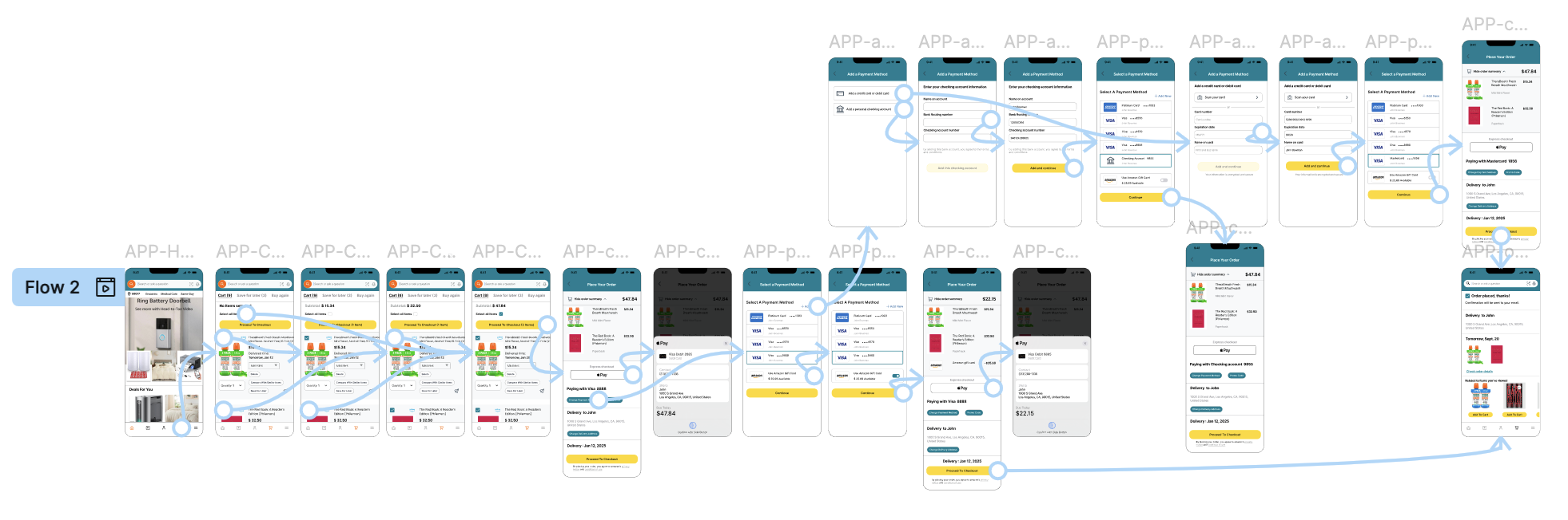
Prototype
I developed a high-fidelity interactive prototype in Figma to simulate a realistic shopping experience within the Amazon app. The prototype connects multiple user flows — from editing product details in the cart to checking out and comparing saved items — ensuring seamless navigation between tasks. I applied Smart Animate transitions to create natural movement between screens, particularly for dropdown interactions and checkout progressions, while keeping fixed elements like the bottom navigation bar consistent. Minor loading effects and transition delays were also added to mimic real-app responsiveness, making the usability testing process more immersive and lifelike.
Outcome
Overall, usability test was quite satisfying. The general flow proved to be viable. I made a few fixes that aimed at facilitating the flow even more.
Iterations
🛒 1. Cart Editing Flow
Before:
- Product detail dropdown worked but lacked clear hierarchy and visual consistency.
- Limited edit options; users mentioned confusion when modifying quantities or variants.
After (Iteration):
- Dropdown menus are visually refined with clearer spacing and stronger contrast.
- Confirmation button now more prominent and consistent across screens.
- Price and quantity update feedback improved for real-time clarity.
💳 2. Checkout Flow
Before:
- Only Apple Pay option available.
- Missing standard credit card and payment input screens.
- Some buttons misaligned and non-scrollable sections limited interaction realism.
After (Iteration):
- Full checkout process added — now includes shipping address, payment details, and review order steps.
- Multiple payment options introduced (Apple Pay + Credit Card).
- Button visibility and layout fixed; scrollable content enabled for a smoother user flow.
-Added confirmation and order summary pages for completeness.
• Challenge
- Enhancing the shopping cart and checkout experience without disrupting Amazon’s existing ecosystem and visual identity.
- Maintaining consistency and navigation simplicity while introducing new features like customization and comparison.
• Lesson learned
- A consistent and simplified design system can improve clarity and speed up prototyping, especially when working within an existing brand framework.
- Prioritizing usability testing early helps identify small details have a big impact on user confidence.
- Seamlessly integrating new flows into an established platform requires focusing on both functionality and familiarity to keep users engaged and comfortable.
.png)