Layered contours create a sense of height, depth, and upward movement.
Experimental Typeface
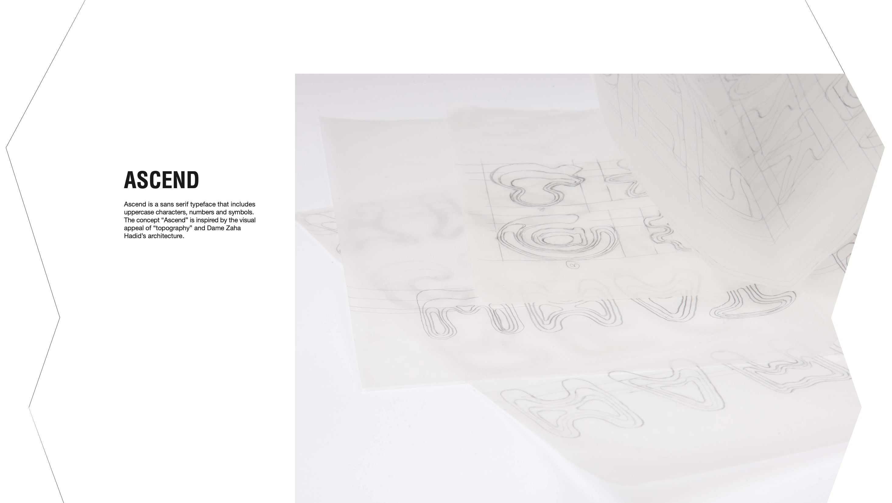
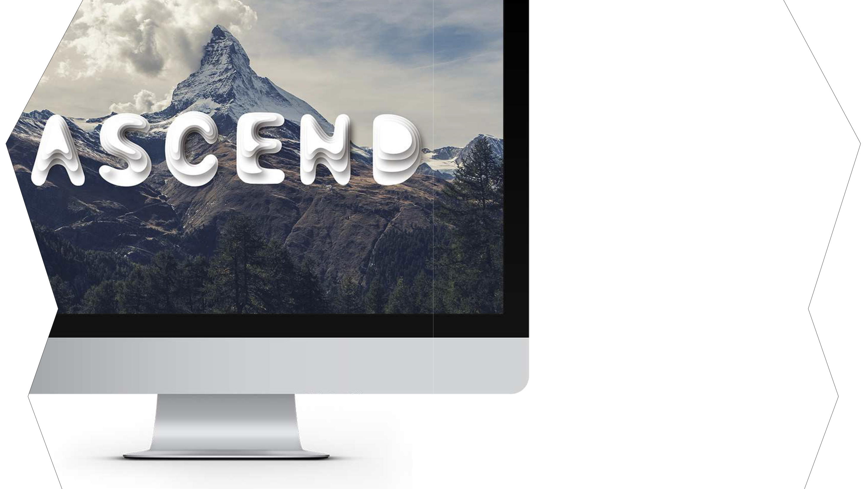
Ascend
A spatial sans-serif typeface built through elevation, layering, and flow.
Type Specimen
Letters as structures
Contour layers create depth, softness, and dimensional rhythm.
01 / Overview
Typography as architecture.
Ascend explores letterforms as spatial objects. Inspired by topographic mapping and architectural elevation, the typeface uses repeated contours to create a visual language of height, movement, and dimensionality.
Letters are treated as architectural forms rather than flat symbols.
Rounded forms soften the system and create a fluid visual rhythm.
02 / Specimen
A type system made to be explored.
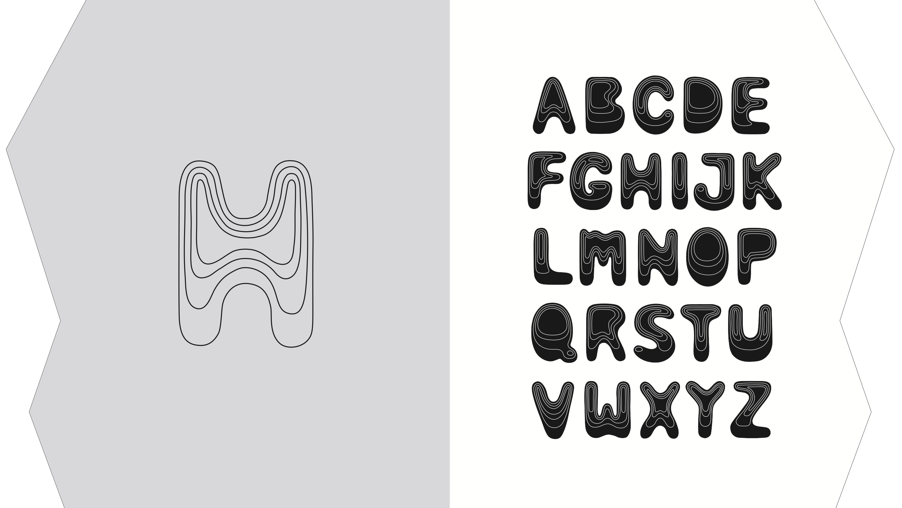
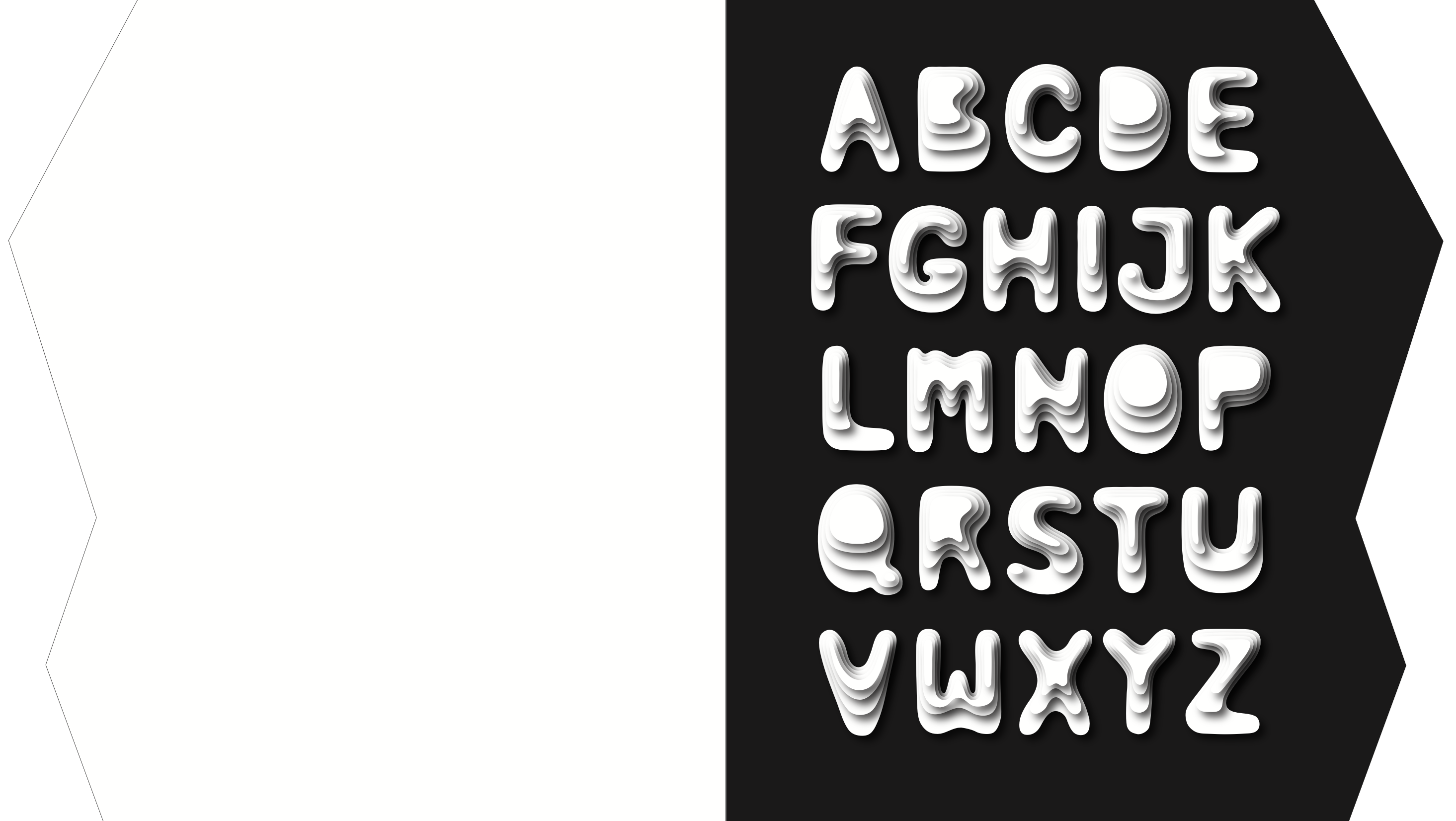
Alphabet
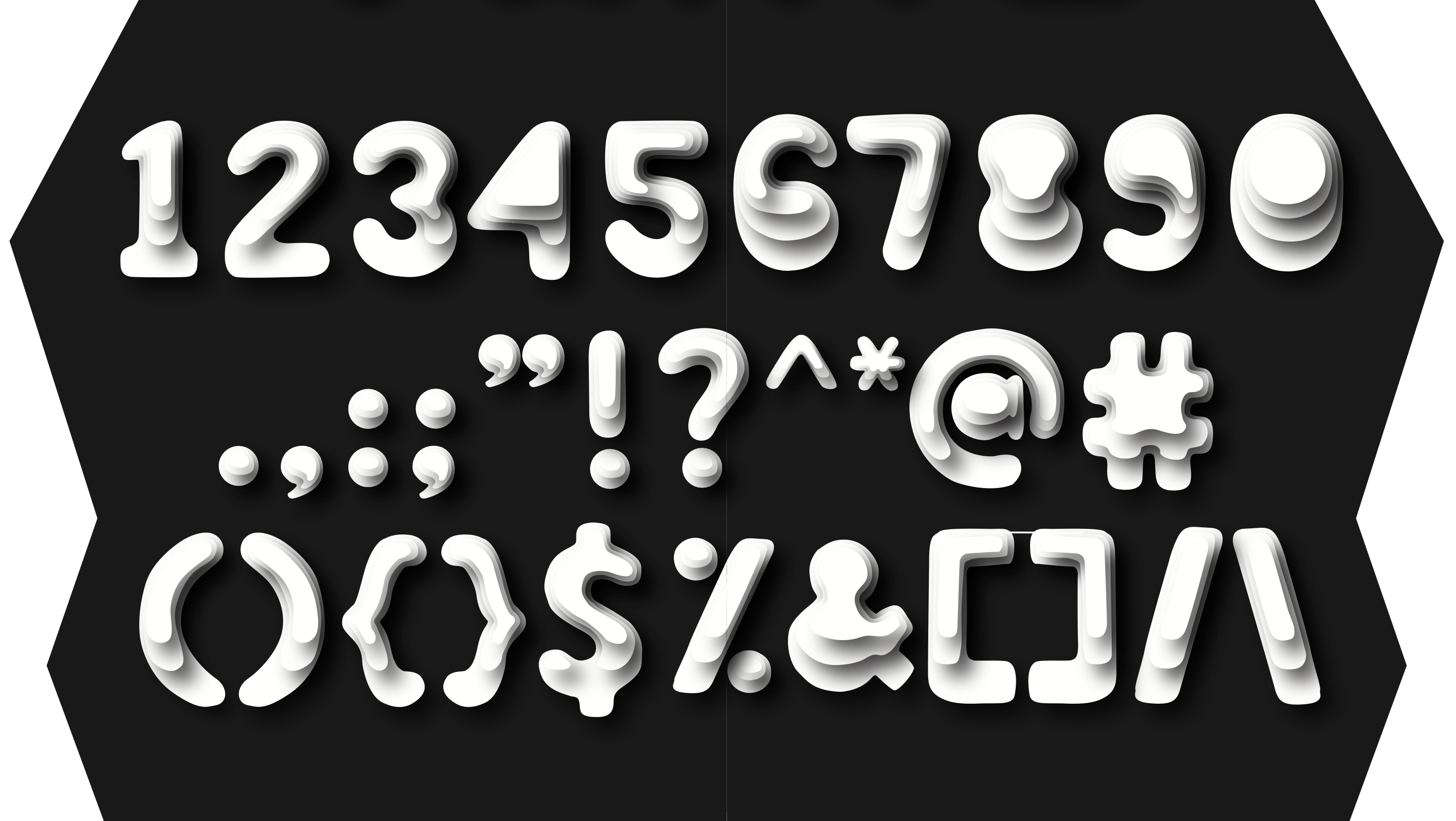
Numbers / Symbols
Process Sketch
03 / Motion
The typeface becomes spatial movement.
Motion Study
Motion extends the contour logic into time, making the typeface feel more dimensional and atmospheric.
Specimen archive
Drag horizontally
Overview
Process
Alphabet
Numbers / Symbols
 Application
04 / Building the Form
From mapping to dimensional type.
Mapping
Topographic maps and architectural elevation became the foundation for the typeface’s layered visual logic.
Layering
Repeated contours build the illusion of volume, turning flat letters into dimensional structures.
Refining
Each form is adjusted to balance softness, mass, contrast, and display readability.
Process Study
The typeface begins as contour exploration, then evolves into a structured display system.
Application
Ascend is designed for display environments — posters, digital compositions, spatial graphics, and visual identity systems.
Final Thought