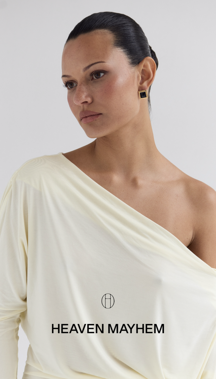
Heaven Mayhem jewelry campaign portrait
Brand Identity · Graphic Design Scroll to explore Los Angeles · 2026

01 · Project Overview

Quiet
impact.

A refined identity system for Heaven Mayhem, balancing the permanence of monochrome with the tension of deep red. The system establishes a precise hierarchy between the primary wordmark, geometric brand stamp, and hand-drawn digital signature—allowing the brand to move from editorial imagery to web without losing recognition.

Discipline Brand Identity
Scope Print + Digital
Final Year 2026

02 · Identity System

A mark with
two moods.

The wordmark is the lead identifier. The circular HM stamp supports it in smaller, detail-driven applications. Neither mark competes for attention; each has a defined role and controlled spacing.

2.1 · Primary Logo

Lead with recognition.

The landscape wordmark is used across primary touchpoints. It may align left, center, or right, but never rotates. A full logo-height of clear space protects it from surrounding content.

Clear space Logo height HEAVEN MAYHEM Primary Wordmark · Clear-space construction
HEAVEN MAYHEM White / Black
HEAVEN MAYHEM Black / Cream
HEAVEN MAYHEM White / Muted Red
2.2 · Brand Icon

The supporting stamp.

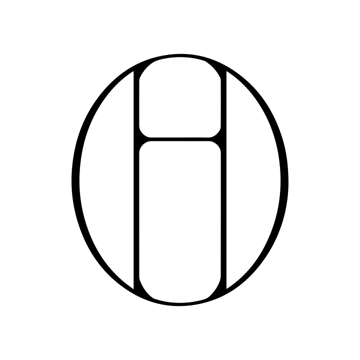
The circular HM is a secondary brand moment for packaging details, garment trims, and quiet digital signatures. It follows the primary logo and should never replace it on corporate or paid brand communication.

Heaven Mayhem geometric brand icon Icon geometry · Circular proportion
HM icon
HEAVEN MAYHEM
Pairing rule · Icon never outweighs wordmark
Approved use
HEAVEN MAYHEM
Never rotate, distort, or fade ×
HEAVEN MAYHEM

03 · Logo in Context

Visible.
Never loud.

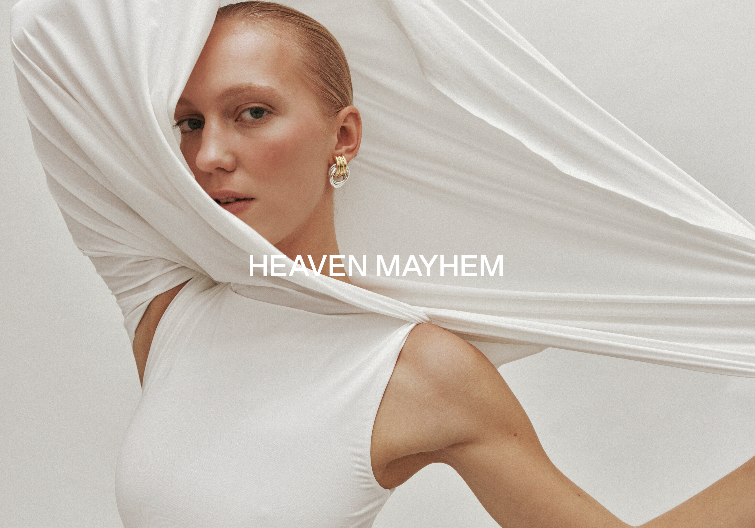
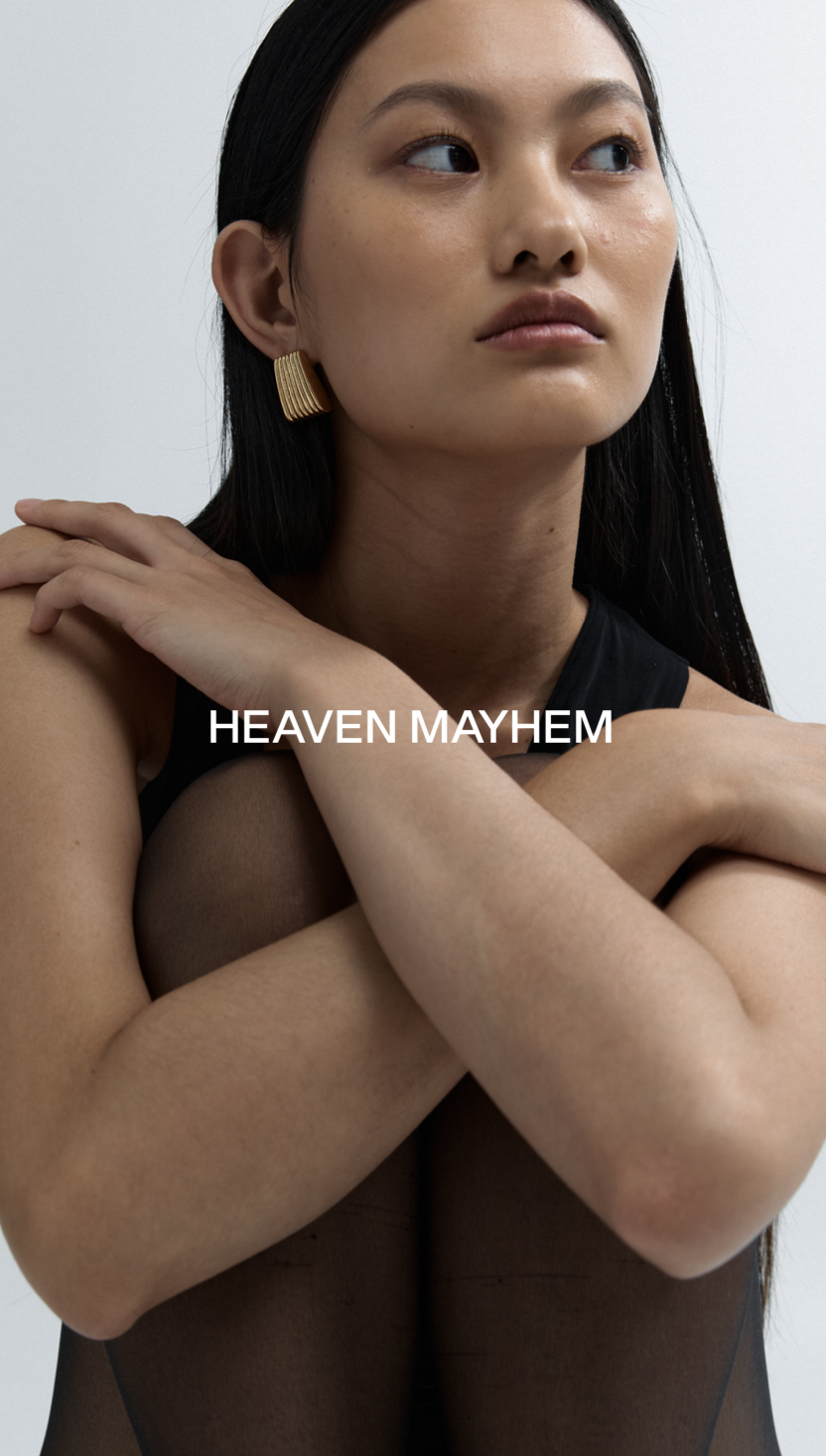
On imagery, the mark occupies a calm area with enough contrast to remain completely legible. Primary wordmark, icon, and paired lockup each appear only where their hierarchy is clear.

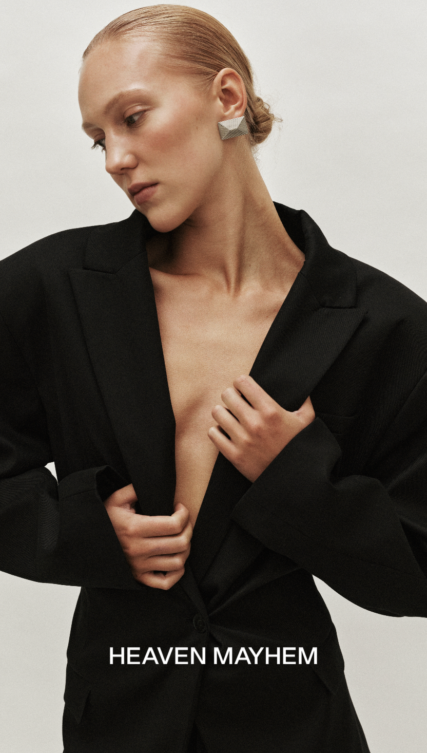
Primary / 01 Primary logo over editorial portrait
Primary / 02 Primary logo over fashion portrait
Primary / 03 Primary logo over monochrome portrait
Icon / 01 Brand icon over accessory image
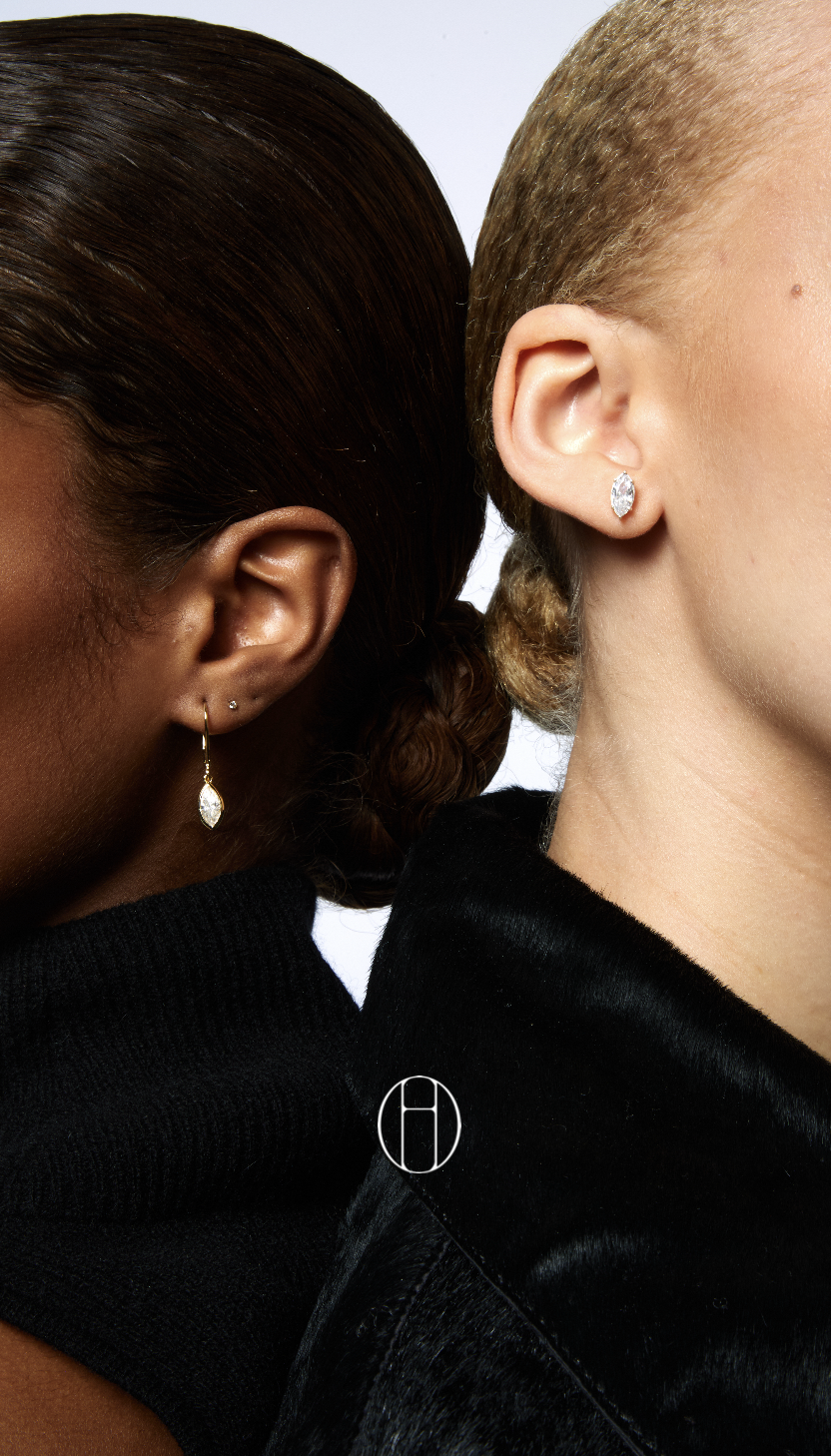
Icon / 02 Brand icon over jewelry detail
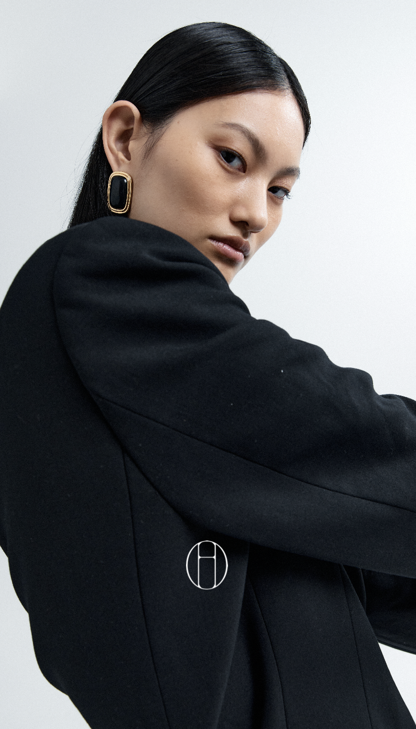
Icon / 03 Brand icon over fashion image
Pairing / 01 Icon and wordmark pairing on portrait
Pairing / 02 Icon and wordmark pairing on cream fashion image
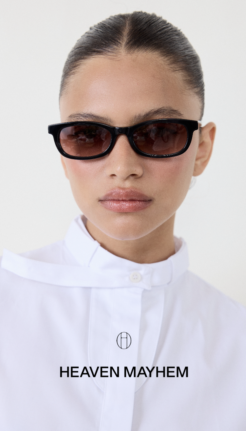
Pairing / 03 Icon and wordmark pairing on editorial portrait

04 · Color System

NEUTRAL / TENSION
Black
HEX#000000 RGB0 · 0 · 0 RolePrimary
White
HEX#FFFFFF RGB255 · 255 · 255 RolePrimary
Stone
HEX#CECAC2 RGB206 · 202 · 194 RoleSecondary
Light Cream
HEX#F2F1ED RGB242 · 241 · 237 RoleSecondary
Beige
HEX#D3CCBC RGB211 · 204 · 188 RoleSecondary
Vanilla
HEX#F5F3E9 RGB245 · 243 · 233 RoleSecondary
Muted Red
HEX#73272D RGB115 · 39 · 45 RoleAccent
Deep Red
HEX#3A0708 RGB58 · 7 · 8 RoleDepth

Black and white maintain clarity and permanence across primary brand communication.

Cream and stone soften the system. Deep red is deliberately limited, creating tension without overtaking the neutral foundation.

05 · Typography System

Editorial
clarity.

A disciplined sans-serif system carries functional communication. Caslon appears sparingly in product names and editorial callouts, introducing contrast without becoming decorative noise.

Futura LT Pro Medium

Primary font
Headers · CTA
Weight 500

ABCDEFGHIJKLMNOPQRSTUVWXYZ

abcdefghijklmnopqrstuvwxyz · 0123456789 · !@#$%^&*()

Futura LT Pro Light

Secondary font
Subheads · Body
Weight 300

ABCDEFGHIJKLMNOPQRSTUVWXYZ

abcdefghijklmnopqrstuvwxyz · 0123456789 · !@#$%^&*()

Neue Haas Grotesk 65

Digital bold
Website · Ads
Weight 600

ABCDEFGHIJKLMNOPQRSTUVWXYZ

abcdefghijklmnopqrstuvwxyz · 0123456789 · !@#$%^&*()

Caslon #450

Accent font
Product names
Regular only

ABCDEFGHIJKLMNOPQRSTUVWXYZ

abcdefghijklmnopqrstuvwxyz · 0123456789 · !@#$%^&*()

Display / Caslon
Objects of desire.
Heading / Futura
Designed for daily ritual
Body / Light
An identity built around clarity, restraint, and modern elegance—leaving space for the product and image to remain the focus.

07 · SMS Campaign

A direct
brand moment.

A mobile-first SMS advertising template that carries the ring launch into a faster, more personal channel. The composition keeps the message concise while preserving Heaven Mayhem’s editorial restraint and product-led visual hierarchy.

Interactive SMS prototype

The interactive prototype demonstrates how the campaign translates into a concise mobile communication while retaining the same visual rhythm as the broader launch.

Open Prototype

08 · Digital Application

The small
signature.

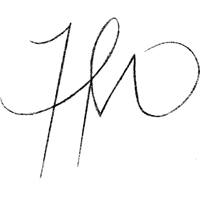
The hand-drawn HM belongs to subtle digital moments such as the website footer. It never replaces the primary logo; it works because the core identity has already been established elsewhere on the page.

heavenmayhem.com / collection
Shop HEAVEN MAYHEM Bag · 0

New Objects · 2026

Designed to be
worn and lived in.

Hand-drawn HM icon in black
Hand-drawn HM icon in white

Heaven Mayhem · Brand Identity

Made to be
remembered.

Explore more work
Jessica Zhou Graphic & Visual Design 2026