Medovik + Leaf
A folk-inspired bakery identity built around handmade pastries, cream paper textures, and warm café details.
A cozy bakery identity with a folk-inspired visual system.
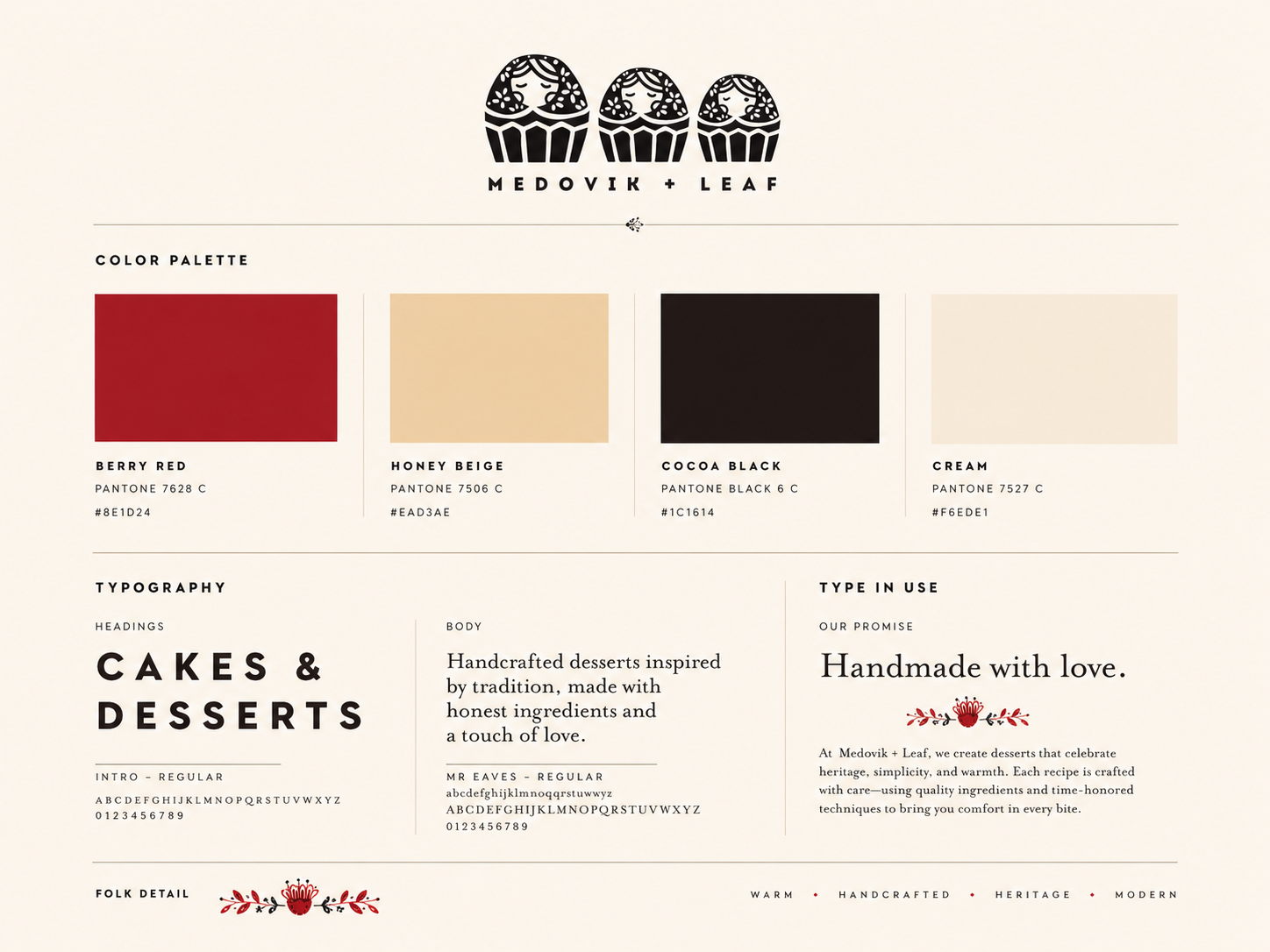
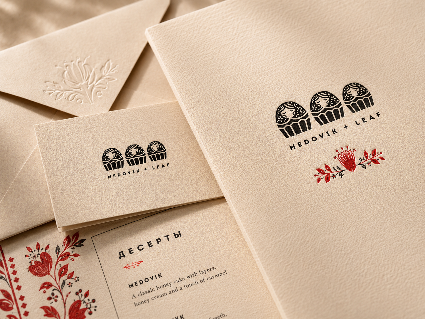
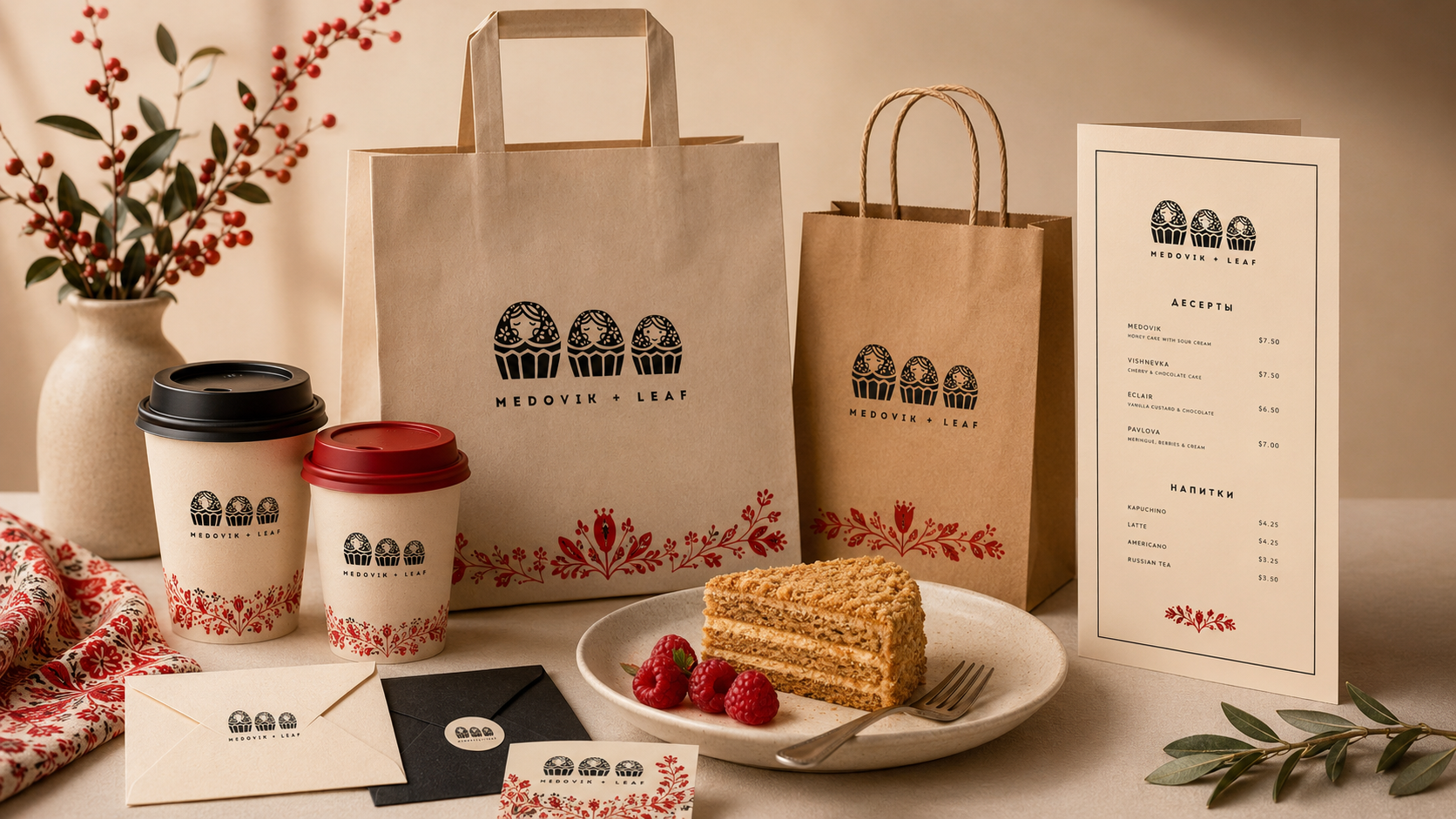
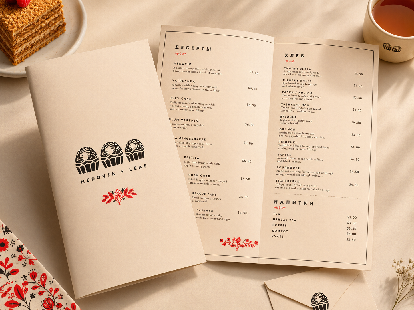
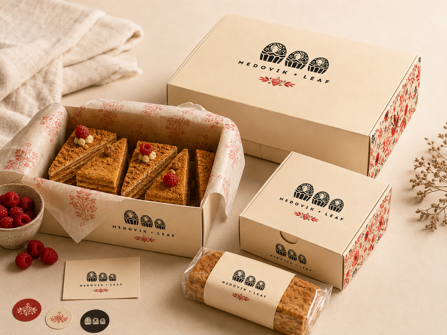
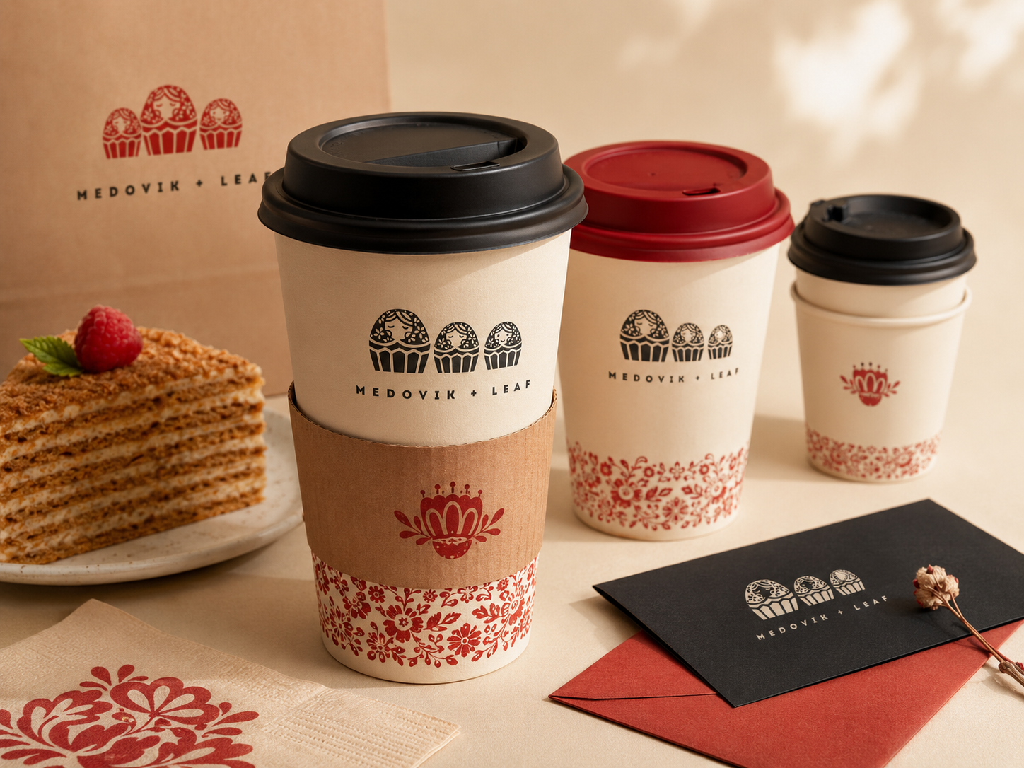
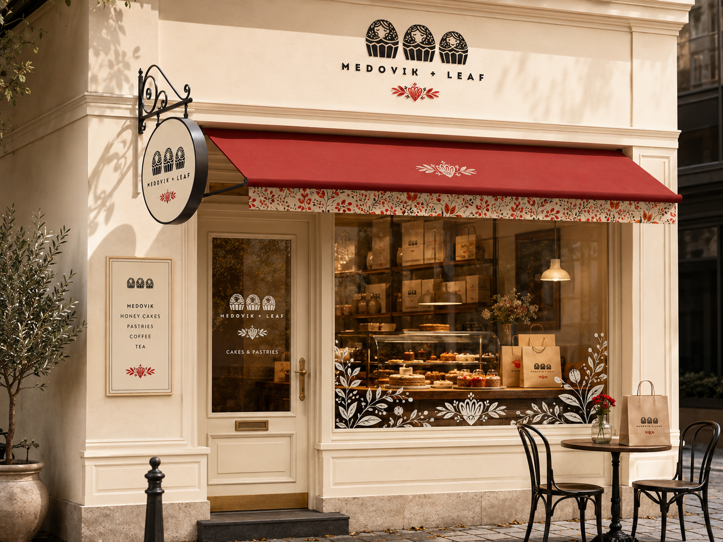
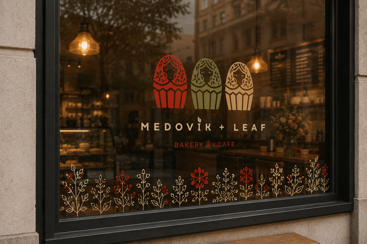
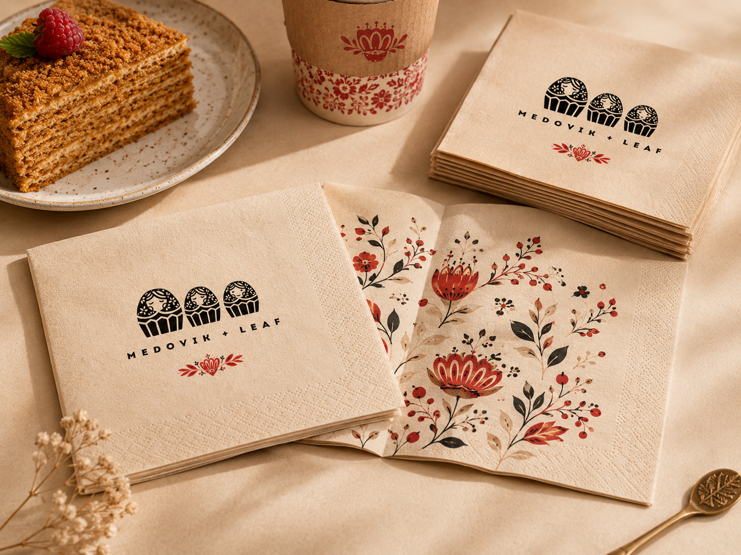
Medovik + Leaf transforms the warmth of handmade honey cakes into a complete café identity. The brand uses matryoshka-inspired dessert characters, botanical ornaments, cream paper textures, and a deep berry-red accent to create a memorable visual world across menus, packaging, signage, cups, and café details.
Handmade warmth, reimagined through folk illustration.
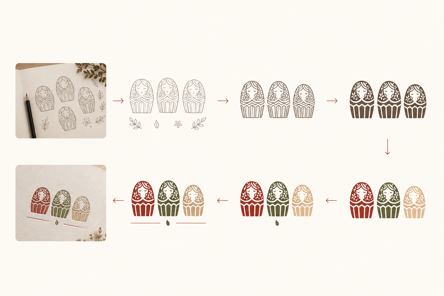
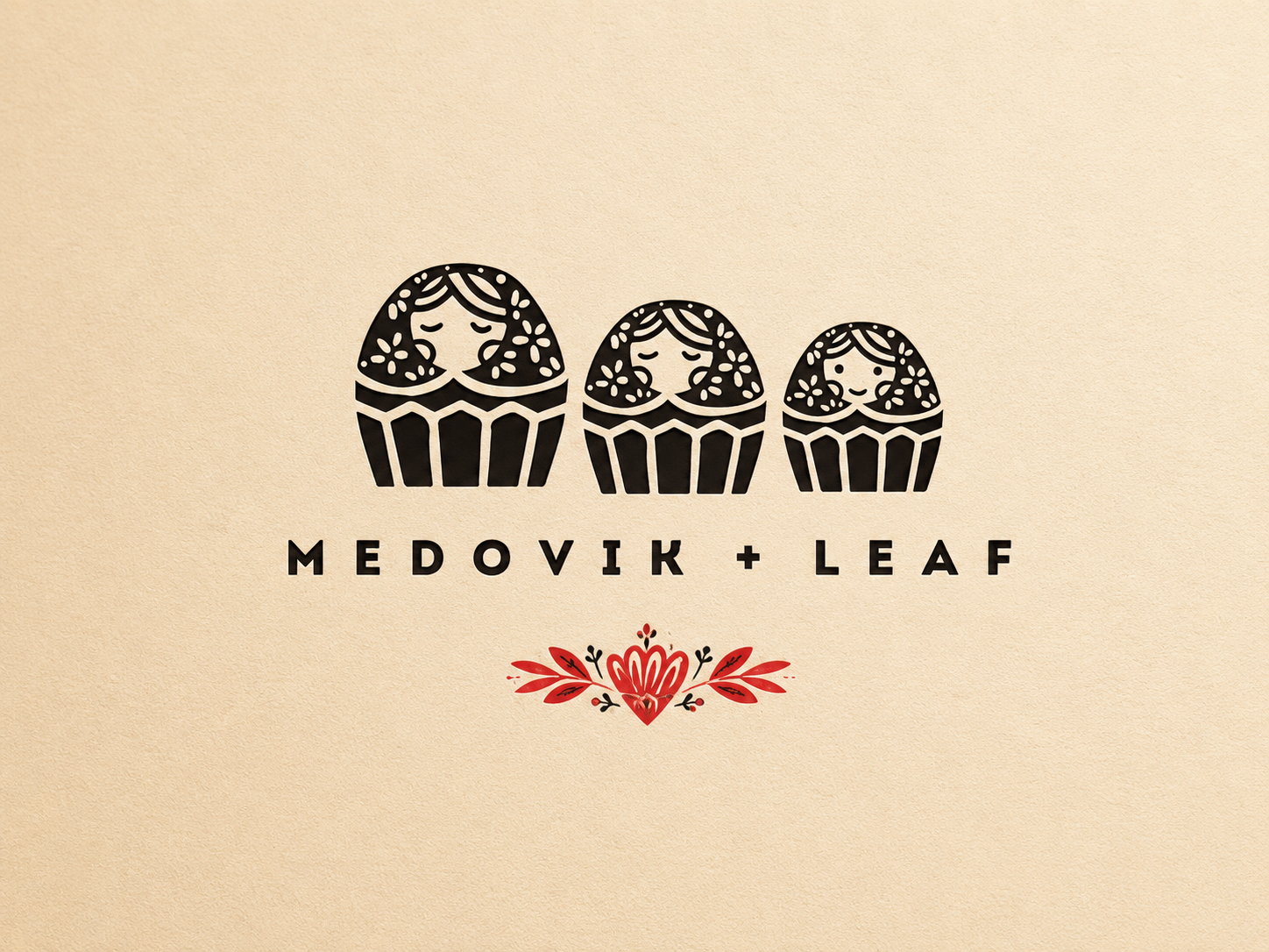
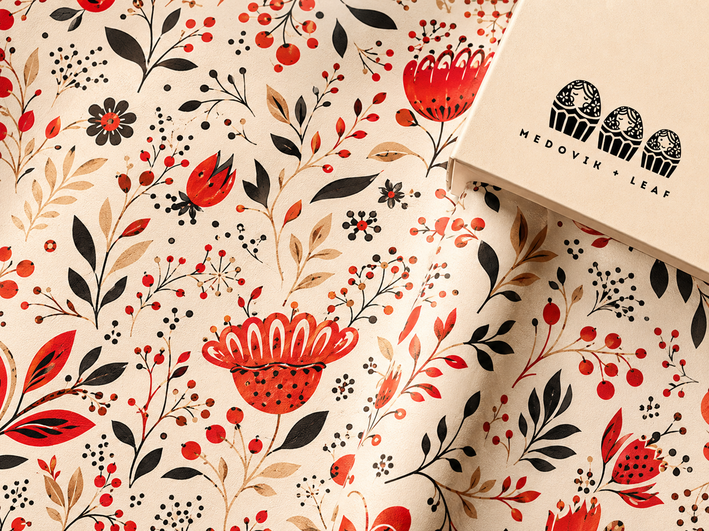
The logo combines a matryoshka-inspired dessert character with the shape of a cupcake, symbolizing warmth, heritage, and the sweetness of shared family moments. The leaf and floral ornaments add a natural, handcrafted tone, while the cream, honey, berry red, and cocoa black palette creates a soft but recognizable café experience.
From sketch to final mark.
The process is shown visually, with minimal copy, so the viewer can immediately understand how the character system evolved.
Cream paper, berry red, cocoa black.
The system uses one strong logo direction, then expands it through floral patterns, printed textures, menus, and packaging.
The brand in motion.
Warm packaging movement.
The second motion moment works as a transition from brand system to final applications, showing the identity through a warmer packaging-focused scene.
Brand images in use.
Large editorial mockups make the project feel more premium and easier to understand without relying on small carousel previews.
A cozy café world built from one memorable mark.
The identity expands from logo to packaging, motion, menu design, and storefront details while keeping the same warm handmade feeling throughout the experience.