Video Guide
Packing Flow
Moving Service

MOVIDEO

Product Design Mobile App UX Case Study
Role

UX/UI Designer

Focus

Planning · Packing · Moving Services

Tools

Figma · Research · Prototype

Scroll to explore
× VIDEO GUIDE ×
PACK · PLAN · MOVE

× Project Overview ×

From moving chaos
to guided action.

Movideo is a video-first moving assistant that helps young professionals learn how to pack, stay organized, and connect with trusted moving services in one clear flow.

Role

Product Design · UI/UX

Timeline

6 Weeks

Tools

Miro · Figma

01 / Background
01

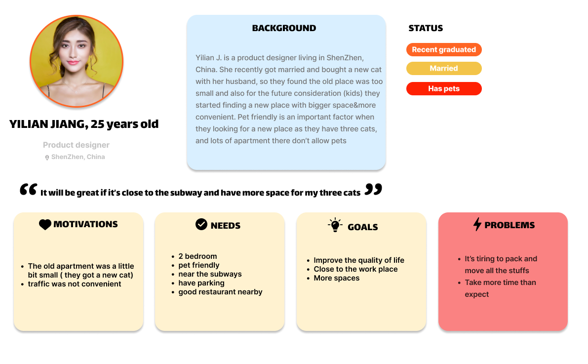
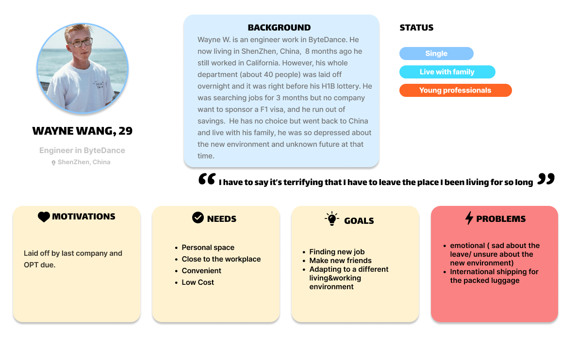
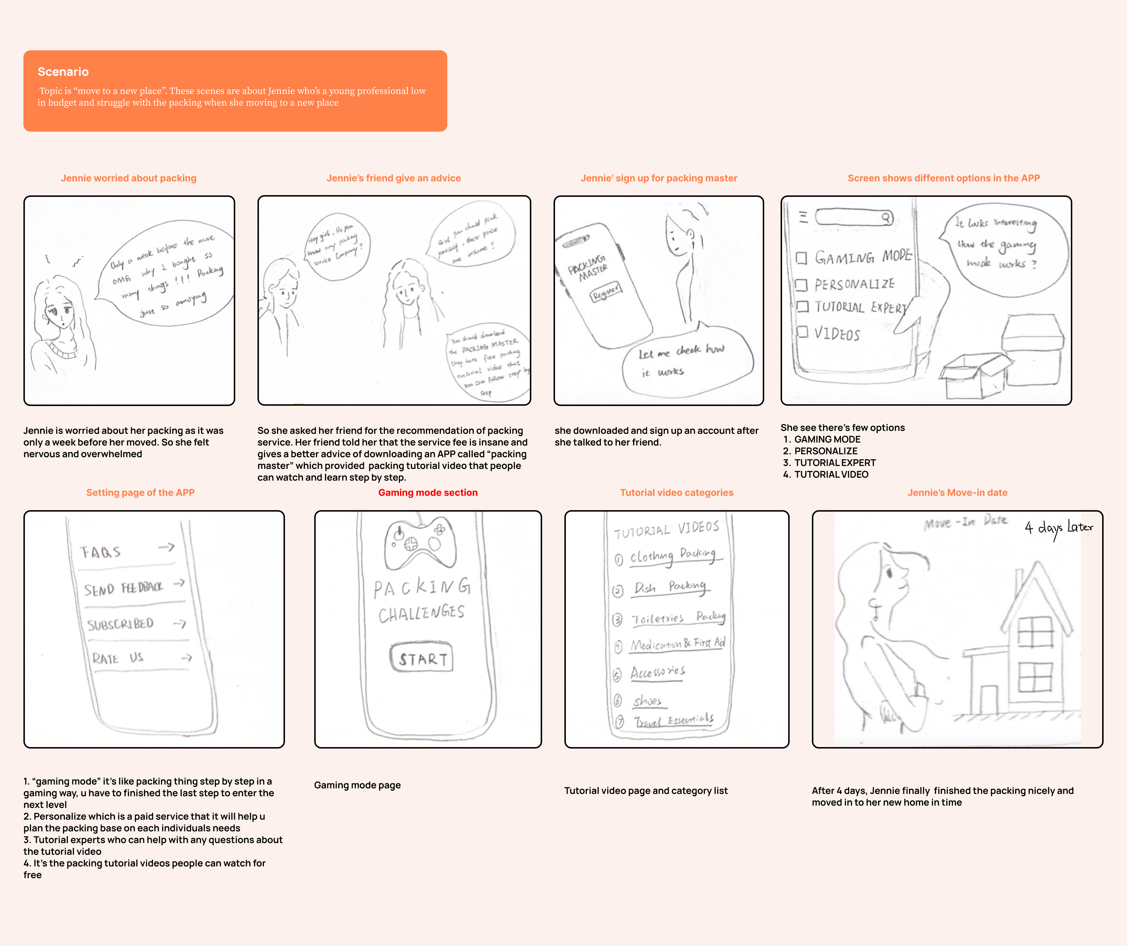
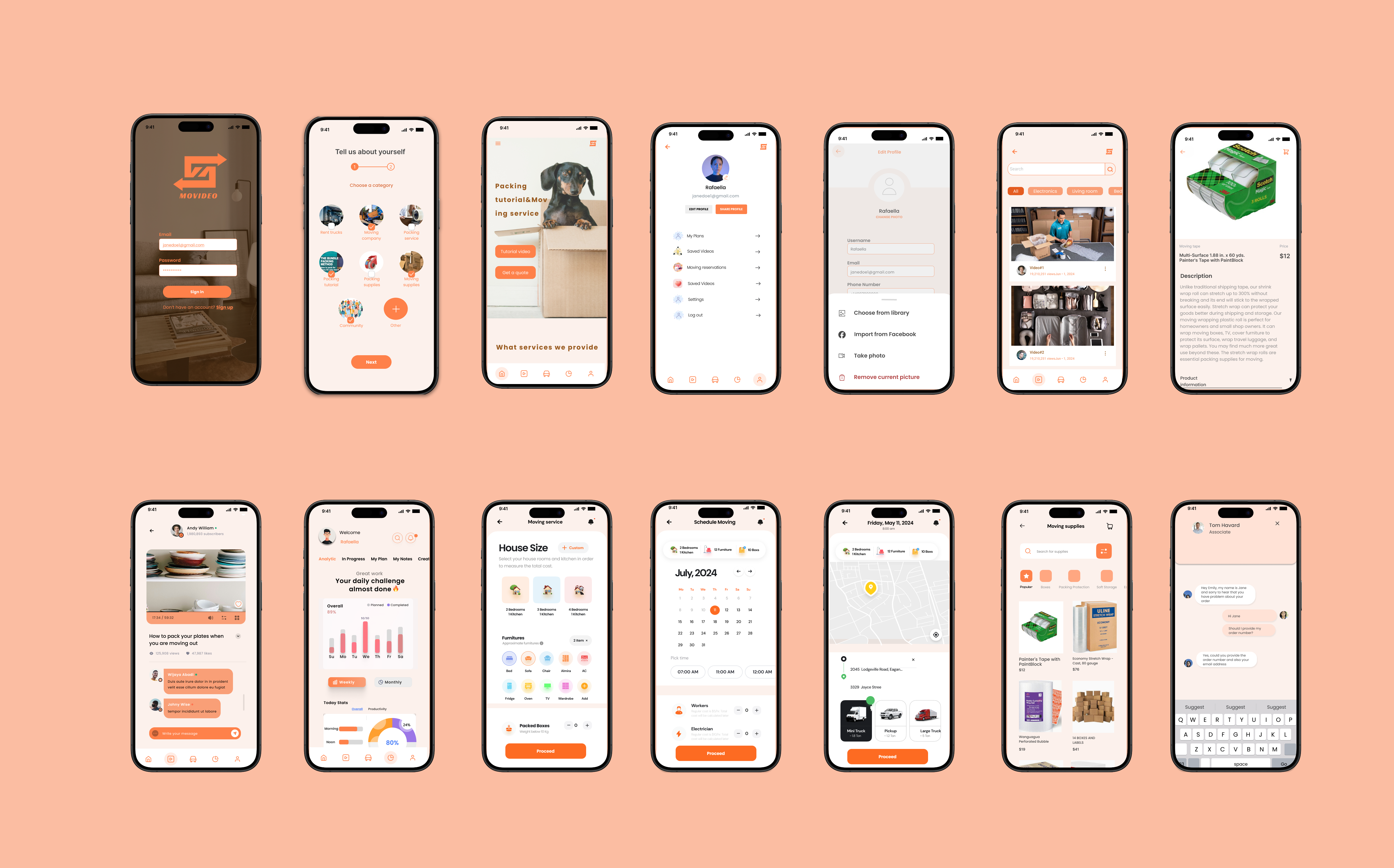
Moving feels overwhelming because the process is scattered.

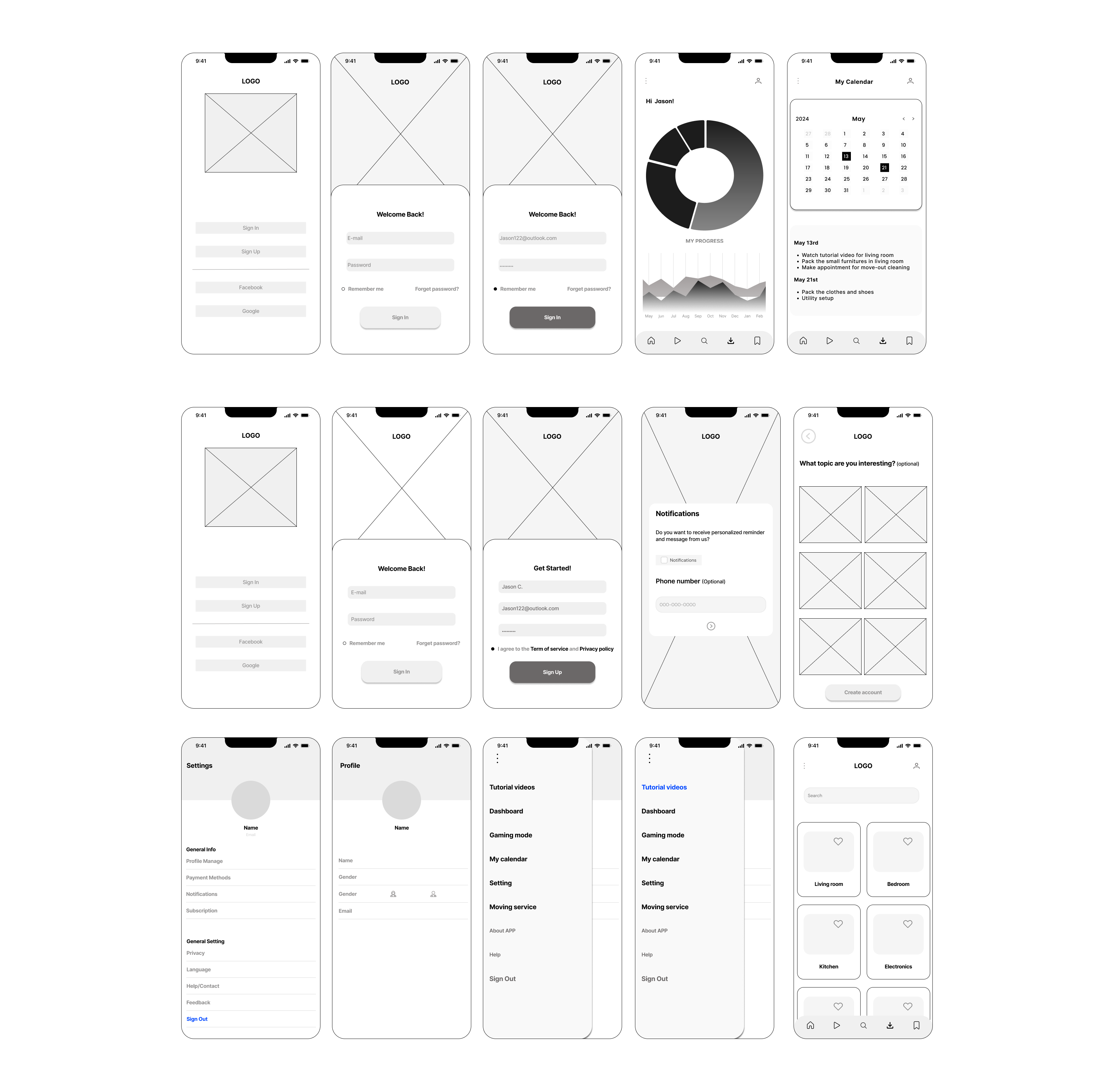
Movideo was built to help young professionals deal with the most frustrating parts of moving: stressful packing, tight budgets, and not knowing which services to trust. Research showed that many users prefer to pack on their own, but struggle with staying organized, efficient, and confident in their choices.

Video tutorials Planning tools Vetted services
02 / Challenge
02

Users needed guidance, but not another complicated checklist.

Movideo addresses common moving challenges like packing stress, limited budgets, and trust in moving services by offering a video-first platform with clear guidance. Usability testing informed improvements to navigation, layout, and content hierarchy, helping create a more intuitive and trustworthy experience.

Clear navigation Trust-building flow Less confusion
03 / Goal
03

Make moving feel guided, affordable, and less stressful.

Movideo aims to make moving simple, affordable, and stress-free for young professionals by combining expert video tutorials, interactive planning tools, and curated service connections into one seamless, user-friendly platform.

Simple process Video-first learning Curated support

This project is a fictitious scenario completed as part of Designlab’s UX Academy.

View Final Prototype

× Final Outcome ×

Turning moving into a guided, visual-first experience.

The final design brings together account setup, tutorial videos, moving service matching, and supplies shopping into one clearer flow for young professionals.

Outcome Preview

Interactive Result System
× VIDEO GUIDE ×
PACK · PLAN · MOVE
Movideo create account outcome screens
Movideo tutorial video outcome screens
Movideo moving service outcome screens
Movideo moving supplies shopping outcome screens
01

Create an account to save moving progress and personalize the experience.

Selected Result

Create an account to make moving progress feel saved and personal.

Users can create an account so their moving preferences, packing progress, and service needs stay connected throughout the experience.

View Final Prototype

× Research Phase ×

01 / Empathize Exploring the User’s Needs

Before designing the product flow, I used interviews to understand how young professionals actually feel about packing, budgeting, and choosing moving services.

Participants

5 people

Age Range

20–30 years old

Method

Voice / video interview

Session

20 mins each

Interview Signal System

Participant patterns → pain points → product opportunities
01
YJ

Participant 01

Yilian J.

25 · Product Designer · Shenzhen, China
Interview Quote

“I want to pack on my own to save money, but I don’t really know where to start.”

Pain Point

Packing feels overwhelming because there is no clear order or structure.

User Need

Needs simple guidance that breaks packing into manageable steps.

Behavior Signal

Prefers self-packing, but still wants expert-level direction.

Design Opportunity

Provide room-based tutorials and task progress to reduce uncertainty.

Insight 01

Packing is the biggest source of stress.

Most users prefer packing on their own to save money, but struggle with organization, efficiency, and physical fatigue.

Insight 02

Trust affects moving-service decisions.

Users are hesitant to hire movers because of unclear pricing, hidden costs, and inconsistent past experiences.

Insight 03

Affordability defines a successful move.

Participants described a good moving experience as low-cost, organized, and convenient.

× Market Research ×

02 / Competitor Analysis Mapping the market gap.

I analyzed four moving-service competitors to understand where current products succeed, where users still feel friction, and how Movideo could create a clearer mobile-first experience.

Scope

4 major competitors

Research Focus

Mission · users · strengths · weaknesses

Design Opportunity

Transparent cost · video guidance · mobile-first journey

Competitive Signal System

Competitor patterns → friction points → Movideo opportunity
02

Planning resources

Moving.com

Strong resource hub for moving tips and checklists, but the experience feels more informational than guided.
Planning Support 78
Pricing Clarity 48
Video Guidance 28
Mobile Journey 46
What Works
  • Broad moving information
  • Checklists and planning articles
  • Useful for early research
Friction Found
  • Experience feels content-heavy
  • Limited step-by-step product guidance
  • Pricing and service path can feel separated
Movideo Opportunity

Turn scattered moving information into a guided mobile flow with tutorials, planning tools, and service options in one place.

Market Gap Map

Movideo connects learning guidance with moving-service support.

More guided learning
More service support
Movideo
Insight 01

Resources exist, but they feel fragmented.

Competitors often separate planning, service discovery, pricing, and learning into different moments.

Insight 02

Trust and pricing need to be more visible.

Users need to understand what they are paying for before they feel comfortable choosing moving support.

Insight 03

Video can make moving feel easier.

A video-first experience can turn stressful packing tasks into clear, repeatable steps.

× Define Phase ×

03/ Persona Turning interview patterns into focused design problems.

After synthesizing interview insights, I created personas and translated recurring frustrations into problem statements that could guide Movideo’s product direction.

Input

User interviews · affinity notes

Output

2 personas · 3 problem statements

Focus

Packing · trust · affordability

Persona Signal Board

Hover · Switch · Read
× HUMAN SIGNAL ×
PACK · TRUST · COST
Movideo persona Yilian Jiang
Movideo persona Wayne Wang
01
02
01

Persona 01

Yilian wants to save money by packing herself, but feels overwhelmed by time and organization.

Her main problem is not motivation. It is knowing how to break packing into smaller, clearer actions without spending too much money or time.

× Problem Statements ×

01

How might we help users categorize their packing when moving so they won’t get stuck and feel less stressed?

02

How might we help users feel confident and protected when hiring a moving company?

03

How might we help users find better and lower-cost moving solutions so they can afford the move?

× Ideation Phase ×

04 / Ideate Creating the framework.

I translated research insights into a clearer product structure through storyboarding and information architecture, focusing on how users move from planning to tutorials, services, and supplies.

Method

Storyboarding · Sitemap · Navigation structure

Goal

Turn research insights into a usable product framework

Focus

Packing guidance · moving services · user planning flow

Framework Board

Sketch → Scenario → Product Structure
04

01 / Storyboard Sketches

Visualizing how the product fits into a real moving scenario.

I used storyboarding to imagine how a young professional might discover Movideo, look for packing help, and move through the app when feeling stressed or unsure.

User scenario Emotional context Guided support
Storyboard Sketches
Movideo storyboard sketches

From story scenario to app structure

02 / Information Architecture

Organizing Movideo into a clear navigation system.

After defining the core use cases, I built a sitemap that separates service booking, tutorial learning, account settings, and planning tools into understandable paths.

Primary navigation Task categories System logic

Movideo Sitemap

Primary / Secondary / Tertiary Navigation
Product Movideo
Entry Home
Core Flow Moving Service
Moving Review
Packing Service
Shopping Cart
Checkout
Payment
Order Details
Learning Packing Tutorial
Bathroom
Bedroom
Kitchen
Living Room
Electronics
Personal Items
Control Settings
General
Language
Privacy
Help
Feedback
User My Account
Sign Up
Log In
Profile
Saved Videos
Planning Planner
Checklist
Calendar
Moving Plan

× Flow Design ×

05/ Ideate User flows as animated task paths.

Instead of showing the flows as static images, this section turns the main task paths into a visual system that highlights each step from entry point to completion.

Flow 01

Book a packing appointment

Flow 02

Watch tutorial videos

Purpose

Map key actions before moving into final screens

Animated Flow Board

CSS-only · No JavaScript
× TASK PATH ×
SEARCH · DECIDE · ACT
Start
Homepage
Search packing service
Enter keywords
Apply filters
View available services
Select service type
Need more service?
View reviews & price
Choose final service?
Booking confirmation
Add to calendar
End
01

Packing Appointment Flow

From search to confirmation, the flow reduces uncertainty before booking.

Users move through search, filtering, service comparison, review, and booking confirmation. The path is designed to make hiring packing help feel clearer and less risky.

Start
Homepage
Find video menu
Search tutorial videos
Select video type
Browse category
Show similar videos
Choose video to play
Watch video
Helpful?
Save for later
End
02

Tutorial Video Flow

Users can find, watch, and save packing videos without losing momentum.

This flow focuses on making tutorial content searchable and reusable, so users can return to helpful packing guidance throughout the moving process.

× Prototype Phase ×

06/ Prototype Let’s make the design.

I moved from low-fidelity structure into a warmer visual system, then refined the final mobile screens around tutorial learning, moving services, and supplies shopping.

Stage 01

Low-fidelity wireframes

Stage 02

Logo · moodboard · component library

Stage 03

High-fidelity screens and feature walkthrough

Prototype System Board

Wireframe → System → Final
× MAKE IT TANGIBLE ×
WIREFRAME · UI KIT · FINAL

01 / Wireframes

Mapping the core user journey before adding visual detail.

The low-fidelity screens helped define the structure for login, onboarding, dashboard, calendar, tutorial library, and service booking before moving into visual design.

Movideo low-fidelity wireframe screens
Input

User flows + task priorities

Output

Core app screen structure

Goal

Validate layout before UI styling

02 / Brand System

Building a warm, reliable visual language for a stressful moving process.

I developed the logo direction, moodboard, color palette, UI components, buttons, cards, navigation elements, and typography system to make Movideo feel helpful and energetic.

Moodboard
Movideo moodboard
Component Library
Movideo component library

03 / Final Design

Designing the final app around guided learning, service planning, and preparation.

The final design connects tutorial videos, moving service planning, and supplies shopping into one visual-first mobile experience for young professionals.

Movideo high-fidelity final screens
Feature 01

Tutorial Videos

Users can browse packing tutorials by room or item type, save useful videos, and follow step-by-step guidance.

Movideo tutorial videos screen
Feature 02

Moving Service

Users can estimate moving needs by choosing home size, furniture, boxes, and service preferences.

Movideo moving service screen
Feature 03

Moving Supplies

Users can shop moving supplies directly inside the app with clear categories, pricing, and product details.

Movideo moving supplies screen

× Usability Testing ×

07 / Iterations Refining Movideo through user feedback.

I used usability testing to understand where users felt confused, slowed down, or unsure. The feedback helped me improve task clarity, screen hierarchy, and the flow of key actions.

Method

Remote usability testing

Focus

Navigation, task clarity, and prototype comprehension

Outcome

Iterations based on repeated user friction points

Testing Evidence

Observe → Understand → Improve
07

Research Evidence

Testing notes became the source for targeted iteration.

Instead of treating testing as a final checkpoint, I used each observation as a design signal. The notes helped reveal where users hesitated, where the hierarchy was unclear, and which flows needed refinement.

Navigation Friction Task Clarity CTA Hierarchy
Session Notes
Movideo usability testing session notes
Testing Findings
Movideo usability testing findings
01

Make the starting point clearer.

Some users needed more context before starting a task. I improved labels and entry points so the next action felt easier to understand.

02

Strengthen hierarchy on key screens.

I refined button emphasis, spacing, and content priority so users could complete flows with less hesitation.

03

Use testing data to guide iteration priorities.

I focused changes on the screens where users showed repeated confusion or slower task completion.

Testing Summary
Movideo usability testing summary

Prototype Viewer

Switch between the revised flows and interact with one prototype at a time.

Flow 01

Main prototype flow

This flow shows the revised final prototype and how users move through Movideo’s core experience.

Flow 02

Moving service flow

This flow focuses on how users compare service options, make decisions, and move toward confirmation.

Flow 03

Moving supplies shopping flow

This flow shows how users browse supplies, review product information, and move through the shopping experience.

× Closing Reflection ×

08 / Reflections What I would improve next.

Movideo helped me understand how important it is to design around real user behavior, especially when the experience involves stress, planning, and decision-making.

Project Takeaway

From testing insights to future product direction
08
01

Test the iterated design again

I would run another round of usability testing to see whether the updated flows feel clearer and whether users can complete core tasks with less hesitation.

Retest Validate Improve
02

Track user experience after MVP release

After launch, I would use short surveys and behavior data to understand user motivation, moving habits, and moments where the product could support them better.

Survey Data MVP

Main Takeaway

Design decisions became stronger when they were grounded in user behavior.

Throughout the Movideo project, I learned the importance of building around real user needs rather than assumptions. From early research to usability testing, user feedback shaped each iteration — from simplifying the service-booking flow to improving the tutorial-watching experience.

Each test revealed how users expect digital guidance and service convenience to work together. This helped me think more critically about clarity, trust, and how a product can reduce stress during a complex real-life process.

Research-led decisions Clearer hierarchy Trust-building UX

Movideo became a practice in turning messy real-life planning into a calmer, more guided digital experience.