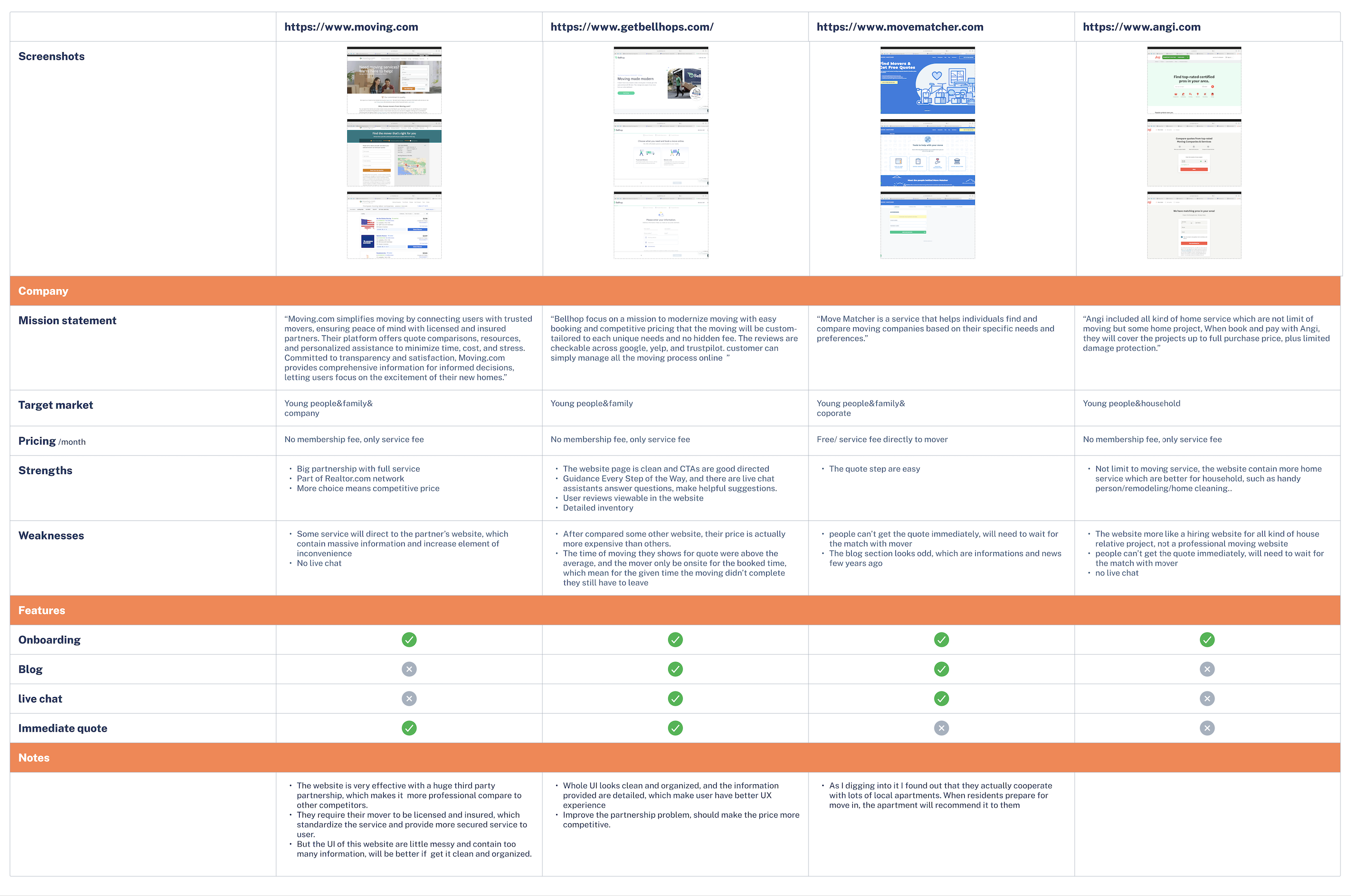
Project Goals
While the business goal was to attract as many users as possible by clearly showing how the app works, I focused on understanding what users truly wanted—and I was able to identify where those needs aligned with the business objectives.
Check in FigmaFeatures Roadmap
The feature roadmap was structured in four tiers to balance essential functionality with engaging future possibilities. At the core (Must-Haves), the app focuses on solving immediate user pain points through personalized accounts, interactive packing checklists with progress tracking, video tutorials, guided step-by-step instructions, reminders, and multi-platform accessibility. Building on this foundation, the Nice-to-Haves enhance usability with a review section for feedback, a robust help center, and strong security features. To create delight, the Surprising & Delightful layer introduces customization options like personalized backgrounds and a community hub for user connection. Finally, the Can Come Later category explores innovative extensions such as immersive VR tutorials and AI-powered AR guidance, signaling the app’s potential for long-term growth and differentiated experiences.
 Check the Sheet
Information architecture
With the features roadmap, I built a sitemap that includes primary, secondary, and tertiary navigation. First, I developed the primary navigation by defining the main actions users might take: My Account, Settings, Planner, Moving Service, and Tutorial Videos. Next, I explored and expanded each of these sections.
User Flow
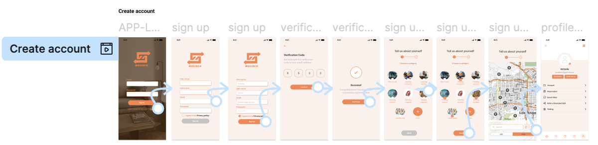
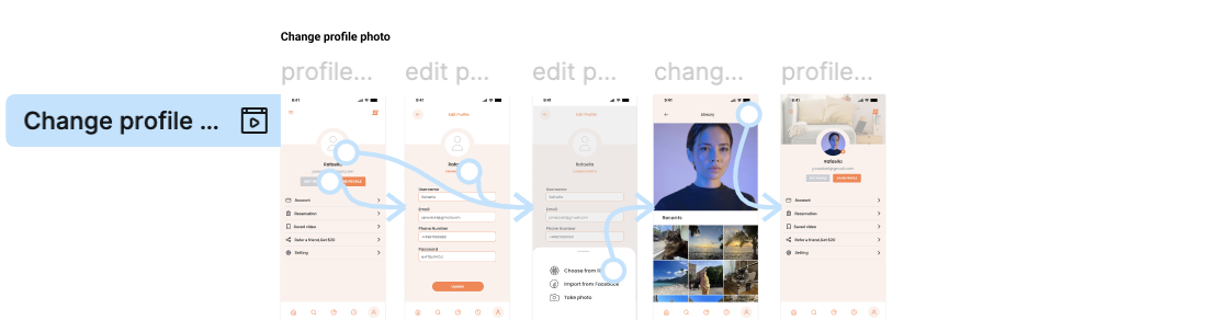
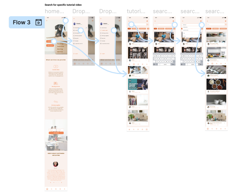
I’ve created user flows for the app. It was crucial to turn all my work into pages, buttons, inputs and links. After creating user flows, I’ve decided to develop in depth two task flows that I’ve eventually tested with my prototype: Book an appointment for packing service and watch tutorial videos.
User Flow
#1 Book an appointment for packing . The flow includes the search of a packing person; the choice of what kind of packing service and time slot and finally the checkout.
#2 Watch tutorial videos . The flow includes the search of tutorial videos for packing; the choice of what kind of packing video they want and can save the videos for future watch
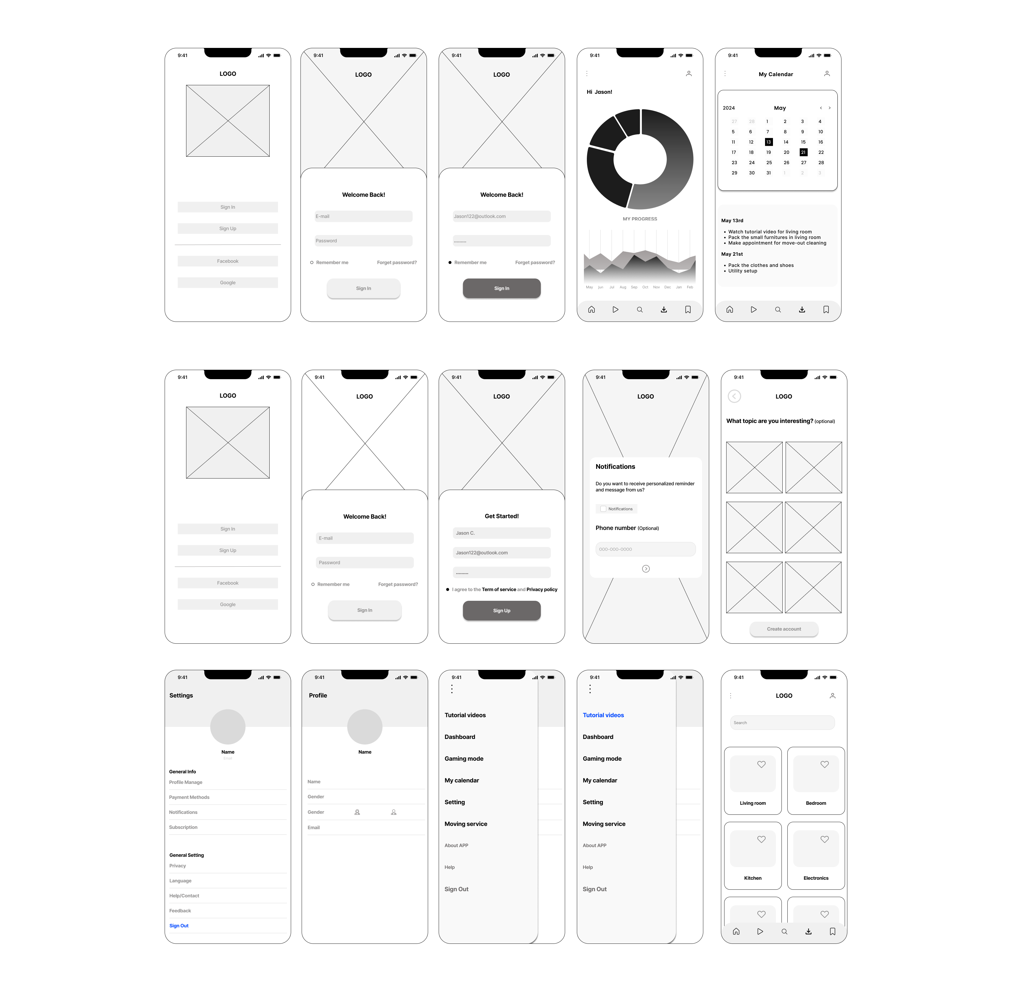
Wireframes
I began by sketching the core user journey screens for Movideo — including the homepage, login and sign-up flow, personalized dashboard, calendar view, tutorial library, and service booking sections. Each screen was designed to map out how users can smoothly transition between watching tutorial videos and scheduling their own packing appointments.
Low-fidelity wireframes allowed me to focus on the structure, hierarchy, and functionality of each page without being distracted by color or visuals. Through this process, I was able to identify key touchpoints, refine navigation patterns (like the bottom tab and hamburger menu), and clarify how each interaction supports the overall task flow — from learning through tutorials to booking professional services.
Click to view in FigmaBrand Identity
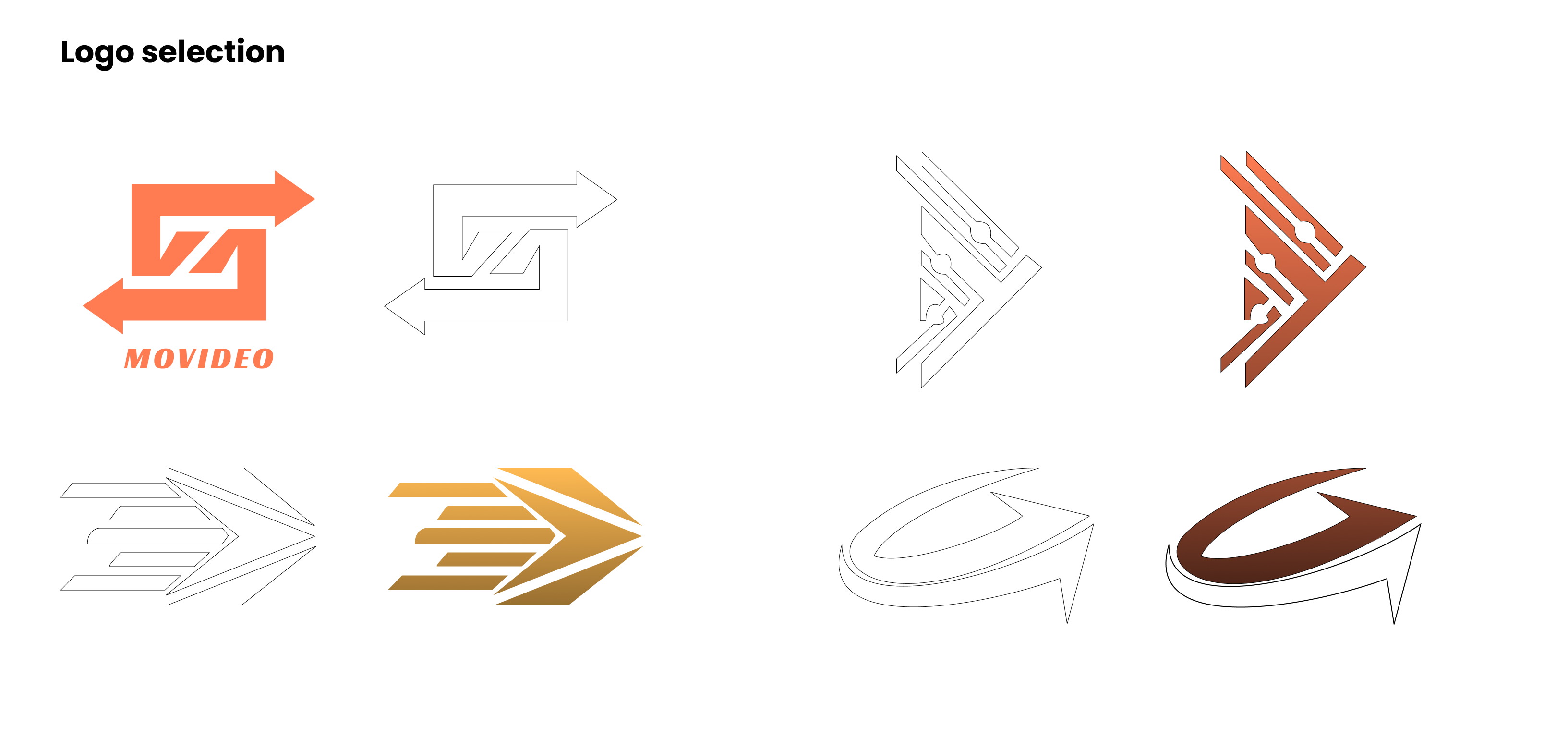
For the creation of the logo, I focused on Movideo’s core idea — a dynamic system built around three elements: learning, service, and connection. The platform bridges tutorial-based learning and real-world service booking, helping users move seamlessly from watching to doing.The logo combines two interlocking arrows pointing in opposite directions to symbolize interaction, exchange, and flow. This represents Movideo’s mission: to guide users through continuous motion — from gaining knowledge to taking action.The bold geometric structure conveys reliability and system efficiency, while the warm orange tone expresses energy, motivation, and creativity. Together, they form an abstract mark that reflects both movement and video, capturing the brand’s name and essence in one unified symbol.
UI Components
The Movideo UI component library establishes a consistent visual system across the platform. Built with modular buttons, icons, cards, and navigation elements, it uses a vibrant orange accent to convey energy and motion while maintaining clarity, balance, and scalability.
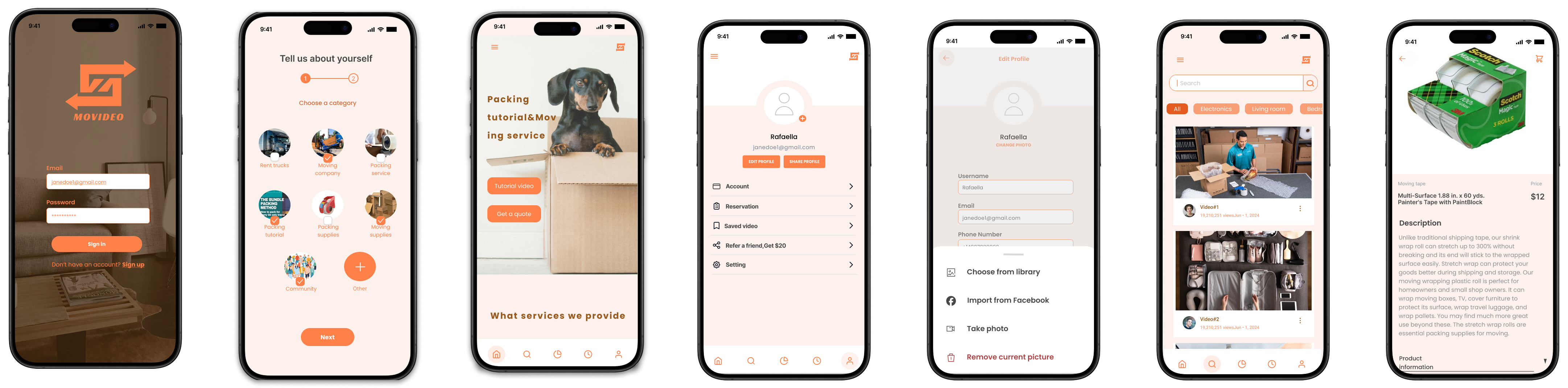
High-fidelity key-screens
These high-fidelity key screens bring Movideo’s concept to life through warm tones, clear hierarchy, and intuitive navigation. The design highlights the seamless flow between watching packing tutorials and booking professional services — reflecting the brand’s mission to connect learning with real-world action. Each screen emphasizes clarity, approachability, and consistency with the Movideo design system.
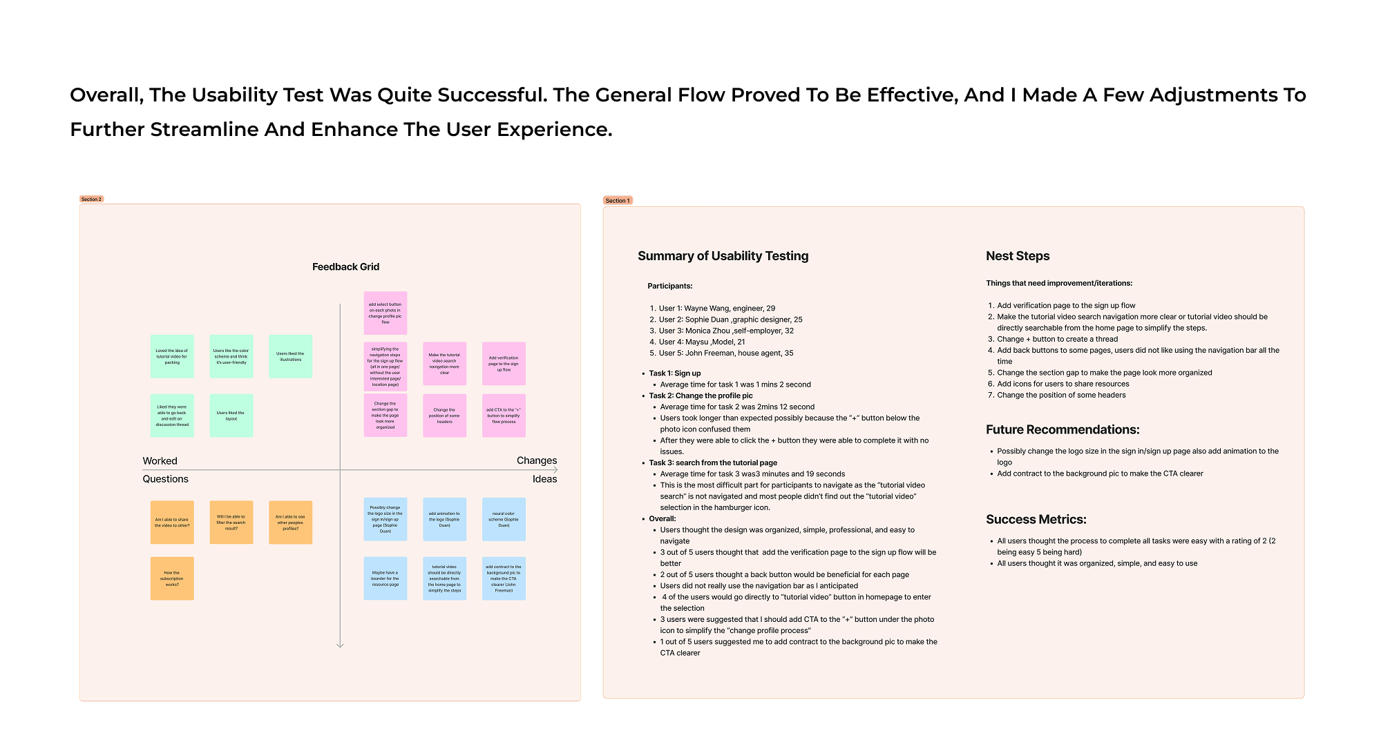
click to view in FigmaUsability Test
I developed an interactive prototype to simulate the complete Movideo experience — from onboarding and profile setup to browsing tutorials and booking services. By connecting key artboards and refining transitions,
I created smooth, realistic navigation that showcases how users move seamlessly through the platform. The prototype captures the essence of Movideo’s goal: transforming learning moments into actionable experiences.
Outcome
Iterations
Thanks to usability tests, I’ve identified four major iterations to my original project:
- I’ve added verification page to the sign up flow
- Make the tutorial video search navigation more clear or tutorial video should be directly searchable from the home page to simplify the steps.
- Add back buttons to some pages, users did not like using the navigation bar all the time and change the position of some headers
View full prototype.png)