A ballet campaign built between discipline and freedom.
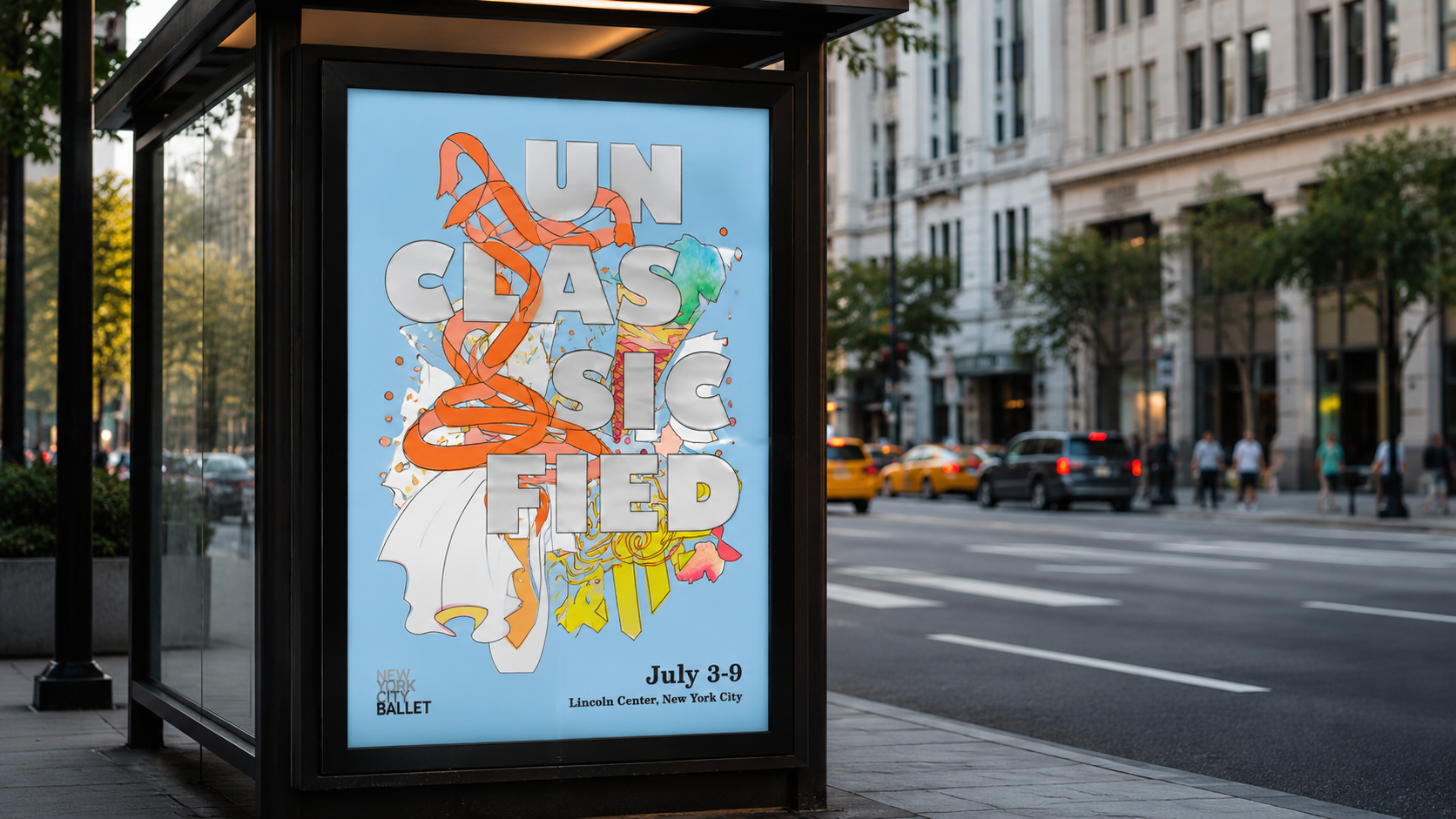
Unclassified is a conceptual campaign identity for a contemporary ballet program. The visual system combines ballet-inspired forms, expressive ribbon illustrations, bold dimensional typography, and playful color to create a campaign language that feels energetic, youthful, and refined.
Redefine classical. Redefine movement. Redefine strength.
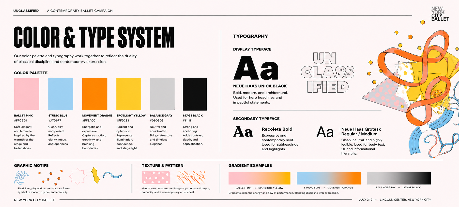
The identity explores the tension between classical ballet and experimental movement. Soft ballet pink and airy blue balance the intensity of orange and yellow, while the silver-gray typography gives the campaign a stage-like, dimensional presence.
Soft colors, sharp rhythm.
The brand guide explains the palette, typography, motion motifs, graphic shapes, and the contrast between classical elegance and contemporary energy.
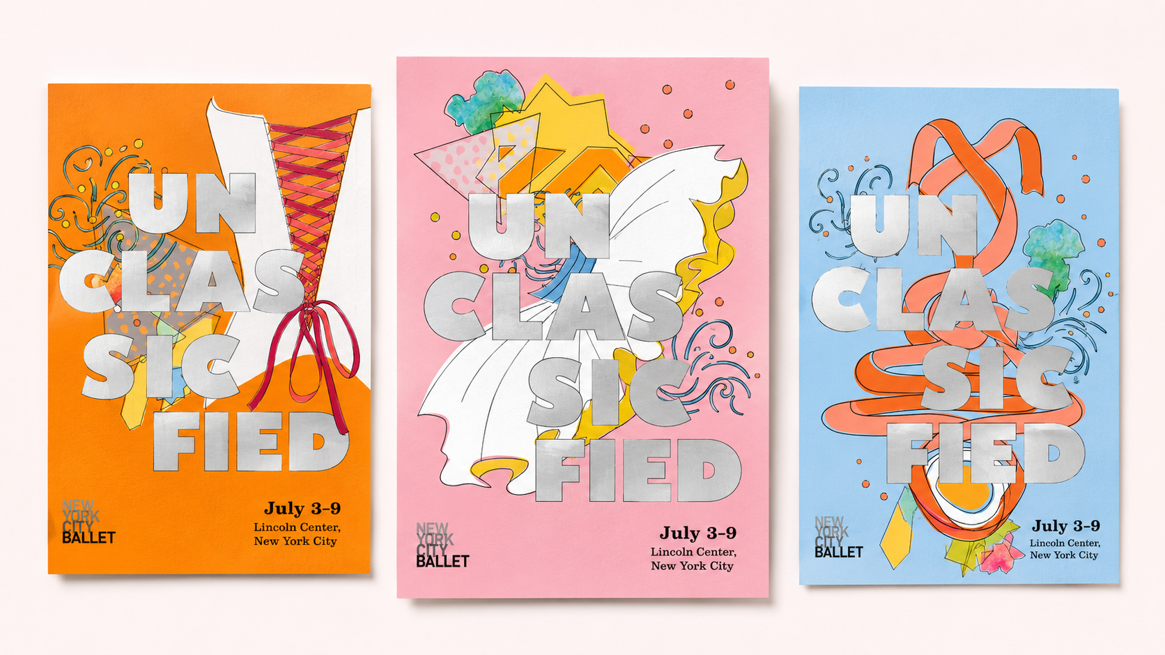
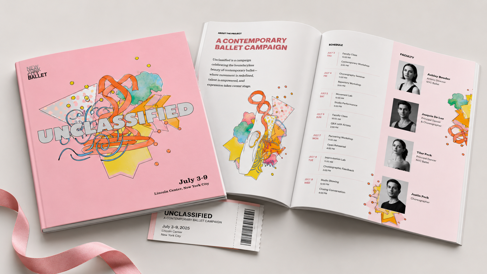
A campaign with three visual rhythms.
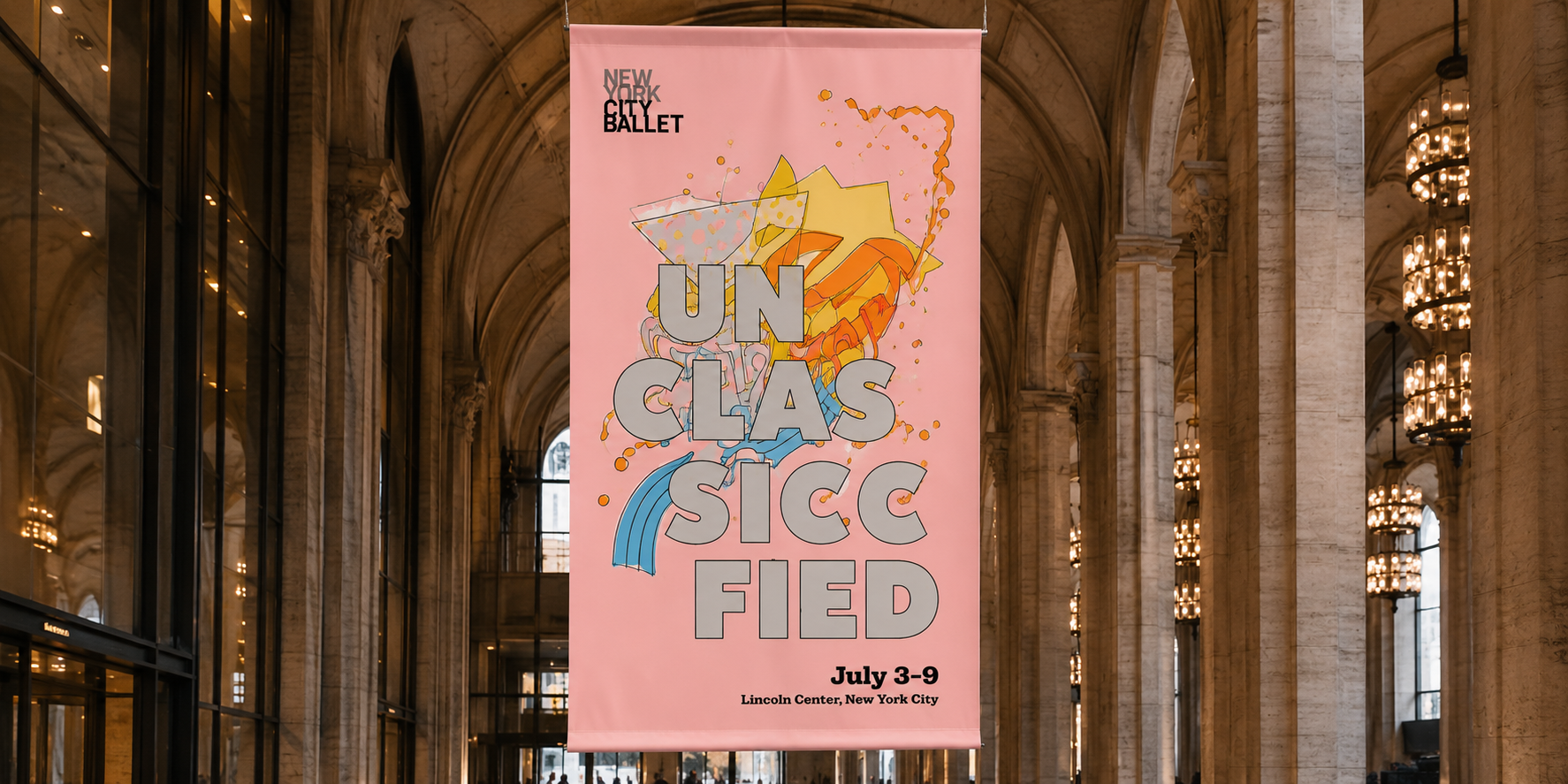
The poster system uses the same typographic voice but shifts color and composition to highlight costume, ribbon, and movement.
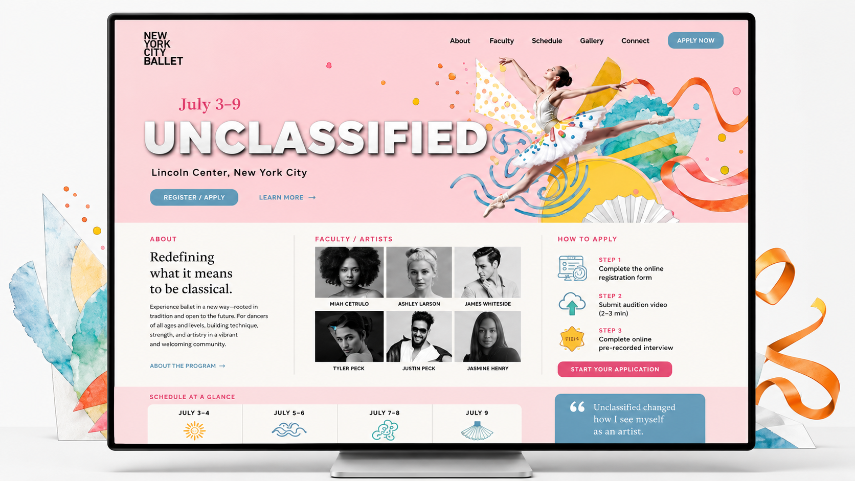
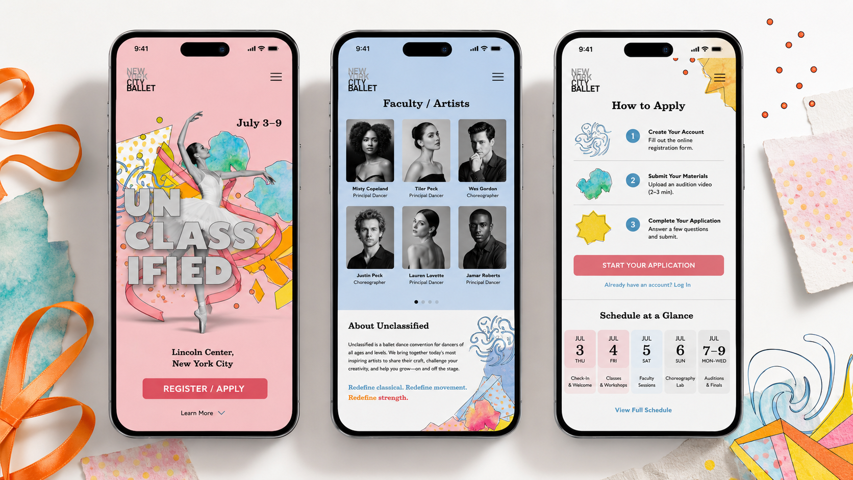
From poster to responsive experience.
The landing page and mobile screens translate the campaign into a clear event experience: overview, faculty, schedule, and application flow.
The campaign in motion.
Ribbon, typography, and stage rhythm.
The second motion moment works as a transition from the visual system into real-world applications. It gives the campaign a more premium portfolio moment while keeping the page simple and editorial.
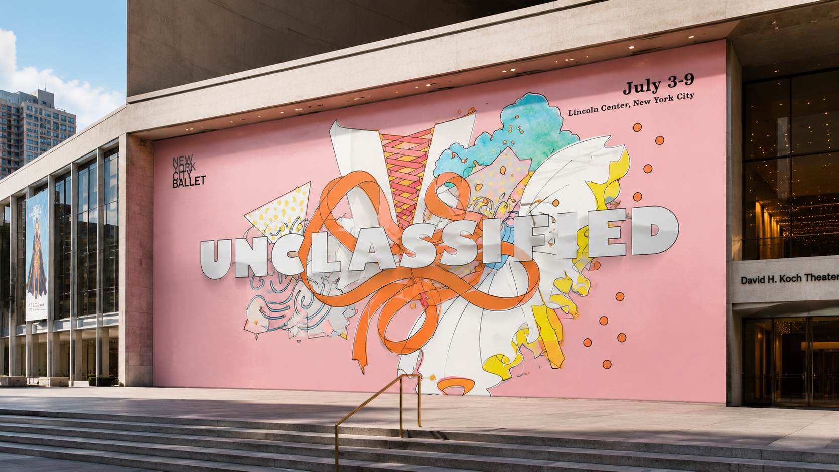
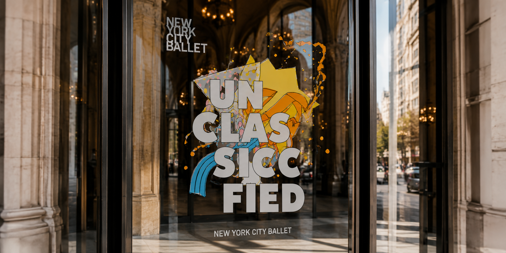
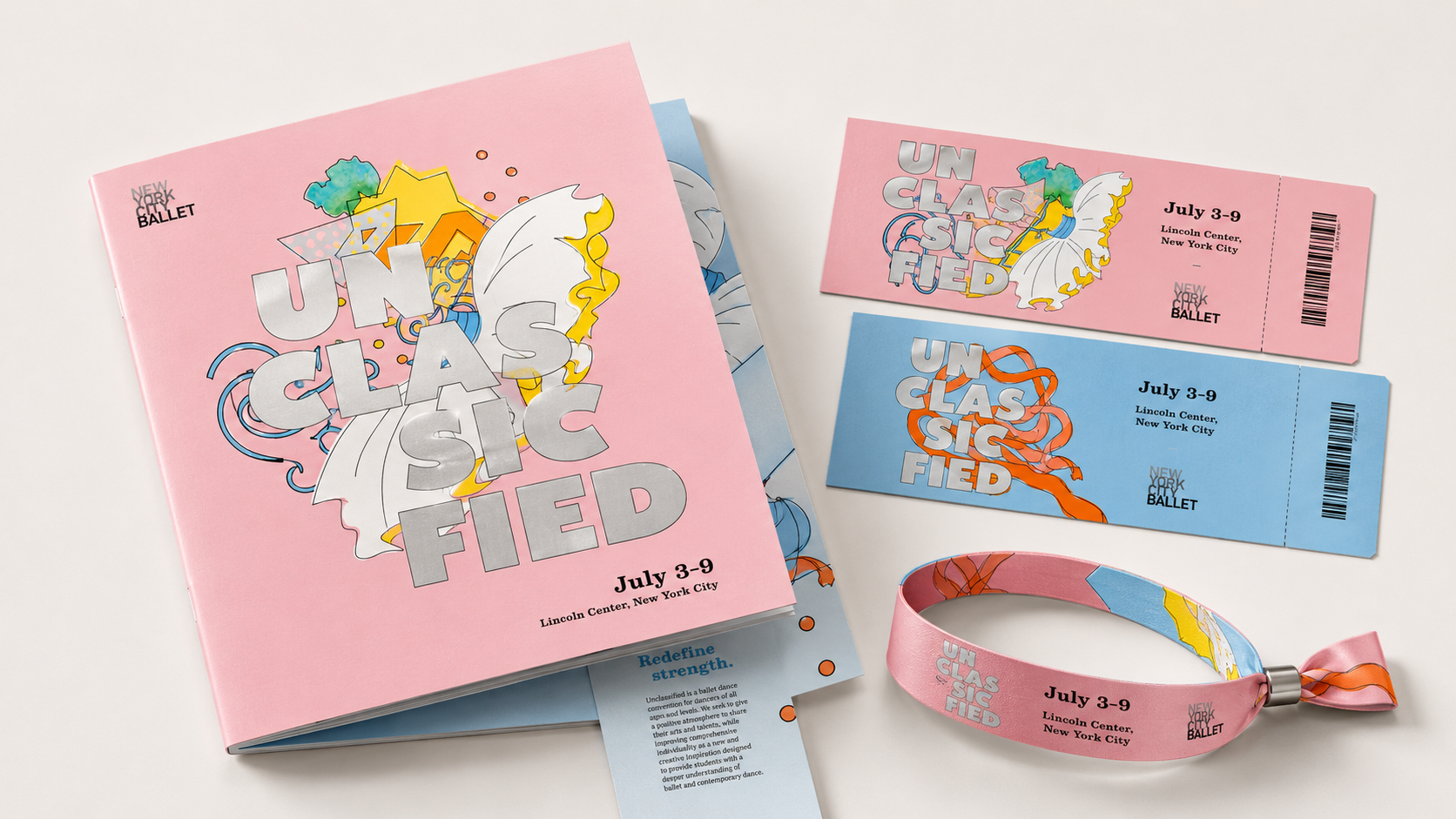
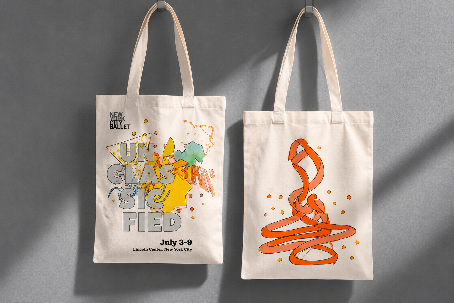
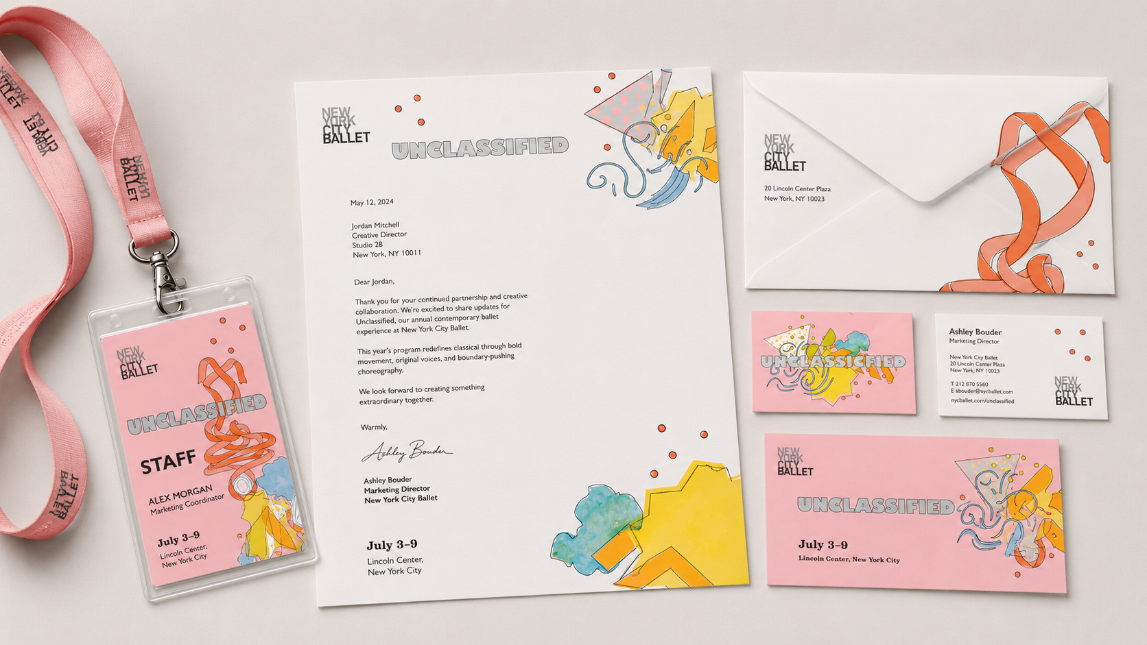
The identity in use.
Large editorial mockups replace the old small collage style, making the project feel more complete, premium, and easier to understand at first glance.
A classical form, reimagined through motion.
Unclassified turns ballet into a flexible campaign system across posters, digital interfaces, event materials, motion, and spatial applications.